 |
|
|
UER Store
|
|
sweet UER decals:

|
|
|
|
Activity
|
|
852 online
Server Time:
2024-05-16 17:23:01
|
|
|
 Jonno23
   
Location: Phoenix, Az, Sector zz9 Plural Z Alpha
Gender: Male

This space for rent
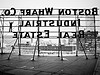
 | |  | 2 that just dont feel quite right.
< on 12/4/2010 9:00 AM >
|  | | | I thought these were solid when I took them, but for some reason I am not quite sure about them. What the hell is bugging me so much about these? Any suggestions? Thanks for looking.


Blah Blah Blah. Shut up and open the damn door.
"It's ok Officer, I watch a lot of cop shows on tv, so i am practically one of you guys." - sadly, that didn't work.
http://www.flickr.com/photos/jonno23/ All my photos suck. |
|
Chris-Kicker
  
Location: New York, NY
Gender: Male

no, I did not Kick Chris.
| |  | Re: 2 that just dont feel quite right.
<Reply # 1 on 12/4/2010 9:15 AM >
| | | | on number one I say its where the horizon is sitting. i think its a little bit low.
on number two i think its somewhat the same thing.
i think the photo was taken at to low of an angle.
just my thoughts. i think thats it anyway.
cheers,
-chris
http://ChurchofAtom.com/
"Signatures are still stupid" |
|
justakitty
Location: The Dirty 'Shwa, Ontario, Canada
Gender: Female

| | Re: 2 that just dont feel quite right.
<Reply # 2 on 12/5/2010 2:16 AM >
| | | | that stadium or whatever it is in 1 isn't quite level... great pic but that unlevel line drew my eye really fast... just my two cents; I'm no great photographer!!
|
|
Jonno23
Location: Phoenix, Az, Sector zz9 Plural Z Alpha
Gender: Male
This space for rent
| | Re: 2 that just dont feel quite right.
<Reply # 3 on 12/5/2010 4:02 AM >
| | | | Kitty I think you are right with that one.
Chris, I kind of was going for the big sky look, but may have gone a little too big. And that second one yeah, maybe too low, but that damn bush gets in the way if I back up. May have to bring a hatchet and get rid of it. lol
Blah Blah Blah. Shut up and open the damn door.
"It's ok Officer, I watch a lot of cop shows on tv, so i am practically one of you guys." - sadly, that didn't work.
http://www.flickr.com/photos/jonno23/ All my photos suck. |
|
RaTBoX

Location: Central Mississippi, USA
Gender: Male

| | Re: 2 that just dont feel quite right.
<Reply # 4 on 12/5/2010 6:25 AM >
| | | | I'm by no means any good at photography, but here's my initial thoughts on the pictures.
With shot one, I understand you're going for a big sky look, but it makes the picture seem pretty empty. Yeah, the cloud formation is a little something, but you still have one third of the shot just distracting from the actual structure. I don't see, or can't make out, any problem with the horizontal lines though.
However, that may be part of the problem with shot two. I love the angles of the highest roof, but the left roof line of the lower building is so close to being horizontal it almost creates an optical illusion which makes (for me anyway) the rotation of the whole image shift a little. It's slightly uncomfortable to look at, like it's making me dizzy as my brain tries to straighten the image.
Yeah the bush might be a little big, but if all that would be in it's place is long columns and the same window structure, it hides that repetition of pattern and adds a little extra color against the strong sky.
I like the two shots, I'd be happy to have taken them. Just saying what I see, which is from a very amateur eye. Hope it offers some level of constructive feedback.
|
|
RenegadeOfFunk

Location: Boston, MA
Gender: Male
| |  | Re: 2 that just dont feel quite right.
<Reply # 5 on 12/5/2010 11:08 AM >
|  | | | You're a little to left of center on the first one and is slightly distorted. I think a few seconds in LR or PS would fix that. It's extremely hard to take a photo of the Trotting Park without a ton of sky though. I would much rather see the sky than a horribly cropped photo to get rid of it. I think a panorama might work to fill the entire frame with the building without being up close with a wide lens.
The second doesn't do much for me. Between the tree and the roof cut off it just doesn't engage me like the first one does.
|
|
Porcelain Doll
 
Location: philadelphia
Gender: Female

Who Cooks For You?
| | | Re: 2 that just dont feel quite right.
<Reply # 6 on 12/5/2010 1:34 PM >
| | | | There's nothing dynamic about either shot, they are very ... boring.
The first one has too much dead space, and just the subject matter is too rectangular and thin. Doesn't do anything for me at least.
The second one, i love the roof design - but the bush kills it for me.
it's better to be absolutely ridiculous than absolutely boring.
“Everyones so shady. That’s why I’m so fuckin pale.” - Porcelain Black |
|
petticat
Location: Milwaukee, WI
Gender: Female
| | Re: 2 that just dont feel quite right.
<Reply # 7 on 12/5/2010 3:08 PM >
| | | | The saturation of the sky in number 2 made me get a headache.
We're all just trapped between the stippled earth and the stubbled sky. |
|
Jonno23
Location: Phoenix, Az, Sector zz9 Plural Z Alpha
Gender: Male
This space for rent
| | Re: 2 that just dont feel quite right.
<Reply # 8 on 12/6/2010 6:32 AM >
| | | | Posted by petticat
The saturation of the sky in number 2 made me get a headache.
|
Sorry! take an aspirin and send me the bill for the bottle I will pay. lol
Blah Blah Blah. Shut up and open the damn door.
"It's ok Officer, I watch a lot of cop shows on tv, so i am practically one of you guys." - sadly, that didn't work.
http://www.flickr.com/photos/jonno23/ All my photos suck. |
|
FLEW2
Location: La Pascua Florida
Gender: Male
| | Re: 2 that just dont feel quite right.
<Reply # 9 on 12/8/2010 12:52 AM >
| | | | Think about Composition, in both shots the foreground seems as if its cut off. You're not providing the eyes of the observer anywhere to go.
Foreground, Middleground, Background.
I also agree with the previous posters, the colors are over saturated, and off balance. Unless you're trying for a certain effect, you want your colors to be as realistic as possible.
The first shot is somewhat symmetrical, but flat, has no depth and the main subject matter takes up too small a portion of the frame. Too much sky imo.
You may have a better chance capturing the big sky effect by including the hills/mountains behind the structure (different angle.)
The second shot provides some geometric shapes, but to what end?
I can't tell what this structure is, or why I would want to see an image of it.
I think this image would have been much better if i could see more of the structure in the foreground, while attempting to keep the angle of the roof as a feature.
Am I close to the mark? Tell me what you think.
dyslexic, astygmatistic, & spastic. |
|
LiveStrong2009
Location: Milwaukee, WI
Gender: Male
| | Re: 2 that just dont feel quite right.
<Reply # 10 on 12/11/2010 9:33 PM >
| | | | Number 1--I think that you should have a lot more of the foreground showing simply because there is nothing interesting going on in the sky. However, the horizon absolutely should not be placed in the center of the frame.
Number 2--Compositionally seems to lack some interest. If you could back up a bit more, to bring in more of the surroundings, that would probably help. Otherwise consider shooting from a different angle, perhaps shoot parallel to the highest point of the roof-- kind of a shot down the building.
Backtrail Photography
http://facebook.com/BacktrailPhotography |
|
ensimismada
Location: CA
Gender: Female
...wishing I had time for one more photo...
| | Re: 2 that just dont feel quite right.
<Reply # 11 on 12/11/2010 10:19 PM >
| | | | #1 would be fantastic if there were a bit more going on with the cloud cover to add some interest and a bit more scale.
#2 has some good shapes but needs tighter cropping for more sense of a focal point.
Nice color in both.
|
|
Jonno23
Location: Phoenix, Az, Sector zz9 Plural Z Alpha
Gender: Male
This space for rent
| | Re: 2 that just dont feel quite right.
<Reply # 12 on 12/12/2010 2:31 AM >
| | | | Thanks again for the comments everyone. The only way I will learn. I am going back again next week. Maybe a re-visit of these shots is in order.
Blah Blah Blah. Shut up and open the damn door.
"It's ok Officer, I watch a lot of cop shows on tv, so i am practically one of you guys." - sadly, that didn't work.
http://www.flickr.com/photos/jonno23/ All my photos suck. |
|
paulpa
This member has been banned. See the banlist for more information.
Location: Canuckistan
Gender: Male

Part-time troll
| | Re: 2 that just dont feel quite right.
<Reply # 13 on 12/13/2010 1:45 AM >
| | | | there is too much sky in the first pic, you needed more elevation.
|
|
Harlan
Location: Austin
Gender: Male
| | | Re: 2 that just dont feel quite right.
<Reply # 14 on 1/2/2011 7:21 PM >
| | | | Yes, the first one's horizon line is too low. Not to be dogmatic about compositional rules, but it would probably look a lot better at about a third from the bottom.
I feel like the second one is just too close to the subject- it's hard to get a complete sense of the building. I'd also bump up the contrast in this one.
I guess I should probably write something down here. |
|
Glenwood
Location: Belleville, NJ

| | | Re: 2 that just dont feel quite right.
<Reply # 15 on 1/2/2011 11:31 PM >
| | | | If you're doing skies, look into a polarizing filter to pop the blues and clean up some of the lighter sections without you having to push the saturation. Look it up on wikipedia to see what exactly they do (I don't have enough time to explain right now), but if when I shoot outside like this I never leave home without one. It actually filters out blue wavelengths in a way post-production cannot achieve.
You might want to think about monochrome for these as well. Have a look in Photoshop and then take out the red channel to up the contrast just enough.
I know big sky is the theme, but it doesn't have to be that big. It's sky, we all know how large it can be. Without the perspective of human-related items, a cloud or mountain can be thousands of feet tall or hundreds. More of the architecture is going to help you in the first one. The second? Too much bush, but the roofline has possibilities. Try zooming in for a detail shot on that one and get rid of the foreground.
Let's both imagine I have something clever here. |
|
.Kyle
Location: Guelph/Burlington, Ontario
Gender: Male
| | Re: 2 that just dont feel quite right.
<Reply # 16 on 1/3/2011 1:05 AM >
| | | | In the first one I personally think the building is a tad over-exposed and the sky is too saturated.
On the second one once again blown out highlights and over-saturated sky.
That's just my personal opinion.
Tralalalalalalala |
|
ahhntzville
Location: Boston

| | Re: 2 that just dont feel quite right.
<Reply # 17 on 1/3/2011 6:38 AM >
| | | | To me, the bigger problem with the first shot is the cutoff shrubs/trees at the bottom edge of the frame. They need to be all in or all out in order to not be distracting. I actually don't mind the composition of the shot otherwise.
As far as the 2nd one goes... what petticat said.
[last edit 1/3/2011 6:39 AM by ahhntzville - edited 1 times]
|
|
Jonno23
Location: Phoenix, Az, Sector zz9 Plural Z Alpha
Gender: Male
This space for rent
| | Re: 2 that just dont feel quite right.
<Reply # 18 on 1/6/2011 2:27 AM >
| | | | Glenwood, Thx, I was thinking about a polarizing filter, and I may go pick one up tomorrow. I will try the crop on the roof line as well and see what I come up with.
the 1st pic is pretty much just straight out of the camera. Out here in the desert, we get pretty blue skies. Everytime I travel I am amazed and reminded how blue an Arizona sky can be compared to other places. I have no idea why it is. And the more I look at #2, the sky does need to be toned down. If we can get away from the grey skies in the next few days, I may go back here and give these another shot. maybe a panoramic of the main grandstand too.
Thanks again everyone.
Blah Blah Blah. Shut up and open the damn door.
"It's ok Officer, I watch a lot of cop shows on tv, so i am practically one of you guys." - sadly, that didn't work.
http://www.flickr.com/photos/jonno23/ All my photos suck. |
|
XScarAudio
Location: Tampa, FL
Gender: Male

| | | | Re: 2 that just dont feel quite right.
<Reply # 19 on 1/6/2011 6:51 PM >
| | | | I think a little post-edit vignetting or a graduated filter will help a lot. The shots themselves are pretty solid, but there is no real focal point to draw you in....
|
|
|
|
All content and images copyright © 2002-2024 UER.CA and respective creators. Graphical Design by Crossfire.
To contact webmaster, or click to email with problems or other questions about this site:
UER CONTACT
View Terms of Service |
View Privacy Policy |
Server colocation provided by Beanfield
This page was generated for you in 187 milliseconds. Since June 23, 2002, a total of 741965741 pages have been generated.
|
|
