|
|
|
UER Store
|
|
sweet UER decals:

|
|
|
|
Activity
|
|
598 online
Server Time:
2024-05-11 12:44:24
|
|
|
 Air
      
Location: Canada
 | |  | Re: Please Review, mmmkay
<Reply # 20 on 1/26/2007 11:21 PM >
|  | | | Posted by chairsmissing
i suspect very few people have access to a RA4 printing setup i.e. color enlarger with processor. i believe the only lab currently still doing this in the city is image works. note, i'm discounting optical systems like those found at future shop, shoppers, etc, simply cause they produce shitty prints. i did a semester of RA4 last year and the results were stunning, though very time consuming.
though i wonder how many people would actually buck up and pay for a drum or imacon scan.
|
Argonian: I have printed from Negs before, but if I want to crop or make some adjustments it would be easier to work with a digi file and then print digitally.
Chairsmissing: I was thinking of Toronto Image works, but have used the Imacon @ Pikto. I print smaller stuff at future shop, and find its hit and miss, but its good for 4x6's to 8x10's. I've gotten some 12x18's done, and all were great except one, which didn't come out properly. I would NOT trust them for anything other then small prints.
"The extraordinary beauty of things that fail." - Heinrich von Kleist |
|
argonian
Location: Toronto, ON
Gender: Female

"Now with added cats!"
| | Re: Please Review, mmmkay
<Reply # 21 on 1/26/2007 11:29 PM >
| | | | Posted by chairsmissing
i suspect very few people have access to a RA4 printing setup i.e. color enlarger with processor. i believe the only lab currently still doing this in the city is image works. note, i'm discounting optical systems like those found at future shop, shoppers, etc, simply cause they produce shitty prints. i did a semester of RA4 last year and the results were stunning, though very time consuming.
though i wonder how many people would actually buck up and pay for a drum or imacon scan.
|
First off, just to clarify, I was speaking of colour.
I don't know any technical terms, I am terrible with such things, but I believe the place I go to, on Elm (I am so bad with proper names even though I am there once a week I have no idea what it is called), doesn't do the whole digital thing (we discussed it once) and they are lovely people. Anyhow, I didn't realize it was so uncommon.
Thank for your responses Chairsmissing and Desmet I have been wondering about this for awhile.
Air, I am sorry for hijacking the thread.
Que pasa, baby? |
|
argonian
Location: Toronto, ON
Gender: Female
"Now with added cats!"
| | Re: Please Review, mmmkay
<Reply # 22 on 1/26/2007 11:31 PM >
| | | | Posted by Air 33
Argonian: I have printed from Negs before, but if I want to crop or make some adjustments it would be easier to work with a digi file and then print digitally.
|
That makes sense. I just like to punish myself by forcing myself to live with the composition as is. That will teach me, I think to myself.
Que pasa, baby? |
|
Alias
 
Location: UK
Gender: Male

www.nicholas-ada ms.co.uk
| |  | Re: Please Review, mmmkay
<Reply # 23 on 1/27/2007 12:08 AM >
| | | | they are all just a bit meh
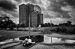
1 - meh you should have waited for sunset the sky is featureless and bland is a good textbook shot
2 - a lesson in film expiry dates and also correct exposures
3 - just meh boring image tone mapped to attempt to make it less boring did not work
4 - best of the group lovely shot colours are a bit soft
5 - awful composition why cut off the bottom of the door frame it just makes people think you have cut the bottom off by accident, Plus to achieve decent results using HDR try burning the window in using photoshop dont just tone map then say its finished.
6 - cant stand the composition has ruined an otherwise awsome image.
Alias
www.nicholas-adams.co.uk |
|
Air
Location: Canada
| | Re: Please Review, mmmkay
<Reply # 24 on 1/27/2007 12:57 AM >
| | | | Posted by argonian
That makes sense. I just like to punish myself by forcing myself to live with the composition as is. That will teach me, I think to myself.
|
I've changed color negs to b&w, and actually made one big print as a square crop. I'm a sucker for the rectangular, but sometimes square is best. I would be nice to have both MF systems. Some day I guess.
"The extraordinary beauty of things that fail." - Heinrich von Kleist |
|
Air
Location: Canada
| | Re: Please Review, mmmkay
<Reply # 25 on 1/27/2007 1:04 AM >
| | | | Posted by Alias
they are all just a bit meh
| 1 - meh you should have waited for sunset the sky is featureless and bland is a good textbook shot |
Ok.
| 2 - a lesson in film expiry dates and also correct exposures |
I hope that's good natured jesting. I experiment with expired films a fair bit.
| 3 - just meh boring image tone mapped to attempt to make it less boring did not work |
Just photomatix'd cause the sky had no contrast, in the first place.
| 4 - best of the group lovely shot colours are a bit soft |
I think the light metering was thrown off. Everything around that building was pitch black.
| 5 - awful composition why cut off the bottom of the door frame it just makes people think you have cut the bottom off by accident, Plus to achieve decent results using HDR try burning the window in using photoshop dont just tone map then say its finished. |
It was intentional actually. There was a bucnh of distracting crap on the floor (paint cans and trash) and the room is tiny anyhow so it doesnt allow for much latitude. That is why I shot it looking up. That, and that door is over 20ft high, so the effect of looking upwards brings across the scale, i think.
| 6 - cant stand the composition has ruined an otherwise awsome image. |
Ok.
|
"The extraordinary beauty of things that fail." - Heinrich von Kleist |
|
cedew


| | Re: Please Review, mmmkay
<Reply # 26 on 1/27/2007 5:17 AM >
| | | | The problem with developing at Walmart is the eight dollar an hour employee behind the counter. The machines are of the same quality you would find at far more expensive places. If you find a decent person behind the counter, you cant go wrong at Walmart.
|
|
Air
Location: Canada
| | Re: Please Review, mmmkay
<Reply # 27 on 1/27/2007 5:11 PM >
| | | | Posted by cedew
The problem with developing at Walmart is the eight dollar an hour employee behind the counter. The machines are of the same quality you would find at far more expensive places. If you find a decent person behind the counter, you cant go wrong at Walmart.
|
The person who develops my prints at shoppers used to work at Toronto Image works, which is a pro-level shop. She was just killing time until her job in asia opened up for her. It made a real difference.
Every messed up roll, or scan I have gotten is from the $8/hr employees running the machine with no real experience or knowledge. I have seen everything from negs on the floor to dirt on them. Two of my b&w negs were also a bit trashed from DC store, where they do it by hand, with what I assumed to be was trained people.
From now on, I will dropping off my stuff at places like TIW and doing the b&w stuff myself.
"The extraordinary beauty of things that fail." - Heinrich von Kleist |
|
Glass

Location: Chicago

as one does
| | | Re: Please Review, mmmkay
<Reply # 28 on 1/27/2007 5:13 PM >
| | | | Or even better, send it out.
|
|
argonian
Location: Toronto, ON
Gender: Female
"Now with added cats!"
| | Re: Please Review, mmmkay
<Reply # 29 on 2/3/2007 5:06 AM >
| | | | I didn’t really want to do this, because I don’t really have anything positive to say and I am under the impression that you will take it as my reaching to find ways to insult you. I am only doing this because I assume I am one of the flamers you want to comment on your pictures.
1. This would have to be the best picture of the bunch, though it is a tad boring and there are two dots on the top right corner that are distracting.
2. There is really nothing that I like about this picture…it is blurry, it is grainy, you almost think that you can make out some detail in the shadows, but you can’t.
3. Caveat: I am not a fan of HDR. Personally, HDR looks cheesy to me and this is no exception. The clouds look fake and everything else looks dull except for the orange that is too vibrant. It just looks like a boring painting to me.
4. This one hurts my eyes. The bright area is way too bright and surrounded by murky darkness. My eye is drawn to the light and then hurt by it. Also, the flares are awful. Oh and also, the picture is grainy and not very sharp.
5. I don’t like the angle. I don’t like the bottom being cut off. Even if the composition was different it would still be a boring subject. Again, I am not a fan of HDR and this hasn’t changed my mind.
6. I don’t like the angle. I don’t like the bottom being cut off.
Honestly, this just seems like a mish mash of your crap. You haven’t even bothered to attempt to present it nicely, they are all different sizes, there are borders on some and not on others, etc. You said that you didn’t want to post your best shots, but I really think you should have.
Que pasa, baby? |
|
|
|
All content and images copyright © 2002-2024 UER.CA and respective creators. Graphical Design by Crossfire.
To contact webmaster, or click to email with problems or other questions about this site:
UER CONTACT
View Terms of Service |
View Privacy Policy |
Server colocation provided by Beanfield
This page was generated for you in 109 milliseconds. Since June 23, 2002, a total of 741358849 pages have been generated.
|
|