 |
|
|
UER Store
|
|
sweet UER decals:

|
|
|
|
Activity
|
|
859 online
Server Time:
2024-05-15 03:09:52
|
|
|
 Zack
 
Location: Burlington, VT
Gender: Male

 | |  | |  | |  | Another Try
< on 4/19/2006 4:33 PM >
|  | | | This is my second set I've posted. The first was met with little praise. These are taken a month or so after that and with my new camera. Three other NEUEU members and I went out scouting last night around some parking lots. I shot these at ISO 800(best my CP995 will do) in black and white.
I think these are a lot better than the ones I posted last, but far from perfect. I'd be glad to hear any constructive criticism.
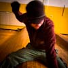
This is probably my favorite.

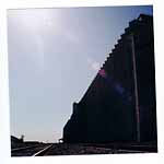
We don't think this is abandoned, but it looks damn close.

Abandoned car.

Some Lovely Stairs(they smell like urine).

And slightly out of focus.

[last edit 4/19/2006 8:27 PM by Zack - edited 1 times]
Great Adventurer and Artist Photographer |
|
kowalski
  
| | Re: Another Try
<Reply # 1 on 4/19/2006 4:46 PM >
| | | | Contrast. Contrast. Contrast. Contrast. Contrast.
|
|
eldubcru
Location: Lake Wales
Gender: Male

EL DUB CRU
| | Re: Another Try
<Reply # 2 on 4/19/2006 4:47 PM >
| | | | Black and white photos are always great to me. They make me use my imagination more to figure out what colors could be there. Very nice. Keep it up.
EL DUB CRU for Life! |
|
Core

Location: MI
Gender: Male

Warning: Some side effects may occur
| | | Re: Another Try
<Reply # 3 on 4/19/2006 4:49 PM >
| | | | I like no1 but you scanned it in crooked. No2 is underexposed but still a great shot. No3 is very nice also, good contrast. The stairs are nice, slightly cliche I think but still workable. The last one, even though slightly out of focus, is very nice. The top and bottom of the wheel are cut off but I think that adds to the picture rather than takes away.
|
|
Zack
Location: Burlington, VT
Gender: Male
| | | | Re: Another Try
<Reply # 4 on 4/19/2006 4:52 PM >
| | | | Yeah I noticed that with #1 after I posted it. It wasn't a scan, these are all digital. I just shot it barely crooked(these are all handheld) so I corrected it but forgot to crop out the sides.
Great Adventurer and Artist Photographer |
|
Glass
   
Location: Chicago
as one does
| | | Re: Another Try
<Reply # 5 on 4/19/2006 9:36 PM >
| | | | The first is the only pic I think that has potential.
It would be much improved if the face was visible instead of a hair tuft.
I like the noise/grain.
-Glass
|
|
T1
Gender: Male

| | | Re: Another Try
<Reply # 6 on 4/21/2006 12:36 AM >
| | | | Posted by Glass
The first is the only pic I think that has potential.
It would be much improved if the face was visible instead of a hair tuft.
I like the noise/grain.
-Glass
|
Easy about the hair. That's me in the photo. As a matter of fact my hair is red.
|
|
Arch-Image
Location: DFW
Gender: Male
"This gene pool could use a little chlorine."
| | | Re: Another Try
<Reply # 7 on 4/23/2006 2:54 PM >
| | | | Comments by shot ....
This is probably my favorite.
I like this shot and agree it's the best of the group. I like the soft contrast in this one, had it been bumped up it wouldnt have worked as well for me. You mentioned you straightened it but I would have worked a bit more at it and got the pipe rail in the front vertical, not sure if you could looking at the wall behind it. Normally I like things out of kilter a littler, it makes people look at the shot closer I think but sometimes straight works better.
We don't think this is abandoned, but it looks damn close.
I like what it looks like you were going for but I think the composition would have been better had you had more of the door if not all in the shot. Also, as Kubla said contrast, need to bring up the whites.
Abandoned car.
This one just didnt do much for me. I will say however this ones contrast is probably the best, whiter whites, blacker blacks.
Some Lovely Stairs(they smell like urine).
It took me a while to decide if I liked this or not, but then again if it took me a while it's a good things because as I mentioned, that means it made me actually set and look and think on it, my point about things being off kilter. there is enough angles and lines in this shot that the main point of focus, the stairs and standpipe in the corner, to me needs to be straightened. I played with shot, and found that made it work better for me, but thats me, shoot for yourself. Again thought, the soft contrast doesnt work, whiter whites, blacker blacks! Learn to use levels, not just the contrast/brightness sliders. Nice shot I thought basically though.
And slightly out of focus.
Not a bad shot as far close in type shots go but again ... contrast, not bad but could use some work
I'll end with this. As for the comment by glass on showing the face, for me that would have totally ruined the shot. To me that would have made it a "look at me" vacation photo. Not a slam to glass, just a reminder to you that we all see things different and like and dislike things differently, it's all basic opinion. Whats the old saying, I dont know what art is but I know what I like! Bottom line I guess watch the composition, work on the levels and contrast and technical stuff but shoot for yourself. I think you have a good eye and look forward to seeing more.
[last edit 4/23/2006 2:59 PM by Arch-Image - edited 2 times]
"Your kid may be an honor student but YOU'RE still an IDIOT!" |
|
|
|
All content and images copyright © 2002-2024 UER.CA and respective creators. Graphical Design by Crossfire.
To contact webmaster, or click to email with problems or other questions about this site:
UER CONTACT
View Terms of Service |
View Privacy Policy |
Server colocation provided by Beanfield
This page was generated for you in 125 milliseconds. Since June 23, 2002, a total of 741775559 pages have been generated.
|
|
