 |
|
|
UER Store
|
|
sweet UER decals:

|
|
|
 ianaf

 | |  | New to UE, critique?
< on 6/15/2013 6:57 PM >
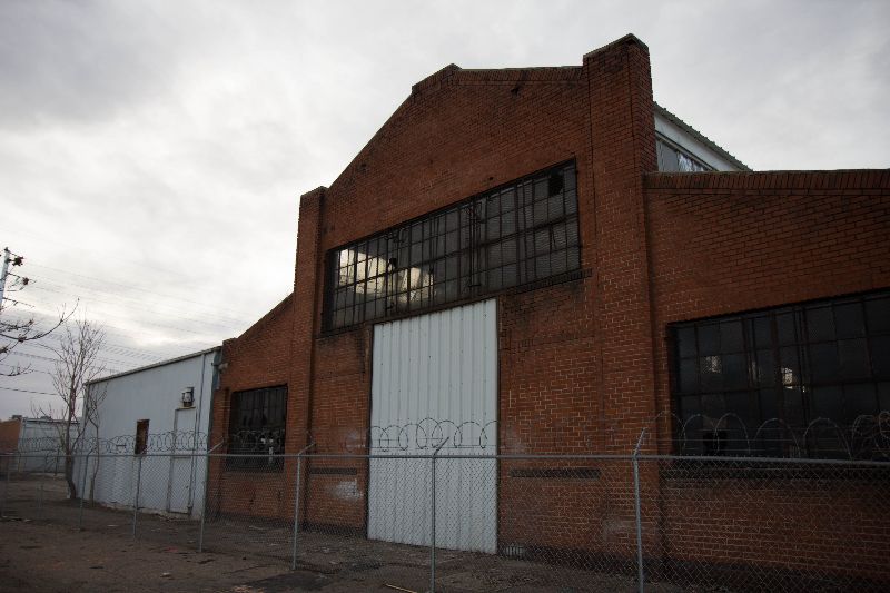
|  | | | I have been into photography for about 3 years, but just recently got into UE. Here are some pics from my first few ventures, let me know what you think.
1.
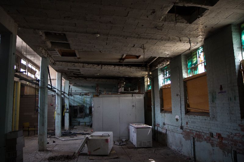
2.
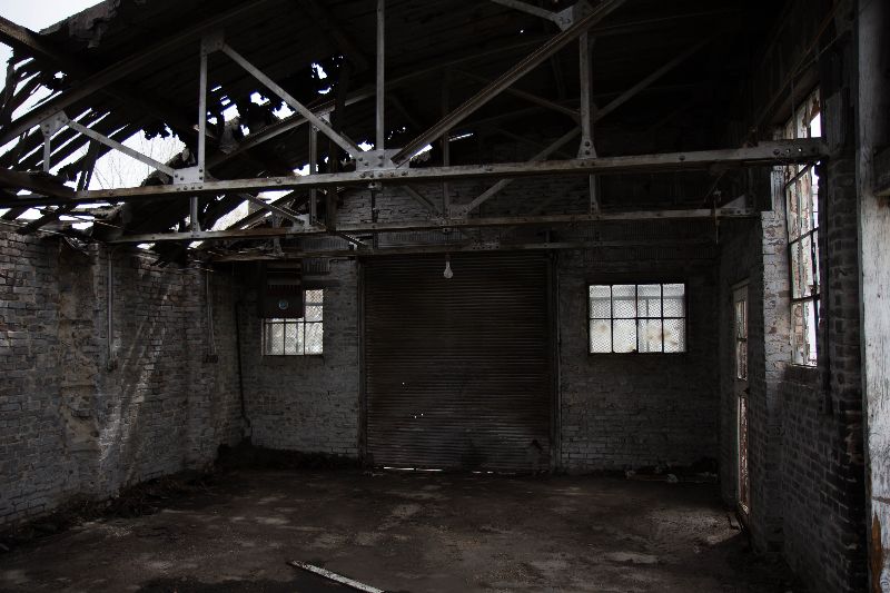
3.
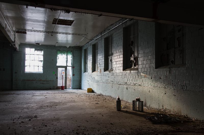
4.
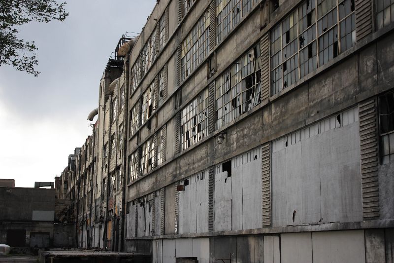
5.
|
|
Fox2
 
| | Re: New to UE, critique?
<Reply # 1 on 7/3/2013 1:00 AM >
| | | | Thanks for sharing.
I felt only number 4 had better composition compared to the rest of the photos. I really liked the dull saturation and colours of that photo. The facade is cool
Number 5 feels rather boring to me and I don't think i would have included it in the set
|
|
theendof93
 
Location: Kings Park, NY
Gender: Female
| |  | Re: New to UE, critique?
<Reply # 2 on 7/19/2013 12:35 AM >
| | | | i definitely like 2, 3, and 4.
TheEndOf93.com
93Photography.com |
|
TenebraeDark
Location: Northeast Arkansas
Gender: Male

| | Re: New to UE, critique?
<Reply # 3 on 7/20/2013 3:24 AM >
| | | | I like 2, 3, and 4 but 1 needs to be tilted down so as to see more of the floor and less of the ceiling. Also 5 is close to being something. I would have experimented with a few more angles of it.
|
|
KingBowser


Soul Coughing!
| | Re: New to UE, critique?
<Reply # 4 on 8/3/2013 3:31 AM >
| | | | Number four was excellent, and number three could have used a minor tweak - maybe in post - or perhaps you could have layered multiple exposures to even out that window.
|
|
mikeandike
| | Re: New to UE, critique?
<Reply # 5 on 8/3/2013 8:37 AM >
| | | | I've been wanting to get into that garage in number 2 with my really camera so bad. I've only had my phone though.

|
|
Steed
     
Location: Edmonton/Seoul
Gender: Male

Your Friendly Neighbourhood Race Traitor
| | | Re: New to UE, critique?
<Reply # 6 on 8/3/2013 12:47 PM >
| | | | I like 1 the most. It could be improved by making the vertical lines parallel.
The biggest problem with 2 and 3 though is just the lack of anything in them.
|
|
nb198

Gender: Male
| | | Re: New to UE, critique?
<Reply # 7 on 10/1/2013 1:48 PM >
| | | |
1. I just want to see it centered and less of the ceiling. I do like it though, despite my criticism. I like it the most out of all of your photos!
I like 1 the most. It could be improved by making the vertical lines parallel.
The biggest problem with 2 and 3 though is just the lack of anything in them |
I agree, however, I do like 2. The room is interesting in my opinion and I find that makes up for the lack of any clear subject. Number 3, I don't really like. It doesn't really have any real subject matter and the environment doesn't seem interesting enough to save it.
I would say in general though, 1-4 are quite good. The last one seems very dull and mundane though.
|
|
urbanxraider
Location: Virginia, USA
Gender: Female
| | | Re: New to UE, critique?
<Reply # 8 on 10/13/2013 2:56 PM >
| | | | 1. Beautiful room with lots of potential, but you didn't do anything with it. Don't just point your camera at something you like amd shoot it — play with it, try different angles, focus on different things you find interesting (like the windows at the top of the right-hand wall...you could have done something brilliant with them). Try to plan out your shots and make them INTERESTING, ya know?
2. Either center it or go for a "playful" angle. I feel like you were unsure about which you were going for in this shot. It definitely distracted me. If, however, you had stuck with one (straight-on or obscure), then it would have been a nice shot.
3. Good, but it's lacking something. I see where you were going with it but the angle just seems a bit odd to me. If you had rotated it a bit (maybe downwards?), then I would have liked it better. Cool shot though.
4. Definitely the strongest in this particular set. I like how you chose a softer, less-saturated look for it, and how you captured the exterior decay in a wider shot. The angle gives it a nice depth as well. Good shot. (:
5. Nothing special about it. Like 1, I feel like you just pointed your camera and took a picture. No composition. I'd maybe have focused on a feature you really liked about that part of the building and went from there.
~Third wheels hold tricycles together~ |
|
tofutiger
Location: College Station, TX
Gender: Male
The pelagic argosy sights land
| | Re: New to UE, critique?
<Reply # 9 on 10/26/2013 4:56 PM >
| | | | I agree with Steed, there is little to catch out attention in your photographs. When I look at photographs with really good composition and with interesting subjects, I feel like the photograph plays pinball with my eyes, I jump from place to place, starting from the part that most catches my attention, to the next.
So, like, if you had a (bad example) chair in some of these, there would be something to catch your attention first, then maybe we'd move our eyes to, I don't know, an interesting pattern on the wall. Here it's empty. I scrolled through these really quick because nothing caught my attention.
"And it was, though more unutterable, like the crumbling away of two little heaps of finest sand, or dust, or ashes, of unequal size, but diminishing together as it were in ratio, if that means anything, and leaving behind them, each in its own stead, the blessedness of absence." |
|
tofutiger
Location: College Station, TX
Gender: Male
The pelagic argosy sights land
| | Re: New to UE, critique?
<Reply # 10 on 10/26/2013 4:57 PM >
| | | | I agree with Steed, there is little to catch out attention in your photographs. When I look at photographs with really good composition and with interesting subjects, I feel like the photograph plays pinball with my eyes, I jump from place to place, starting from the part that most catches my attention, to the next.
So, like, if you had a (bad example) chair in some of these, there would be something to catch your attention first, then maybe we'd move our eyes to, I don't know, an interesting pattern on the wall. Here it's empty. I scrolled through these really quick because nothing caught my attention.
"And it was, though more unutterable, like the crumbling away of two little heaps of finest sand, or dust, or ashes, of unequal size, but diminishing together as it were in ratio, if that means anything, and leaving behind them, each in its own stead, the blessedness of absence." |
|
Flareodactyl
Location: Vancouver, Canada
Gender: Male
| | Re: New to UE, critique?
<Reply # 11 on 11/6/2013 4:01 AM >
| | | | 4 is definitely my favourite. I love the dimensions in it as I feel like it goes on forever.
Edit: It's also interesting to see MikeandIke's photo of the garage in number 2. The photos came out completely different just due to the fact that there are slight changes in lighting and angles.
[last edit 11/6/2013 4:03 AM by Flareodactyl - edited 1 times]
http://www.youtube...atch?v=nM_u22RKLcY My Lower Mainland Cliff Jumping Video |
|
ISLAND

Location: Canada
Gender: Male
| | Re: New to UE, critique?
<Reply # 12 on 1/21/2014 3:16 AM >
| | | | I think the angle on the first shot feels a bit weird. Your other ones are at like a 3/4 angle, but the first one is SO close to being straight on 1-perspective, which bothers me. Nice pictures overall though, just some constructive criticism!
|
|
|
|
All content and images copyright © 2002-2024 UER.CA and respective creators. Graphical Design by Crossfire.
To contact webmaster, or click to email with problems or other questions about this site:
UER CONTACT
View Terms of Service |
View Privacy Policy |
Server colocation provided by Beanfield
This page was generated for you in 156 milliseconds. Since June 23, 2002, a total of 739280868 pages have been generated.
|
|
