 |
|
|
UER Store
|
|
sweet UER decals:

|
|
|
|
Activity
|
|
856 online
Server Time:
2024-05-15 03:12:36
|
|
|
 IIVQ
       
Location: La Sud-Est du cité majeur du North-Holland (Bijlmer), .NL
Gender: Male
Back in Urbex!
 | |  | |  | |  | |  | Edits
< on 4/17/2011 11:59 AM >
|  | | | Hi. Let me start off: I am not a fan of editing photos. This has two reasons:
1. I don't get much satisfaction out of the editing (like I do out of pano editing)
2. The end result is usually not the work.
Next to that, I adhere a bit to the philosophy that you should get your images right on the camera itself.
However, sometimes I look at pictures and I think ... if this piece had a little more contrast ... and that were a bit more ... and I find myself donning my GIMP suit.
I was wondering. Which of these photos do you like better?
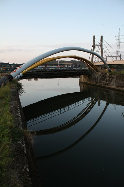
Sky/Tubes/Bridge/Water - unedited (the Original)
or
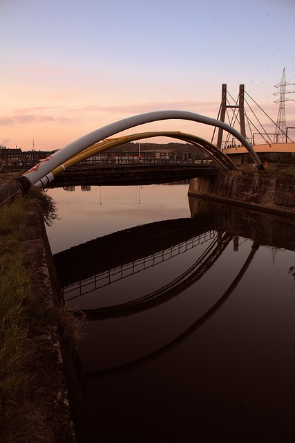
Sky/Tubes/Bridge/Water - edited Edited?
And, what could I have done to better edit it?
I played a little with the curves, and made the highlights a little bit less cyan and the shadows a little less magenta (i.e. more green)
Tijmen
Posted by MapMan | 18/9/2005 19:25 | Hedy Lamarr made porn?
Posted by turbozutek | 20/9/2005 2:29 | Dude, educate us! |
|
swizzler

Location: Ontario
Gender: Male
| | Re: Edits
<Reply # 1 on 4/17/2011 12:18 PM >
| | | | Definitely the second one!
Canon EOS 5DMKII | EF 24-105 f/4L | EF 17-40 f/4L | EF 50mm f/1.8 II | Yashica Electro 35 GS |
|
20SeVeN

Location: The Island called Rhode...
Gender: Male
| | Re: Edits
<Reply # 2 on 4/17/2011 4:28 PM >
| | | | Posted by swizzler
Definitely the second one!
|
I agree, the sky looks much more spectacular. I would've possibly sharpened it slightly (maybe?), but I'm not a photographer...
|
|
IIVQ
Location: La Sud-Est du cité majeur du North-Holland (Bijlmer), .NL
Gender: Male
Back in Urbex!
| | | | | Re: Edits
<Reply # 3 on 4/17/2011 9:25 PM >
| | | | Posted by 20SeVeN
I agree, the sky looks much more spectacular. I would've possibly sharpened it slightly (maybe?), but I'm not a photographer...
|
I've tried sharpening, the original already has some abberation and sharpening really worsens that... besides, I shoot in JPEG, so it also increases artifacts.
Posted by MapMan | 18/9/2005 19:25 | Hedy Lamarr made porn?
Posted by turbozutek | 20/9/2005 2:29 | Dude, educate us! |
|
swizzler
Location: Ontario
Gender: Male
| | Re: Edits
<Reply # 4 on 4/17/2011 11:59 PM >
| | | | Posted by IIVQ
I've tried sharpening, the original already has some abberation and sharpening really worsens that... besides, I shoot in JPEG, so it also increases artifacts.
|
If you have Lightroom you can correct CA even if the file is .jpg. Have you tried unsharp mask as opposed to regular overall sharpening?
Canon EOS 5DMKII | EF 24-105 f/4L | EF 17-40 f/4L | EF 50mm f/1.8 II | Yashica Electro 35 GS |
|
metawaffle
  
King of Puns
Location: Brisbane!
Gender: Male

Purveyor of Fine Lampshades
| | | Re: Edits
<Reply # 5 on 4/18/2011 12:02 AM >
| | | | The water looks better in the first. Also, I'd adjust the contrast up a bit, I think.
http://www.longexposure.net |
|
IIVQ
Location: La Sud-Est du cité majeur du North-Holland (Bijlmer), .NL
Gender: Male
Back in Urbex!
| | | | | Re: Edits
<Reply # 6 on 4/18/2011 7:27 AM >
| | | | Posted by swizzler
If you have Lightroom you can correct CA even if the file is .jpg. Have you tried unsharp mask as opposed to regular overall sharpening?
|
What is CA?
I use The GIMP - I'm on Linux. What I did was indeed unsharp mask, but I find that it gives the image a (very mild case of) clown puke - the effect seen on overdone HDRs where the pixels hurt your eyes - but without the good effects of it. I'm not a fan of sharpening.
Posted by metawaffle
The water looks better in the first. Also, I'd adjust the contrast up a bit, I think.
|
Thx. Problem with upping the contrast is that already with a few steps (+3 or so) the black reflections start blending in with the black water, thereby removing the reflection aspect of it. The colours only start to visually benefit at contrast +8 or so. (on a scale of -100 - +100)
Thx.
So far it's 3-3 for both images, and I'm still not convinced which I like more 
Posted by MapMan | 18/9/2005 19:25 | Hedy Lamarr made porn?
Posted by turbozutek | 20/9/2005 2:29 | Dude, educate us! |
|
Vic
Location: Toronto
Gender: Male

| | Re: Edits
<Reply # 7 on 4/18/2011 7:12 PM >
| | | | Posted by IIVQ
I use The GIMP - I'm on Linux. What I did was indeed unsharp mask, but I find that it gives the image a (very mild case of) clown puke - the effect seen on overdone HDRs where the pixels hurt your eyes - but without the good effects of it. I'm not a fan of sharpening.
|
I find that the defaults for unsharp mask in The Gimp overdo it, as you mentioned. Just try turning it down a little, and fiddling with the settings.
|
|
Valkyre

Location: Niflheim
Gender: Male
Its not the end of the world, but you can see it from here.
| | | Re: Edits
<Reply # 8 on 4/19/2011 12:01 PM >
| | | | Yeap. Second one for sure. It's not completely about what the original photo is and the post-processing output. It's just how you're satisfied with it. Everyone's got their different type of processing. But yeah, second one owns!
Once things get political, they want us to stop shooting and start dancing.
I don't dance. |
|
atomx
Location: Brighton, ON
Gender: Male

| | | Re: Edits
<Reply # 9 on 4/19/2011 12:19 PM >
| | | | Just a quick tip on un-sharp mask.
Best done in Photo Shop, but might be able in Gimp.
Two layers.
Bottom layer, original (edited to your liking)
2nd Layer copied and above - un-sharp mask - with a blend of pin light and less opacity
You won't get the clown puke look.
"Programming today is a race between software engineers striving to build bigger and better idiot-proof programs, and the Universe trying to produce bigger and better idiots. So far, the Universe is winning." - Richard Cook |
|
Buffalonian
Location: Buffalo, NY

| | Re: Edits
<Reply # 10 on 4/19/2011 12:32 PM >
| | | | Posted by swizzler
If you have Lightroom you can correct CA even if the file is .jpg. Have you tried unsharp mask as opposed to regular overall sharpening?
|
Yup. LR is really great at sharpen, but also maintaining sane CA. Additionally, I might add using a polarizer to soften the sky a bit. I think it's a bit rough on a spectacularly composed photo. You have the makings for a good photo here with just a little post-work. I mean nothing replaces on-front work to reduce post, but well that's always the struggle of growing as a photographer.
Love the comp, though. Very nice.
I cream, you cream, we all cream for .. white spooge. |
|
Eschaton
Location: Western NC
Gender: Male
Entry: Eschaton (es-kuh-tawn) noun | end of time, climax of history | Etymology: Greek for 'last'
| | | Re: Edits
<Reply # 11 on 4/19/2011 6:48 PM >
| | | | I'm going to have to vote for the first one here, for a few reasons.
1. The sky in the second definitely looks better. You can see the clouds more, and there is a more interesting color variation for the eye to follow. The problem is, it makes all the dots (birds?) in the upper right corner much more noticeable, and they're very distracting to me. Those should be cloned out.
2. I'm digging the warm sunset/twilight feel of the tone change. However, I just can't shake the feeling that it's unnatural, which may just be a bias because I know it's true.
3. The tone in the edit also muddles the background and the foreground. Look in the very center at the bridge railing against the buildings. The tone juxtaposition in the first one was doing a good job of telling my eye what's in the background and in the front, but in the edit my eye is a little more confused. Many might dismiss this, but the little touches like that really make a photo for me.
The same goes for the reflection in the water, which I feel is the most interesting part of the photo. The tone sacrifices some of the crispness in the bridge's reflection that in the end make it feel like a less important part of the shot.
tl;dr- While the changes in the edit make the shot feel warmer and more inviting, it loses the finer touches that the original has.
At least you know you have an interesting and enjoyable shot
[last edit 4/19/2011 6:49 PM by Eschaton - edited 1 times]
Ars Gratia Adventuris |
|
sandy frank
Location: Indiana-ish
Gender: Male
Why doesn't Johnny care...?
| | Re: Edits
<Reply # 12 on 4/19/2011 7:00 PM >
| | | | I seem to be drawn more toward the second one. It's warm, and I tend to like it that way.
Since you're on linux, have you tried digiKam? It's pretty well polished, nice controls, reads RAW, nice catalog setup. (I generally have a virtualbox running XP with PS and Lightroom, but for basic viewing and sorting linux-side, digiKam is impressive).
I've no sense, I lick electric fence; I put barbed wire in my pants and do a Celtic dance.
- My Canon 300D is beat to hell, a bit finicky, and a 'lil loose, much like everything else I own...
http://www.youtube...atch?v=IvN10-n1NBc |
|
IIVQ
Location: La Sud-Est du cité majeur du North-Holland (Bijlmer), .NL
Gender: Male
Back in Urbex!
| | | | | Re: Edits
<Reply # 13 on 4/20/2011 10:13 AM >
| | | | Posted by Buffalonian
Yup. LR is really great at sharpen, but also maintaining sane CA.
|
What is CA?
Posted by sandy frank
I seem to be drawn more toward the second one. It's warm, and I tend to like it that way.
Since you're on linux, have you tried digiKam? It's pretty well polished, nice controls, reads RAW, nice catalog setup. (I generally have a virtualbox running XP with PS and Lightroom, but for basic viewing and sorting linux-side, digiKam is impressive).
|
I do have this photo in Digicam, but I've never used it for editing photos. I always use GIMP for that. And I don't shoot in RAW.
Posted by MapMan | 18/9/2005 19:25 | Hedy Lamarr made porn?
Posted by turbozutek | 20/9/2005 2:29 | Dude, educate us! |
|
IIVQ
Location: La Sud-Est du cité majeur du North-Holland (Bijlmer), .NL
Gender: Male
Back in Urbex!
| | | | | Re: Edits
<Reply # 14 on 4/20/2011 10:26 AM >
| | | | Posted by Eschaton
I'm going to have to vote for the first one here, for a few reasons.
1. The sky in the second definitely looks better. You can see the clouds more, and there is a more interesting color variation for the eye to follow. The problem is, it makes all the dots (birds?) in the upper right corner much more noticeable, and they're very distracting to me. Those should be cloned out.
2. I'm digging the warm sunset/twilight feel of the tone change. However, I just can't shake the feeling that it's unnatural, which may just be a bias because I know it's true.
3. The tone in the edit also muddles the background and the foreground. Look in the very center at the bridge railing against the buildings. The tone juxtaposition in the first one was doing a good job of telling my eye what's in the background and in the front, but in the edit my eye is a little more confused. Many might dismiss this, but the little touches like that really make a photo for me.
The same goes for the reflection in the water, which I feel is the most interesting part of the photo. The tone sacrifices some of the crispness in the bridge's reflection that in the end make it feel like a less important part of the shot.
tl;dr- While the changes in the edit make the shot feel warmer and more inviting, it loses the finer touches that the original has.
At least you know you have an interesting and enjoyable shot
|
Wow, thank you! Those comments really help in improving my technique, and also help me realize that as I'm going to choose one of those as a poster, I have to hang it somewhere in my room and have to think about where I'm going to hang it before actually choosing one - as one wall of my room is yellow and the other is light Purple/Blue. I think the warm one might go really well on the purple wall and the blueish one on the yellow wall for contrast.
 
A friend of mine suggested only making the sky red (by use of a gradient mask) but you can't have a red sky with blue water reflection (I have a great bridge calendar where all photos have bridges with no train on them and a reflection in the water of the bridge with a train on it). But the colour or the underside of the bridge is really an awful brown that it couldn't have and indeed it's losing details.
Also, I will never clone the birds out - Even though they're blurry patches, so be it. I will not become either a commie who edits out unwanted objects or a yankee who just erases everything that does not contribute to perfection!
I still don't know what to do but I *do* have more things to think about! Again, thx!
Tijmen
Posted by MapMan | 18/9/2005 19:25 | Hedy Lamarr made porn?
Posted by turbozutek | 20/9/2005 2:29 | Dude, educate us! |
|
Buffalonian
Location: Buffalo, NY
| | Re: Edits
<Reply # 15 on 4/20/2011 11:43 AM >
| | | | Posted by IIVQ
What is CA?
|
Cow Ass
no, seriously .. chromatic aberration ... color/focus shifts, basically ..
http://en.wikipedi...romatic_aberration
I cream, you cream, we all cream for .. white spooge. |
|
Lichtbringer
Location: Köln
Gender: Male

I liked popular culture before it became popular.
| | | Re: Edits
<Reply # 16 on 4/21/2011 11:46 PM >
| | | | Posted by IIVQ
I use The GIMP - I'm on Linux. What I did was indeed unsharp mask, but I find that it gives the image a (very mild case of) clown puke - the effect seen on overdone HDRs where the pixels hurt your eyes - but without the good effects of it. I'm not a fan of sharpening. |
Try Wavelet Sharpen: http://registry.gimp.org/node/9836
DistrictNoir.com | flickr | Facebook | twitter |
|
|
|
All content and images copyright © 2002-2024 UER.CA and respective creators. Graphical Design by Crossfire.
To contact webmaster, or click to email with problems or other questions about this site:
UER CONTACT
View Terms of Service |
View Privacy Policy |
Server colocation provided by Beanfield
This page was generated for you in 171 milliseconds. Since June 23, 2002, a total of 741775844 pages have been generated.
|
|
