
|
dreckenschill
 
location:
Troy
Gender: Male

 | |  | |  | |  | let me know what you think
< on 12/5/2009 5:43 AM >
|  | | | So these are the first photos I am putting up for critique hope it goes well haha.1.
2.

3.

4.
5.
|
|
Felonious Monk
 
location:
Between Bridgeport and Branford
Gender: Male

This text is personal.
| | | | Re: let me know what you think
<Reply # 1 on 12/5/2009 3:12 PM >
| | | | 1 is my favorite
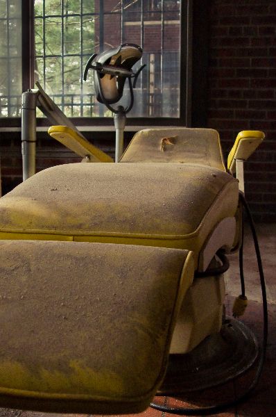
2 I'm not a huge fan of the composition on. The angled lines of the window, i feel, throw off the composition but the exposure seems good.
3 is pretty well composed and exposed.
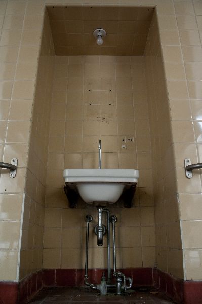
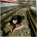
4. I feel the sink shot suffers from the extreme angle it's at. to me, the lines are the interesting part here and I think they get thrown out by shooting at an angle that's so close to the floor.
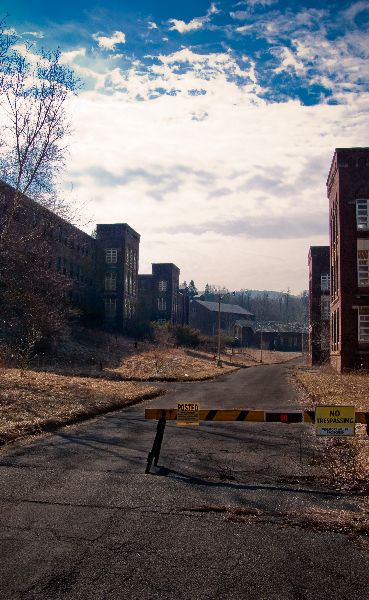
5 is nice. The leading lines carry the eye down to the vanishing point in the photo. The sky has some nice detail and color as well. ( i was just poking around there the other day, actually.)
Are you compressing these for the web or using "save for web"? Something's murdering your image quality. Either that or it's a mix of compression and a little over-sharpening.
"i've been trying for almost a year to get Colfax to one of my events to give it some credibility" - bfinan0
|
|
JackAttack

location:
Brantingham, NY
Gender: Male
| | Re: let me know what you think
<Reply # 2 on 12/5/2009 3:18 PM >
| | | | You posted the chair! You dick..
|
|
Switch_

location:
Orlando, Florida
Gender: Male

| |  | | | | | Re: let me know what you think
<Reply # 3 on 12/5/2009 5:41 PM >
| | | | 2 and 4 suffer from some strong perspective distortion.
|
|
JackAttack
location:
Brantingham, NY
Gender: Male
| | Re: let me know what you think
<Reply # 4 on 12/5/2009 5:57 PM >
| | | | | 2 and 4 suffer from some strong perspective distortion. |
I think it offers a view that most of us don't see often. The "ants eye view", to me, offers something unique in Dreckenschill's photo's. It's interesting to see things that we're used to seeing from a straight on POV, in this fashion.
Shoot on, Dreckenschill.
|
|
dreckenschill
location:
Troy
Gender: Male
| | | | Re: let me know what you think
<Reply # 5 on 12/5/2009 10:11 PM >
| | | | Posted by Felonious Monk
Are you compressing these for the web or using "save for web"? Something's murdering your image quality. Either that or it's a mix of compression and a little over-sharpening.
|
I don't compress them when I export them from lightroom but I was lazy and just used the uploader on UER so that is most likely the cause of it.
|
|
dreckenschill
location:
Troy
Gender: Male
| | | | Re: let me know what you think
<Reply # 6 on 12/5/2009 10:15 PM >
| | | | Posted by Switch_
2 and 4 suffer from some strong perspective distortion.
|
The perspective distortion as you see it is to me a more dramatic angle that you don't tend to see in UE photography. Everything tends to be lets just set up my tripod chest height and take pictures with little thought going into being unique, it's not like I am taking a picture of a hallways and just rotating it 40 degrees.
|
|
Felonious Monk
location:
Between Bridgeport and Branford
Gender: Male
This text is personal.
| | | | Re: let me know what you think
<Reply # 7 on 12/5/2009 11:07 PM >
| | | | Hope you don't think i'm trying to be a dick or anything just merely stating my take on the set since it's the critiques forum and all.
"i've been trying for almost a year to get Colfax to one of my events to give it some credibility" - bfinan0
|
|
Protios
location:
Lower Sackville, Nova Scotia
Gender: Male
To get where you're going, Remember where you've been
| | Re: let me know what you think
<Reply # 8 on 12/5/2009 11:20 PM >
| | | | Posted by dreckenschill
The perspective distortion as you see it is to me a more dramatic angle that you don't tend to see in UE photography. Everything tends to be lets just set up my tripod chest height and take pictures with little thought going into being unique, it's not like I am taking a picture of a hallways and just rotating it 40 degrees.
|
I'm a big fan of waist height as well. Good set before the aforementioned quality problem. Although the record picture seems extremely noisy even compared to the upload quality of the rest of them. I think it might have been nice to get that G in there for "Great Songs of Christmas."
To get where you're going
Remember where you've been |
|
dreckenschill
location:
Troy
Gender: Male
| | | | Re: let me know what you think
<Reply # 9 on 12/5/2009 11:37 PM >
| | | | Posted by Felonious Monk
Hope you don't think i'm trying to be a dick or anything just merely stating my take on the set since it's the critiques forum and all.
|
No not at all and I appreciate your opinion, we all have our own styles. I was just looking to see what others thought and I was glad that you took the time to really tell me.
|
|
dreckenschill
location:
Troy
Gender: Male
| | | | Re: let me know what you think
<Reply # 10 on 12/5/2009 11:41 PM >
| | | | Posted by Protios
I'm a big fan of waist height as well. Good set before the aforementioned quality problem. Although the record picture seems extremely noisy even compared to the upload quality of the rest of them. I think it might have been nice to get that G in there for "Great Songs of Christmas."
|
Yeah i noticed the extra noise on that one too. I seem to have the worst luck with uploading pictures, the quality is always murdered.
|
|
Protios
location:
Lower Sackville, Nova Scotia
Gender: Male
To get where you're going, Remember where you've been
| | Re: let me know what you think
<Reply # 11 on 12/9/2009 12:35 AM >
| | | | Posted by dreckenschill
Yeah i noticed the extra noise on that one too. I seem to have the worst luck with uploading pictures, the quality is always murdered.
|
think about getting a photobucket account, or a Flickr or, (insert favourite photo host) account and then link the photos that way. The quality will be much higher.
To get where you're going
Remember where you've been |
|
don_corleyone
 
location:
F/RoX
Gender: Male

I have abandonment issues
| | Re: let me know what you think
<Reply # 12 on 12/9/2009 12:40 AM >
| | | | you cut off the edges of your subject in the first three shots.
leave the gun. take the cannoli.
|
|
dreckenschill
location:
Troy
Gender: Male
| | | | Re: let me know what you think
<Reply # 13 on 12/9/2009 3:41 AM >
| | | | Posted by don_corleyone
you cut off the edges of your subject in the first three shots.
|
what did I cut off in 1 and 2? I know the g is cut off in 3 but thats just how it worked out, I don't think it really takes away form the image though.
|
|
gutterbabies
 
location:
Iowa
"Who takes a lawn chair urban exploring?"
| | | Re: let me know what you think
<Reply # 14 on 12/9/2009 9:18 PM >
| | | | I really enjoyed the concept of the set, and the composition is very good.
For number 4, I would recommend trying a different angle, because the way the lines of the wall around the sink are positioned, it draws the eye away from the sink. Also, I think number 2 could use some cropping in order to focus in on one thing, instead of having so many things going on. Or, I would recommend blurring the background.
|
|
dsankt

location:
live and in the fresh
| | | | Re: let me know what you think
<Reply # 15 on 12/9/2009 9:20 PM >
| | | | Sloppy comp and boring subjects.
sleepycity.net: watch out for the third rail baby, that shit is high voltage. urbex and urban exploration photography |
|
dreckenschill
location:
Troy
Gender: Male
| | | | Re: let me know what you think
<Reply # 16 on 12/9/2009 11:02 PM >
| | | | Posted by dsankt
Sloppy comp and boring subjects.
|
would you like some fireworks to liven them up??
|
|
Pommangee
location:
Ontario
Gender: Female

| | Re: let me know what you think
<Reply # 17 on 12/11/2009 12:23 AM >
| | | | I am definitely no expert, but I think with either a much higher or much lower Fstop, the first photo would be better. With a wider aperture, you could go for some selective focus, or with a narrower aperture you could get a fuller depth of field and a great crisper focus. The way it is now, it's kinda-sorta in between.
Keep experimenting!
|
|
dreckenschill
location:
Troy
Gender: Male
| | | | Re: let me know what you think
<Reply # 18 on 12/12/2009 7:07 AM >
| | | | Posted by emilyONION
I really enjoyed the concept of the set, and the composition is very good.
For number 4, I would recommend trying a different angle, because the way the lines of the wall around the sink are positioned, it draws the eye away from the sink. Also, I think number 2 could use some cropping in order to focus in on one thing, instead of having so many things going on. Or, I would recommend blurring the background.
|
Not to be a dick but are you one who is really in a position to critique? A critique should come from an educated mind and eye which from what tell photography wise you don't possess.
|
|
ifightghosts
This member has been banned. See the banlist for more information.
Gender: Male
| | Re: let me know what you think
<Reply # 19 on 12/13/2009 1:46 AM >
| | | | Posted by dreckenschill
Not to be a dick but are you one who is really in a position to critique? A critique should come from an educated mind and eye which from what tell photography wise you don't possess.
|
not to be a dick but who the fuck are you?
judging by the quality of your work, your in no position to decide what critique is valuable or not. with the exception of your fifth shot, they are all fairly poor photographs. they are all either boring, sloppily composed, or both.
1.
i mean really? its an awkward point of view of a boring dentist chair. your eye is drawn up the chair to the also boring lamp, and then out the window. the lighting is boring, there is no emotion or atmosphere to the shot. it's straight up boring.
2.
this shot had potential. too bad you shot it so your lines are all crooked, everything is in focus, and it looks like your shot from below your kneecap. stop being lazy and raise your tripod. try shooting at eye level before you start working with awkward angles. lucky for you, the exposure is alright, but im sure you dont know how you got so lucky.
3.
wow, this picture gets me a soft chub. old vinyl. woo.
honestly, if you hadnt cut the g off and had tried to incorporate some depth of field to focus the eye, you'd have a boring shot i'd expect from a high school photo student taking picture in their grandparents house. the grain makes me nauseous. every heard of low iso? try noise ninja or the noise reduction software by NIK.
4.
are you seriously posting this? it's about as boring as watching grass grow. the least you could have done was keep your lines straight. im surprised your common sense didnt kick in and tell you this shot is putrid. the colors blow, the the kneecap height perspective makes my neck hurt, and in case you didnt get the memo, generic "run of the mill" institutional sinks are fucking boring.
5.
its a good shot. the over sharpening and overtly blue sky are a little hard on the eyes though.
now you've got a real critique.
hello motherfucker hey high how ya durnnn? |
|
Powered by AvBoard AvBoard version 1.5 alpha
Page Generated In: 109 ms
|
|


