|
|
|
UER Store
|
|
sweet UER decals:

|
|
|
|
Activity
|
|
914 online
Server Time:
2024-05-04 15:09:31
|
|
|
 micro
    
Gender: Male
Slowly I turned
 | |  | Re: UER Redesign Contest
<Reply # 200 on 2/20/2008 1:18 AM >
|  | | | Here's my design. I'll admit, it's pretty different and it might not be to everyone's liking, but have a look:
Seriously.. is it too much to ask to just have this site look like other message boards out there? The current design already looks bad enough. Let's not make it even worse. All I want is a design that doesn't look like the console for a Star Trek BBS game, that isn't embarrassing to have up on my screen while at work, and that doesn't make my eyes bleed. Just pick the style of a regular old message board (the kind that millions of other sites out there use) and let's get this thing going. I mean, honestly.. this thread is almost two years old now.
|
|
Avatar-X
    
Alpha Husky
Location: West Coast
Gender: Male

yay!
| |  | Re: UER Redesign Contest
<Reply # 201 on 2/21/2008 1:58 PM >
| | | | I personally find UER much easier to read and track than the ugly style of most message boards out there, including your example.
I programmed my own message board system from scratch because I hated phpBB/yAbb/vbulletin/etc, and found that they did not provide the feature set I was looking for. As such, UER has many unique features that you just don't find in those other softwares. I'm certainly not going to try and duplicate them now.
-av
huskies - such fluff. |
|
secretdestroyers
 
Location: Baltimore
Gender: Male
| | | Re: UER Redesign Contest
<Reply # 202 on 2/21/2008 9:10 PM >
| | | | Posted by Avatar-X
Well, to be perfectly honest, I haven't really seen a design that really makes me go "Wow!" yet, and I also have had absolutely no spare time to work on UER at all these days. I got a new job and they're sure keeping me busy.
-av
|
it's not a contest if no one wins!

F this I"m going exploring! |
|
don cornelius

This member has been banned. See the banlist for more information.
Location: Your asshole.

Proud Parent
| | | Re: UER Redesign Contest
<Reply # 203 on 2/21/2008 9:14 PM >
| | | | whats the point of a redesign of the current site? if it aint broke dont fix it. I think the existing one is simple and easy to use.
40+ year olds with Myspace pages are not cool, they are pediphiles on the prowl. Buyer beware. |
|
Emperor Wang

Location: On an island, in a river
Fetish? What fetish?
| | Re: UER Redesign Contest
<Reply # 204 on 2/22/2008 12:56 AM >
| | | | The feature set is awesome, and I like the page layout just the way it is, but the graphical elements could stand an overhaul. Some new buttons, icons and a fresh colour scheme would spiff the place up. The current ones are getting old.
It's great to be alive! |
|
Explorer H

Obla-di-obla-doberator
Location: Around the corner from the Turkey Hill
Gender: Male

I just want some slack.
| | | Re: UER Redesign Contest
<Reply # 205 on 2/22/2008 3:07 AM >
| | | | Posted by micro
All I want is a design that doesn't look like the console for a Star Trek BBS game, that isn't embarrassing to have up on my screen while at work, and that doesn't make my eyes bleed.
|
I chuckled at your BB screen shot, because it's so cookie-cutter. If you want a more "visually friendly" layout, there's always premium membership.
http://doublehmedia.com http://hartmancommercialphoto.com |
|
fedge
Location: Gaud Corners, Ontario, Canada
Gender: Male

you blight up my life™®
| | | Re: UER Redesign Contest
<Reply # 206 on 2/24/2008 3:40 AM >
| | | | It would be nice to have the occasional elf fly across the screen and make elf noises at random.
18-odd Years Of UER-ing! |
|
Jake Noodles
Location: Tantallon, Nova Scotia
Gender: Male

The Unluckiest Page
| | Re: UER Redesign Contest
<Reply # 207 on 2/24/2008 2:11 PM >
| | | | I must say, all of my favourite designs in this contest have originated from Explorer_H!

Rural Explorer |
|
Sand
Location: Pac South
Everything interesting is always behind a fence.
| | Re: UER Redesign Contest
<Reply # 208 on 3/25/2008 7:32 PM >
| | | | Posted by Avatar-X
I personally find UER much easier to read and track than the ugly style of most message boards out there, including your example.
I programmed my own message board system from scratch because I hated phpBB/yAbb/vbulletin/etc, and found that they did not provide the feature set I was looking for. As such, UER has many unique features that you just don't find in those other softwares. I'm certainly not going to try and duplicate them now.
-av
|
I agree. I find the regular message boards unorganized, clunky, and just play icky to look at. If I want to look "normal" I will just go with the corporate thing. Personally, UER looks so....I dunno...it looks good. I hope that even if there is a redesign, contributors will still be able to see the site in the current format. I love it.
L
|
|
Sand
Location: Pac South
Everything interesting is always behind a fence.
| | Re: UER Redesign Contest
<Reply # 209 on 3/25/2008 7:34 PM >
| | | | Posted by Emperor Wang
The feature set is awesome, and I like the page layout just the way it is, but the graphical elements could stand an overhaul. Some new buttons, icons and a fresh colour scheme would spiff the place up. The current ones are getting old.
|
The one thing that would be good on the current one is having a link up at the top or perhaps another URL for internet browsing on PDA's. I think there is an option for turning off the maps, but I would rather have a separate URL or something for a PDA version. It's hard to get to California using a palm pilot because of the way the images tile. I have to find a tiny corner and click. But all you with your new Iphones LOL prolly have no issues...just me and my old TX that are getting that problem. Time to upgrade (not! never!!!)
L
|
|
Sand
Location: Pac South
Everything interesting is always behind a fence.
| | Re: UER Redesign Contest
<Reply # 210 on 3/25/2008 7:39 PM >
| | | | Posted by EvilNick
What about a redesign of how the photos are displayed in the LDB? A layout similar to http://evilnick.sm...om/gallery/1813942 i think would be a bit better. You could even use dhtml to pre load the images to make for faster browsing
|
You know what I would love? In "My LDB" I would love for it to have two groups: places's I've been - and places I plan to visit. Maybe one more for just whatever you want to call it (places I want to keep an eye on). It would be much more functional for me that way.
L
|
|
Sand
Location: Pac South
Everything interesting is always behind a fence.
| | Re: UER Redesign Contest
<Reply # 211 on 3/25/2008 7:42 PM >
| | | | Posted by Avatar-X
This is exactly their purpose. They are supposed to be in-your-face and distracting. If the "New message" banner was nondescript and hidden off to the side, people would easily miss the fact that they have new messages. The banner only stays as long as a new message exists.
-av
|
Hmm....I guess a solution for people who get too many PM's and want to turn it off...would be a "turn off PM notification" which I think is already an option? Maybe not. But who really gets that many PM's?
L
|
|
Sand
Location: Pac South
Everything interesting is always behind a fence.
| | Re: UER Redesign Contest
<Reply # 212 on 3/25/2008 7:42 PM >
| | | | Posted by Air 33
Haha~! Plan B, I guess? But what if that really really sucks!
Personally I hope that flying santa doesnt come back. Was making me dizzy!!
|
Flying santa made my slow computer die. So I had to use Infiltration until it was gone. But now my supercomputer I've built should be able to handle 10 santas!
L
|
|
Avatar-X
Alpha Husky
Location: West Coast
Gender: Male
yay!
| | | Re: UER Redesign Contest
<Reply # 213 on 3/25/2008 10:07 PM >
| | | | Posted by sandaili
The one thing that would be good on the current one is having a link up at the top or perhaps another URL for internet browsing on PDA's. I think there is an option for turning off the maps, but I would rather have a separate URL or something for a PDA version. It's hard to get to California using a palm pilot because of the way the images tile. I have to find a tiny corner and click. But all you with your new Iphones LOL prolly have no issues...just me and my old TX that are getting that problem. Time to upgrade (not! never!!!)
L
|
You can reach UER for PDAs & phones at http://mobile.uer.ca
huskies - such fluff. |
|
KublaKhan
Location: Edinburgh, Scotland

With Satan, it's always gimmie, gimmie.
| | Re: UER Redesign Contest
<Reply # 214 on 3/25/2008 10:34 PM >
| | | | Personally, I like the UER interface as it is now. But I'm old and cranky and I don't adjust well to new situations. So if Av were to make sudden and drastic changes, I'd probably lose sleep and stay awake all night trying to figure it out. And I'd end up sending Av hundreds of pointless PM's asking hundreds...nay, thousands...of equally pointless questions.
My $0.02 (plus GST)
"The truth is knowable. But probably not, ever, incontrovertible."
--Don DeLillo
PICS |
|
A. Lien

Location: Fantasy Island B.C.
Gender: Male
Abductees Anonymous all welcome
| | Re: UER Redesign Contest
<Reply # 215 on 3/28/2008 6:56 AM >
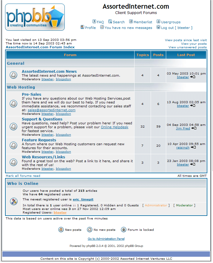
| | | | Posted by micro
Here's my design. I'll admit, it's pretty different and it might not be to everyone's liking, but have a look:
http://www.assorte...-message-board.gif
Seriously.. is it too much to ask to just have this site look like other message boards out there? The current design already looks bad enough. Let's not make it even worse. All I want is a design that doesn't look like the console for a Star Trek BBS game, that isn't embarrassing to have up on my screen while at work, and that doesn't make my eyes bleed. Just pick the style of a regular old message board (the kind that millions of other sites out there use) and let's get this thing going. I mean, honestly.. this thread is almost two years old now.
|
Micro; you are a highly skilled photographer, (visual person), yet you put this Government of B.C. grade, washed out insipid yawn of a sample as a suggested alternative to AV's original, clean, easy to read, funky (in that lovable Star Trek kinda way) righteous layout.
Color me confused good Sir. One of many things I like about the current format is how well it works with photos. The alternating neutral shades of gray between posts is brilliant. Photo Gray shows photographs to their best. White is too bright, black too dark. My screen bg matches the dark gray on this site. It's easy on the eyes, and makes photos look their best.
If being fussy, I would maybe suggest changing the tabs to a squashed oval shape, the pointed ends look a bit like signposts, but that's probably the idea! Cheers.
My sister is Charlotte Light and Dark. Who am I?
Farewell and thank you... "I was doing something that I thought could have some impact someday. In many ways, it's really these photographs that kept me going creatively." Dennis Hopper |
|
kowalski
| | Re: UER Redesign Contest
<Reply # 216 on 3/28/2008 7:09 AM >
| | | | Posted by Avatar-X
I personally find UER much easier to read and track than the ugly style of most message boards out there, including your example.
|
I agree, your forum UI is much better than the typical forum platforms. Sure, graphically it could use a refresh, but I'd rather it stay the same than get worse. And if there's one thing we can all learn from this thread, it's that UER could certainly look worse.
|
|
siologen
Location: Melbourne, Australia.
I Go Where The Drains Are
| | | Re: UER Redesign Contest
<Reply # 217 on 3/30/2008 5:24 AM >
| | | | Ive never had any issues with UER's layout. Its a very well designed site i finks. Maybe has a few superfluous features that dont get used, that could be done away with, but otherwise...
n is there any way to bargain with the mods to get rid of the Xmas decorations and flying santa/reindeers?
Big Drayyynes!
http://siologen.livejournal.com Blog |
|
Recovery
Location: Montreal, Quebec, Canada
Gender: Female
| | | Re: UER Redesign Contest
<Reply # 218 on 3/30/2008 1:50 PM >
| | | | I think the menu buttons are responsible for giving the design a little bit of a dusty feeling. Everything now is straight and simple. Here is an example (copyright Julien Roumagnac http://www.j-rouma...wse&filter=last100)
|
|
Armed Geoduck
Location: Dallas, Tx.
Gender: Male
| |  | |  | Re: UER Redesign Contest
<Reply # 219 on 4/18/2008 8:21 AM >
| | | | I definately like Wabbit's interpretation for what the site could potentially gear itself toward. I do think we need a look overhaul. What do you think about being able to change themes from a list for your own personal account, and everytime you login, it shows the theme you chose for your account? Kind of like a css thing going on with a master style(being the original UER theme that we are all used to) and then being able to choose from say, black and red, to green and yellow , or black and yellow. Or, even being able to have a color customization menu for your particular account. That way we could just choose from a list of colors for text, button color, background color, etc. Just an idea, and my .02
[last edit 4/18/2008 8:21 AM by Armed Geoduck - edited 1 times]
Tact is the ability to shut your mouth before someone else wants to. :)
|
|
|
|
All content and images copyright © 2002-2024 UER.CA and respective creators. Graphical Design by Crossfire.
To contact webmaster, or click to email with problems or other questions about this site:
UER CONTACT
View Terms of Service |
View Privacy Policy |
Server colocation provided by Beanfield
This page was generated for you in 218 milliseconds. Since June 23, 2002, a total of 740483991 pages have been generated.
|
|