|
|
|
UER Store
|
|
 order your copy of Access All Areas today!
|
|
|
|
Activity
|
|
890 online
Server Time:
2024-04-26 08:51:12
|
|
|
 Rusty Canadian
   
Location: Taurontau-esti
Gender: Male
Total Likes: 104 likes
LS swap it!
 | |  | |  | Re: Portrait critique
< Reply # 4 on 10/11/2017 1:51 AM >
| Reply with Quote
| | | First of all if you look at my shots, I'm by no mean a good photographer, I know some things from my stepmother so correct me if I'm wrong.
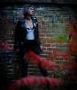
For #1, I love the contrast but I feel like my eyes are drifting on the plants in the frontground, they're taking too much room and it's distracting me from the real subject. Rule of base would be the 2/3. But in here, the plants are almost 1/2 way in the picture and it's overloading it, with it. Not to forget also, the bright red colour is attracting my sight to it.
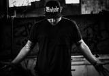
#2, Overall good, should've aimed the camera towards where she's facing. She's more on the right side even though she's looking right. You want to camera to follow her sight, it makes us move our eyes to where she's looking at but there's nothing to look at but a border after a bit. She should've been on the left side of the picture (2/3 once again) looking right --> moving our eyes through the image. Also, you are shooting profile so you should not see that much of a gap between the top of her head and the top of the picture, she's not centered (horizontally).
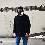
As for #4, the shirt and the pants are not detailed enough. You never want a picture that has deep black or white in them, you always want informations everywhere. The pants are too dark and the shirt is over blown with the exposure removing details, stuff to look at like a zipper, pockets or folds in the shirt anything. Especially if it's your subject. As for the focus, it looks off, as if it wasn't focused on her, either that or she moved in a long exposure.
|
"When we see a sign that says "Danger: Do Not Enter", we understand that this is simply a shorthand way of saying "Leaving Protected Zone: Demonstrate Personal Accountability Beyond This Point"."
- Ninjalicious |
|
themadheretic

Total Likes: 20 likes
| | | Re: Portrait critique
< Reply # 5 on 10/11/2017 2:31 PM >
| Reply with Quote
| | | Posted by Rusty Canadian
First of all if you look at my shots, I'm by no mean a good photographer, I know some things from my stepmother so correct me if I'm wrong.
For #1, I love the contrast but I feel like my eyes are drifting on the plants in the frontground, they're taking too much room and it's distracting me from the real subject. Rule of base would be the 2/3. But in here, the plants are almost 1/2 way in the picture and it's overloading it, with it. Not to forget also, the bright red colour is attracting my sight to it.
#2, Overall good, should've aimed the camera towards where she's facing. She's more on the right side even though she's looking right. You want to camera to follow her sight, it makes us move our eyes to where she's looking at but there's nothing to look at but a border after a bit. She should've been on the left side of the picture (2/3 once again) looking right --> moving our eyes through the image. Also, you are shooting profile so you should not see that much of a gap between the top of her head and the top of the picture, she's not centered (horizontally).
As for #4, the shirt and the pants are not detailed enough. You never want a picture that has deep black or white in them, you always want informations everywhere. The pants are too dark and the shirt is over blown with the exposure removing details, stuff to look at like a zipper, pockets or folds in the shirt anything. Especially if it's your subject. As for the focus, it looks off, as if it wasn't focused on her, either that or she moved in a long exposure.
|
|
Hey Rusty, took some of your advice on the 2/3 and recropped these 2. As for the red tree, I can't do much about it, I was going for that "shoot through" effect. I definitely need to work on my in camera framing etc.
|
|
|
|
| This thread is in a public category, and can't be made private. |
|
All content and images copyright © 2002-2024 UER.CA and respective creators. Graphical Design by Crossfire.
To contact webmaster, or click to email with problems or other questions about this site:
UER CONTACT
View Terms of Service |
View Privacy Policy |
Server colocation provided by Beanfield
This page was generated for you in 156 milliseconds. Since June 23, 2002, a total of 739206482 pages have been generated.
|
|