|
|
|
UER Store
|
|
sweet UER decals:

|
|
|
|
Activity
|
|
735 online
Server Time:
2024-05-16 06:50:54
|
|
|
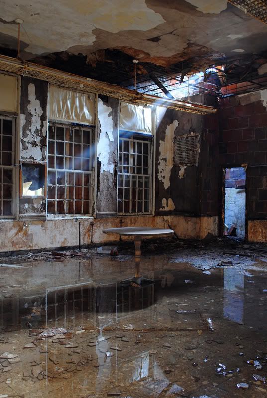
 randomesquephoto
  

Don't be a Maxx
 | |  | Re: Ray of light
<Reply # 1 on 12/17/2011 2:55 PM >
|  | | | Cool shot. I actually like the reflection in the eater more than the light.
I feel... like the table isn't in the best place. Or... that the light isn't or something. It just feels like it's lacking a string focus point. And it makes your eyes try to pick up everything at the same time, reducing the photos impact.
Anyway... :/
RIP Blackhawk |
|
Dave Summer

Location: Ontario
| | Re: Ray of light
<Reply # 2 on 12/17/2011 3:05 PM >
| | | | Cool location. I would take the table away.
|
|
Speed
 
Location: Philly area
Gender: Male
Retired Explorer
| | Re: Ray of light
<Reply # 3 on 12/17/2011 3:31 PM >
| | | | Couple things without completely ripping your photo apart.
The table is not an entirely bad thing. It's placement in the frame however is. The ray of light is cool and what I believe was your point of focus or subject in your minds eye when you took this shot.
That's what you should have concentrated your composition on.
There's entirely too much extra information in this frame
I'm thinking you should have physically moved further to your right and squared up with the ray and tightened up the frame considerably. It also would have allowed you to strategically place the table in the frame.
great exposure though and you are definitely improving!
Ever a simple crop though could help this photo a bit.
Crop the top, bottom and left side a bit.
R.I.P. NickSan | R.I.P. Don Corleyone |
|
Weirdlig
 
Gender: Female

| | Re: Ray of light
<Reply # 4 on 12/18/2011 12:20 AM >
| | | | Thanks, all!
One thing I'm learning about critiques [mainly from my girlfriend who's in art school] is that you're discouraged from explaining yourself or making excuses. So while one part of me wants to say that the creepy table was actually my main focus [the ray above it just sealing the deal] the other part wonders if the idea is to make my focus/intent more obvious to the viewer?
She'd also mentioned you want your viewer, ideally, to spend seven seconds viewing your photo. More means the photo is too complicated and less means the opposite.
Glad to hear the exposure seems right, I'm thinking next time I probably want to make my viewpoint clearer with less distraction.
[last edit 12/18/2011 12:20 AM by Weirdlig - edited 1 times]
http://www.flickr....irdlingphotography |
|
Livingstone

Gender: Male
| | Re: Ray of light
<Reply # 5 on 12/18/2011 12:35 AM >
|  | | | I agree with Speed on table placement, it seems knocking it over with the top to the left and angled toward the camera a tad with the legs still partially visible would have filled in the left corner area nicely. Though personally if I find it upright I shoot it upright and do the best I can.
When I came across that table it was tipped over, maybe that's why it doesn't seem right?? Nicely exposed and fwiw I like the shot.
|
|
|
|
All content and images copyright © 2002-2024 UER.CA and respective creators. Graphical Design by Crossfire.
To contact webmaster, or click to email with problems or other questions about this site:
UER CONTACT
View Terms of Service |
View Privacy Policy |
Server colocation provided by Beanfield
This page was generated for you in 205 milliseconds. Since June 23, 2002, a total of 741912058 pages have been generated.
|
|