 |
|
|
UER Store
|
|
sweet UER decals:

|
|
|
|
Activity
|
|
716 online
Server Time:
2024-05-16 05:43:37
|
|
|
 Lasso
    
Location: Grand Rapids, MI
Gender: Male

 | |  | |  | Opinions?
< on 11/8/2011 6:05 AM >
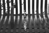
|  | | | what do you guys think of these 2 pics? Is the glowy/blownout part distracting? I kind of like them but I know it's not a very well executed photo... but I almost think the little imperfections kinda make it unique? Or maybe not lol
Also, which one is better?
(and sorry about the obnoxious watermark, I usually don't do that to my urbex pics but my new website auto-adds them and I'm too lazy to go back and change them)


[last edit 11/8/2011 6:06 AM by Lasso - edited 1 times]
|
|
RunkPock

Location: Vancouver
Gender: Male

| | Re: Opinions?
<Reply # 1 on 11/8/2011 6:14 AM >
| | | | I like these alot.
|
|
Ghostofthelens
Location: Pearland, Tx.
Gender: Male
| | Re: Opinions?
<Reply # 2 on 11/8/2011 8:54 AM >
| | | | #1; I like the focus you set here, bringing in the back more clear than the foreground. But with that said, the brightness of light here is a bit much. I think I would have used a yellow B&W filter here., or even a amber creative filter, both of which would have brought more detail in.
If you wanted the flooding out, I think a cross hair on that corner glare would have given a wonderful touch. But the over exposure really does not do much for me on this one.
#2; Even thought I know a Green B&W filter is used for portraits, I thin in this case it would have offered a lot. Again the over exposure, does little for me. Also there is so much clutter it makes it hard to focus on any one thing, yet it also makes you want to look more.
Both of these I like, but what I find that hurts them is the over exposed lighting.
Futurus partum par fabrica |
|
Lasso
Location: Grand Rapids, MI
Gender: Male
| | | Re: Opinions?
<Reply # 3 on 11/8/2011 1:50 PM >
| | | | Cool, I will play around with your suggestions next time... I really like this look so I want to get it right. And thanks for the comment Crawnorder
|
|
Williamdc
Location: Grand Rapids
Gender: Female

| | | Re: Opinions?
<Reply # 4 on 11/18/2011 7:10 PM >
| | | | The first one is a bit overexposed for my liking, as my attention is first drawn to the super white spaces. However I personally think the second photo is fantastic. There is something about it that almost makes it look like it's a drawing, to me at least. I believe that the second one is stronger. The candlestick (I'm assuming it's a candlestick? Correct me if I'm wrong) in the front of the composition is so spooky looking, I love it.
- Kara
|
|
Xanderrrrrr
| | Re: Opinions?
<Reply # 5 on 12/2/2011 12:19 PM >
| | | | The dodging is really obvious on the candle stick. Perhaps give it a halo around the edge, but avoid the stick itself to get the effect you want?
The top one has way too much stuff going on in it... All the stuff is really cool, but it's just confusing
[last edit 12/2/2011 12:20 PM by Xanderrrrrr - edited 1 times]
|
|
Price

Location: Houston,TX
Gender: Male
Urbex: Keeping record of things most people have forgotten.
| | Re: Opinions?
<Reply # 6 on 12/12/2011 6:09 PM >
| | | | 1 is over exposed too much
both are creepy and fucking awesome.
“It still amazes me how many millions goes to discovering another star in the galaxies when, for all we know, we are still sitting on top of another undiscovered world beneath our feet.”
-Martin Dansky (1952) |
|
|
|
All content and images copyright © 2002-2024 UER.CA and respective creators. Graphical Design by Crossfire.
To contact webmaster, or click to email with problems or other questions about this site:
UER CONTACT
View Terms of Service |
View Privacy Policy |
Server colocation provided by Beanfield
This page was generated for you in 265 milliseconds. Since June 23, 2002, a total of 741907061 pages have been generated.
|
|
