 |
|
|
UER Store
|
|
 order your copy of Access All Areas today!
|
|
|
 callmejazz
   
Location: High Point, NC
Gender: Male

 | |  | Ideas
< on 5/6/2011 4:43 AM >
|  | | | 1.

2.

3.

4.

5.

6.
"Bloody" Olympus E-600. S.P.E.C.T.R.E. |
|
Steed
     
Location: Edmonton/Seoul
Gender: Male

Your Friendly Neighbourhood Race Traitor
| |  | Re: Ideas
<Reply # 1 on 5/20/2011 6:50 AM >
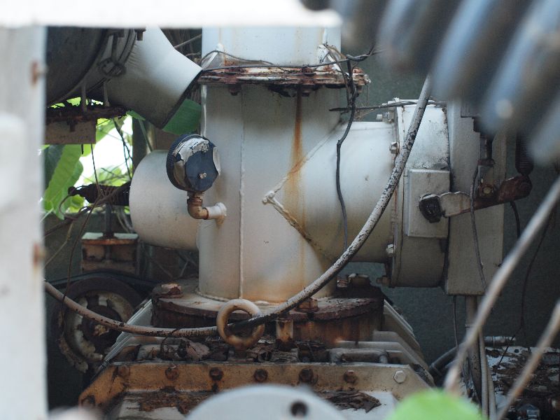
| | | | Some good stuff.
I really like 1, but that one loop of razor wire kind of ruins it for me.
2 and 3 are cool.
4 has great texture, but it might look better from a slightly different perspective; I think the corner is too close to the edge on the right.
It's kind of hard to tell what 5 is about. I have a feeling you meant to capture whatever's floating in the air. It's not a great picture on its own, but whatever you were trying to capture you probably succeeded.
I'm undecided on 6. It's too bad about the one blowout. Might look better in black and white.
|
|
Tom133t
| | Re: Ideas
<Reply # 2 on 5/20/2011 7:11 AM >
|  | | | #3 is awesome. The reflection really brings out the colors of that wall.
#1 is very cool, but too flat. Try using a more selective focus - if you had a sort of depth-of-field effect by focusing primarily on the nearest strand of razor wire, it would make for a much more cohesive photograph. You might want to even try a different background - trees are boring. Is there a dirty brick wall nearby that you can angle in?
|
|
Adv.Pack

Location: Connecticut
Adventure Pack
| | Re: Ideas
<Reply # 3 on 5/22/2011 11:45 AM >
| | | | 1. I feel like the focus should be on the part closest to the camera. As is, it is just a distracting blob cutting through everything. I also really would change the background. Maybe try it from the other side or make a more shallow depth of field to make it less distracting.
2. This is crooked! Also, the focal point seems pointless. Why are you focused on that section in particular? This could maybe work better as an abstract pattern shot from a different angle.
3. Just crop out that blue part at the bottom and this is really good.
4. Why is this not strait!? Feels like you just thought it looked cool, looked up and took a shot. REALLY be careful of horizontal lines. I think the subject is cool but, the crookedness ruins it.
5 and 6, i wouldn't bother with trying to improve. The subject matter just isn't there.
Good job over all.
https://www.instagram.com/chris.kiely/
ttp://www.flickr.com/photos/adv_/ |
|
|
|
All content and images copyright © 2002-2024 UER.CA and respective creators. Graphical Design by Crossfire.
To contact webmaster, or click to email with problems or other questions about this site:
UER CONTACT
View Terms of Service |
View Privacy Policy |
Server colocation provided by Beanfield
This page was generated for you in 93 milliseconds. Since June 23, 2002, a total of 739048098 pages have been generated.
|
|
