 |
|
|
UER Store
|
|
 order your copy of Access All Areas today!
|
|
|
|
Activity
|
|
743 online
Server Time:
2024-05-16 12:36:34
|
|
|
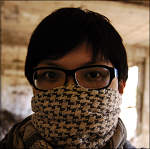
 jinx13
  
Location: Peninsula, San Francisco Bay Area
Gender: Male
 | |  | They've forgotten what the sun is
< on 11/28/2010 6:24 AM >
|  | | | I was terrified to go into this place because it was dark. Finally went one night to discover it was totally unboarded. Went back in the day time.
Nearly got busted on the way out. Win some, lose some.
Here are some of my favorites from the trip. A few of them were also taken in vertical but for some reason I've always been partial to horizontal shots.
Be brutal, I know I have a long way to go.
1

2

3

4

5

6

7

Gravity, it's not just a good idea, it's the law. |
|
freeside
 
Location: Northern California
Gender: Male

eh vigo!
| | Re: They've forgotten what the sun is
<Reply # 1 on 11/28/2010 7:14 AM >
| | | | Ok, for starters, much improved over previous stuff.
shot by shot breakdown:
#1: what is the subject here? Boring photo sorry. Random shot of a hole in the wall of a room. That's my first impression. No focus, nothing specific or artsy or anything to draw me to this. That said, it's well exposed, lines are straight, general rule of thirds followed, etc. It's technically, as in the technical aspects of photography, a good picture, but has no soul, no art, no purpose to me.
#2: same as 1
#3: You've got to understand that it's REALLY difficult to make super interesting, cool photos of empty interior rooms. I've pretty much given up on it. With that in mind, this one is pretty darn good. Great exposure, nice soft diffused lighting, semi-interesting subject i.e. the kitchen in general. technically excellent, but still lacking something that draws the eye or really makes the shot interesting. Not bad.
What would I do to liven up #3? Maybe mess around by opening lots of the cabinets and drawers in different positions (a slightly played-out technique, but still boosts interest). Maybe work with reflections in the glass as well. You can't capture everything in a room, but one thing that is obviously missing is the top of the counter surface. I'm thinking go really low or really high in a corner with this shot. Emphasize the gritty floor or go for the crazy angle approach. I really do like the soft light and soft shadows in this room though. I would have attempted a very similar shot and would have ended up saying the same thing to myself about my own picture. 
p.s. - I forgot how fun it is to critique photos!
#4: Not bad at all here. Very nice lighting, razor sharp with your lines and perspectives, and technically excellent compo. But again is lacking in the soul department for me. As a documentary type of photo its passable. Judicious use of vignette to decent effect. Vignette can be used as you see fit, but generally speaking helps focus the eye on a part of the picture with the exclusion of the rest of the picture; or make a shot look more Holga-esque or filmy (i.e. for the artsy effect). It's not doing that here though. It looks OK, but could have more potent effect with different compo. Since I find the window boring but giving context and good background to express the spanish or whatever style this place is, I would focus more on the billiards. I personally would have moved the cues and balls to be the main focus of the shot, included them in the foreground, gotten lots of green and colors up in your face, with the background still there, with the window still in the shot, but that's just me. Then again, the light would have been on the wrong side of the balls. Shooting a subject up close with the light directly behind makes for a difficult shot. I probably would have taken a view turned 90 degrees so one side of ball is lit, with soft shadows on the other. Oh, and #4 is simply begging to be shot vertically.
#5: good lighting, clean lines and perspectives, well exposed. If that's a post vignette: it looks great and works. If that is vignette effect is from the lighting in the room: cheers for exceptional use of the natural play of light to focus the attention. But again, it's an interior room that's mostly empty and is therefore hard to make interesting in my book.
#6 and 7, falls into above critique. Perfect exposure, good clean lines and perspectives. Blown out windows? Who cares! They don't detract from the picture. Some people freak out about having anything blown out in a shot, and feel the need to have everything properly exposed. Well, even your eyeball doesn't even see that well. Other people make incredible images where you would never even think about part of it being "overexposed".
A big question you have to ask yourself, is what am I going for when I shoot these places? Art? Documentation? Fun? Journalism? magazines? something cool? something unique? fashion photography locations? etc. The list goes on and on and on and many people will think the above photos are excellent if you said they were documentary photos of a site soon to be demolished, or to include on a blog article about the history of the place etc. I would say the same. If you tried to sell them as 'art', ok maybe not. But that isn't necessarily a bad thing. If you accomplished what you set out for, good, but what is that? Helps a lot to know when critiquing a photo. Otherwise I can only critique on my own inner concept of what you should have done.
I personally try to highlight the unique features of a location, with an artsy twist, and very unique interpretation that is uniquely my own. I try to extract something beautiful from each site, something pleasing to the eye that is not normally seen.
blah blah blah. Long response. Last thing: don't be afraid to manipulate the scene and objects in the scene to suit your needs. I used to be a purist and wanted to capture things as they were without touching anything. Then I went out with Lost America a few times and watched the guy move shit all over the place, setting up 'props' found on site and massively staging photos. That's when I changed and started working the site to make the picture even better. I started getting better stuff, with heavier impact after that. I would even go so far as rotating the whole damn pool table if that's what I needed to get things right.
When there's a bunch of crap distracting from my photo, I move it all out of the way. Spent 10 minutes straight at Yahoo to clean the damn place up cuz it looked so shitty.
ciao,
-free
|
|
jinx13
Location: Peninsula, San Francisco Bay Area
Gender: Male
| | Re: They've forgotten what the sun is
<Reply # 2 on 11/28/2010 7:34 AM >
| | | | Thanks a lot free! That's a lot for me to compile, but compile I will.
As for what I want to do with these photos, it's a mix of 80% documentary, 20% art. For me it's a sort of, 'look at the things we throw away,' kind of thing.
If I ever take this up more in the art department that'll be a long time coming. I know what catches my eye, it's just about trying to figure out what catches other people's eyes too.
Also, I took your advice and took some closer looks at other pictures I really like and realized that for some of them I found myself saying something along the lines of, "oh my god, check that fucking floor!" Then when I saw the checkerboard floors at night I knew I had to come back in the day.
Thanks again, free. You and swiz have been super helpful in getting me through this whole photography thing.
BTW, can I, uh, Yahoo?
Gravity, it's not just a good idea, it's the law. |
|
swizzler

Location: Ontario
Gender: Male
| | Re: They've forgotten what the sun is
<Reply # 3 on 11/29/2010 2:34 PM >
| | | | I think they're all fucking great. Nice work!!
Canon EOS 5DMKII | EF 24-105 f/4L | EF 17-40 f/4L | EF 50mm f/1.8 II | Yashica Electro 35 GS |
|
e-photog
  
Location: Kitchener, Ontario
Gender: Male

This IS in fact me...
| |  | Re: They've forgotten what the sun is
<Reply # 4 on 11/29/2010 4:05 PM >
| | | | Posted by swizzler
I think they're all fucking great. Nice work!!
|
Agreed. Perfect lines and simple composition. And of course, your exposure is spot on in every one of these. 4 is my favourite though =)
www.e-photog.ca |
|
|
|
All content and images copyright © 2002-2024 UER.CA and respective creators. Graphical Design by Crossfire.
To contact webmaster, or click to email with problems or other questions about this site:
UER CONTACT
View Terms of Service |
View Privacy Policy |
Server colocation provided by Beanfield
This page was generated for you in 109 milliseconds. Since June 23, 2002, a total of 741940030 pages have been generated.
|
|
