 |
|
|
UER Store
|
|
 order your copy of Access All Areas today!
|
|
|
 Orangedrink
      
Gender: Male
Phobiaphile
 | |  | |  | Feed mill
< on 8/20/2010 3:08 AM >
|  | | | I'm brand spanking new to the photography scene so I'm sure everyone will have plenty of good criticism 
1.

2.
3.

These were shot with a Canon Powershot S3IS on manual. I pumped up the contrast in 1 and 2 in post because I liked it that way. Is it too much?
|
|
Fusspot

Location: Bay Area, CA
Gender: Female

Because... REASONS!
| | Re: Feed mill
<Reply # 1 on 8/21/2010 5:47 AM >
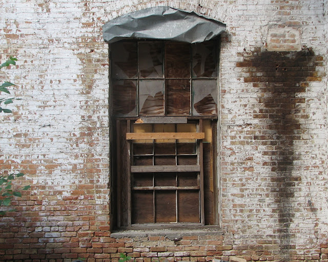
| | | | I think the contrast in the first two may be a little too much for me. Perhaps a little bump in saturation would be nice to really enhance the tone of the bricks and the greenery in the first one. More than the contrast though, I think the framing of your photos might be a good place to start.
- In the first pic, I really like the stacked bricks at the bottom, but they're cut off. The top of the arch over the window is cut off as well. And the pole on the right side of the photo is distracting, which takes the focus off of what appears to be the subject matter in the center of the photo. For this one, maybe take a vertical shot rather than a horizontal one? More like this (with more on the top and the bottom than was included in the original.)

- In the second pic there are the green bits around the left edge and bottom of the photo that don't really do anything to enhance the image, which ends up just being a distraction. The arch over this window is *almost* completely in frame this time. I find myself thinking the stain on the wall is as interesting as the window. Personally, I'd have filled the frame with those two elements and left the rest out. Again, maybe vertical instead of horizontal would have helped this one out a bit.

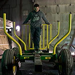
- I like the third pic composition-wise, just wish the bottom of the cart wasn't cut off. It looks a little bright/over-exposed, so everything looks a bit washed out. A little darker looks a little more dramatic -- if shopping carts are allowed to be dramatic. ;) And a little boost to the saturation, to bring out the colors in the background.

I'm sure there are plenty of folks that can offer more technical advice on exposure and such, as I'm working on getting all that down myself and therefore don't have a lot of useful advice to give. In the meanwhile, I focus on framing and use Photoshop to correct whatever else I didn't get exactly right. 
Hope I haven't overstepped my bounds here with my constructive criticism...
|
|
Orangedrink
Gender: Male
Phobiaphile
| | | Re: Feed mill
<Reply # 2 on 8/21/2010 2:10 PM >
| | | | | Hope I haven't overstepped my bounds here with my constructive criticism... |
Not at all. This was all helpful. Thanks!
|
|
UrineLuck
Location: Faribault MN
Gender: Male
| | | Re: Feed mill
<Reply # 3 on 8/30/2010 3:25 PM >
| | | | I like #3 quite a bit, I'd really like to see the bottom of the shopping cart tho as not to cut off your focal point mid image, kind of like cropping people off at the knees. Keep it up tho!
|
|
Protios
Location: Lower Sackville, Nova Scotia
Gender: Male
To get where you're going, Remember where you've been
| | Re: Feed mill
<Reply # 4 on 9/1/2010 12:28 AM >
| | | | I agree with pretty much everything Fusspot said.
I think the first photo would have been much better in Portrait instead of Landscape though, since it appears to me you tried to get the arch in the top and ended up cutting off the bricks as aforementioned.
As far as contrast goes, I like the first two shots, but I like contrasty photos. As far as editing goes, do what you like... after all, if you don't like it... what's the point?
To get where you're going
Remember where you've been |
|
|
|
All content and images copyright © 2002-2024 UER.CA and respective creators. Graphical Design by Crossfire.
To contact webmaster, or click to email with problems or other questions about this site:
UER CONTACT
View Terms of Service |
View Privacy Policy |
Server colocation provided by Beanfield
This page was generated for you in 140 milliseconds. Since June 23, 2002, a total of 739406506 pages have been generated.
|
|
