 |
|
|
UER Store
|
|
sweet UER decals:

|
|
|
|
Activity
|
|
904 online
Server Time:
2024-05-16 09:14:35
|
|
|
 pryor
  
Location: saint louis, mo
Gender: Male
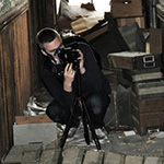
 | |  | some shotz.
< on 10/9/2009 9:41 PM >
|  | | | any critique would help, just a noob trying things out,..etc.


|
|
olive
   
Location: hamilton
Gender: Female
good plan, poorly executed.
| |  | Re: some shotz.
<Reply # 1 on 10/9/2009 10:05 PM >
| | | | these are good. keep trying.
was number two taken with a tripod? it doesn't look very sharp.
for number three, id suggest taking one step to the left and rotating your body to be more square with the staircase, and get a dead on shot using the rule of thirds.
five is crooked. also you might wanna try taking a few steps back hand shooting landscape rather than portrait.
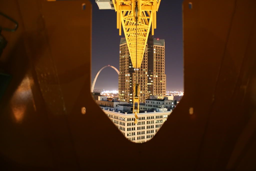
six of perfect, and also my favorite. it might look interesting to crop it into a landscape but leave a lot of the metal thing in the foreground.
seven is awesome.
eight is soft and unfocused. the composition is good though.
ten is neat.
eleven is crooked and the right side is over exposed.
Sorry, what was that you were saying about forever alone? |
|
Off-Limits
Location: Leuven, Belgium
Gender: Male
| | | Re: some shotz.
<Reply # 2 on 10/10/2009 9:24 AM >
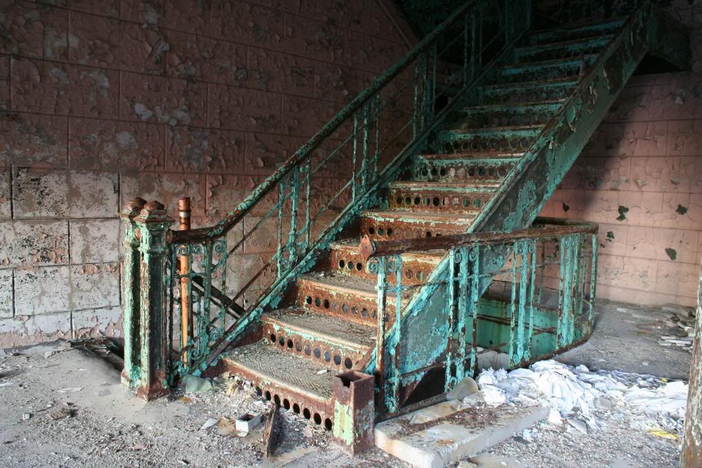
| | | | Nr 1 is a very interesting stair but your POV and composition are quite boring.
Nr 3 is tilted to the right
Nr 4 is tilted to the left, very interesting composition though
Nr 5 is tilted to the right and there's half a person in your shot, try to avoid that.
I'd make nr6 in portrait and crop out the distracting thing on the left, also 50% of your shot is occupied by boring, out-of-focus, yellow metal...
7 is very good, maybe a bit tilted if you look at the chimney, very nice colors too
8 is unsharp indeed, but very cool
10 is good, like the shadows on the concrete floor a lot!
>>www.off-limits.eu<<
https://www.flickr...otos/33475620@N05/ |
|
Carrier_X
Location: Boston MA
Gender: Male
| |  | | | Re: some shotz.
<Reply # 3 on 10/13/2009 5:14 PM >
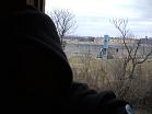
| | | | 3rd shot is tilted however if you altered your POV I feel like this image could be very interesting, also the 7th is very cool, I like the way you did this. The 8th is a little out of focus, but if it was it would be a a very strong piece. I also like 10, however I wish there was a little bit more contrast or maybe just darker blacks, but thats just me. Also the shot through the crane is cool but I'd rather see a shot of the city below not through the crane, I feel like I'm getting only a small portion of what the view has to offer. Keep up the good work and you'll get there.
[last edit 10/13/2009 5:18 PM by Carrier_X - edited 1 times]
"I run with the hunted and if I’m not the happiest man on earth I’m surely the luckiest man alive." |
|
Chthonian
Location: Ottawa, ON
Gender: Male
In search of the city beneath
| | Re: some shotz.
<Reply # 4 on 10/14/2009 9:35 AM >
| | | | I don't really have time to comment on all the images themselves this morning, but a quick two things that'll make the set all that much better with hardly any effort: Put some spaces in between the shots, and put actual numbers next to them. People don't like it when they have to scroll through the post counting photos in order to put a number to one of them. The spaces are the most important though, by far.
|
|
Carrier_X
Location: Boston MA
Gender: Male
| | | | Re: some shotz.
<Reply # 5 on 10/14/2009 3:36 PM >
| | | | Posted by Chthonian
People don't like it when they have to scroll through the post counting photos in order to put a number to one of them. The spaces are the most important though, by far.
|
I agree.
"I run with the hunted and if I’m not the happiest man on earth I’m surely the luckiest man alive." |
|
colinski
 
Location: Virginia
Gender: Male
head like a hole
| | Re: some shotz.
<Reply # 6 on 10/15/2009 4:09 PM >
| | | | As others have said, spacing and number would be nice.
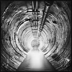
1. Stairs. Looks very good. I like the colors, it's a nice centered up composition. You should crop out the junk in the lower right corner.
2. Phone. Ida know. It looks out of focus and just isn't that interesting.
3. Stairs. It feels very crooked. None of the lines go straight. It makes me uncomfortable to look at. Not sure if you can rotate a little to try straighting it out.
4. Holes. Needs to be straightened. The foreground is a bit out of focus, so you might be able to crop out that first hole. Other than that, good shot.
5. Generator. It's weird, but I like the perspective on it. Good shot.
6. Crane. I think it would be a much cooler picture without the framing. You've got a good position. If you're going to show that much in the foreground, you'll probably want it in focus. Also center up the picture.
7. Night exterior. Nice! I like this one. The green light is kinda weird.
8. Hallway. Doesn't feel like it's in focus, seems a little crooked. I've seen and taken so many of these shots, I just don't really like them any more, but YMMV.
9. Fence. Don't really like the shot through the fence. It's out of focus, but not soft enough to not feel like it's there.
10. Bridge. I like this one as well. Pretty cool shot. I like the colors that show up when you shoot at night. Play with cropping a little. You can probably get rid of that big middle of the frame on the left side that's poking out.
11. Shelves. Level it, foreground doesn't look in focus. Off kilter can be cool, but the lines have to do something or have some purpose. Shooting slightly crooked can be fixed easily, but there's no reason for it usually.
I'd make sure you check your focus. Play with trying to get foreground and background both in focus. Other than that, nice shooting. Keep up the good work!
one day your life will flash before your eyes. make sure it's worth watching. |
|
pryor
Location: saint louis, mo
Gender: Male
| | Re: some shotz.
<Reply # 7 on 10/15/2009 9:04 PM >
| | | | wow thanks alot everyone,...this really helps. my tripod seems to be a piece of shit, it wont stay level and one of the leg locks wont actually lock. that may factor into a few of these.
|
|
Intrinsic
 
Location: Collingwood
Gender: Male
| | Re: some shotz.
<Reply # 8 on 10/15/2009 9:09 PM >
| | | | I enjoyed #1 and #3 and as mentioned, if you put a carriage return in between the photo tags:
Example:
[ inp = 12345 ]
[ inp = 12354 ]
then you will be able to space your images which makes it easier to differentiate between them.
|
|
RustIsRadical
Location: massachusetts
Gender: Male
| | Re: some shotz.
<Reply # 9 on 11/22/2009 8:22 AM >
| | | | 1 is nice, but the light fallout at the top is a little to extreme for my tastes.
2 is not quite focused, and I would have moved the camera to the right so the photo started with the red writing and wall socket, and the wall ended roughly 1/3rd into the frame.
3 *really* needs to be straightened! And darkened a little bit, too bright for a UE pic IMO.
4 could be really nice, but you need to use a slower aperture (f/22 or slower) so as to widen the depth of field, so that the first yellow circle can be in focus as well as the rest of the frame.
6 has great potential! but the majority of the frame is out of focus boring painted metal. digital cameras have great resolution, so try cropping it to roughly the four holes around the "punched out" piece. I would extend it to the bottom of the "punched out" bit. then post that "forum size" and it should be a really interesting shot! I love the way the bright yellow trusses of the crane become closer, and closer, and closer, until it is almost pure yellow.
7 I like this one a lot, I just would have composed it so the smokestack building started the frame, I find the bright lights distracting.
Nice shots! I would *really* love to see a cropped version of the crane pic
**edit: hearing you complain about your tripod, all I can say is BUY A NEW ONE! A nice tripod is your best friend! A crappy one is your worst enemy. I suffered through a piece of shit wal-mart tripod for a few months before I realized what a waste of time it was! save up the cash for a good one, and for now, set the self timer to 2 seconds and use that for every tripod shot. el cheapo tripods just can't hold the slr body still enough when you press the shutter.
[last edit 11/22/2009 8:35 AM by RustIsRadical - edited 1 times]
if you can be told what you can see or read, then you can be told what to say or think |
|
|
|
All content and images copyright © 2002-2024 UER.CA and respective creators. Graphical Design by Crossfire.
To contact webmaster, or click to email with problems or other questions about this site:
UER CONTACT
View Terms of Service |
View Privacy Policy |
Server colocation provided by Beanfield
This page was generated for you in 93 milliseconds. Since June 23, 2002, a total of 741924017 pages have been generated.
|
|
