 |
|
|
UER Store
|
|
sweet UER decals:

|
|
|
|
Activity
|
|
865 online
Server Time:
2024-05-05 06:07:53
|
|
|
 zonnebloem


 | |  | The Brickworks
< on 7/19/2008 4:00 AM >
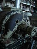
|  | | | Well, I'm a noob. To UER and Toronto, for that matter. Made my first trip to the Brickworks last Sunday. I wasn't all that fascinated, but here's what I got:
(Oh, and Ps. These were taken with the Nikon d70s and a 35mm f2 lens).
#1. (This is normally contrastier, but they never look the same after I upload them).
#2 (I'm fascinated by buttons, especially in old buildings. Hence the next two).
#3
|
|
trent
      
I'm Trent! Get Bent!
Location: Drainwhale hunting
Gender: Male

Not on UER anymore.
| |  | Re: The Brickworks
<Reply # 1 on 7/20/2008 4:03 AM >
| | | | Hello,
Welcome to UER.
Well, since no one has gotten back to you on this one yet I'll give it a go. So you know, I don't know too much about photography specifically but have a solid grasp on design in general. (Too bad I always have problems critiquing my own work though).
Also, so you know, if people post in this section I am assuming they know what they did well already and are posting here to hear about some thing they weren't aware of. If my negative critiques seem to outweigh the positive ones, it's because I am focusing on the negative aspect of it more to help the poster improve. I could also be wrong on some of my points, so please take them with a grain of salt.
In general: It happens to everybody here at first, but using an off-site account like flickr, photopucket, or similar is preferred so you can link to the image, display it here in full size, but UER doesn't actually have to host it. The thumbnails start to get annoying after awhile, especially when trying to view good photos from people or give critiques. That way you also don't have to scale the pics down to upload here. In general I like your shots.
1.)
The Good:
Interesting shot. A lot to keep the eye busy. I think B&W is well suited in this shot. You mentioned the contrast, but I'm happy with it. If so, I would love to see the original.
The Bad:
While I do thoroughly appreciate the angle of the shot not being simply in the middle of the hallway and is offset to make the shot more interesting, the negative I see from that is that it makes the equipment on the left side become the primary focus of the shot (even though blurry) instead of the ladder/stairs which is what I think you intended due to it being the most in focus. The left side is so overpowering that I find myself lost enjoying that side and almost don't notice the right side of the 'hallway' which is then lost for me. Though if this was a normal non-industrial hallway it might be a completely different story.
2.)
The Good:
I do like the close-up shot stuff. When I UE I often find myself looking at and taking photos of small thing like nails, rocks, cracks, graffiti, granola bar wrappers, etc. I love seeing things in detail instead of a big room containing things I cant fully see leaving me with unanswered questions. I'm first drawn to those two control boxes for awhile, and then I see there's more to explore on the right side of the shot. That's two photos/experiences in one for me. Bonus!
The Bad:
While both control boxes are in frame, they barely are. Give me just a little bit more space on the left side so that control box with two buttons isn't all up on the border of the photo. Same thing with the "B" marking/graffiti. If it still continues vertically out of frame then maybe photoshop out that little bit that is hanging out of frame. If that's it, then encompass the entire marking with a little breathing room between it and the border. Though I do still understand that you can only back up/zoom out so much or you're no longer doing close up shots of those control boxes anymore. Really nitpicking here, but if the control boxes were the main subject, then why show the stuff in the background behind that steel column and not focus in more on just those boxes? (even though I also listed this as a positive above).
3.)
The Good:
Nice shot. Again I like the B&W. Interesting to quickly look at.
The Bad:
See #2 in regards to breather room around the edges. Not the right side - I'm okay with that box being cut off. I more don't like the tightness around the bottom and top of the shot. Though to include more room around those thing the cut-off of the box on the right side might then look weird.
Closing:
I hope this helps. I'd like to see more from you though. I know this is the critique section and not the normal photography section, but don't leave me hangin' here with only three shots. (5-6 are nice). Though I completely understand if you wanted focus on specifically just shot shots.
Later.
-TR
He who rules the underground, rules the city above.
|
|
zonnebloem
| | Re: The Brickworks
<Reply # 2 on 7/20/2008 5:23 AM >
| | | | Hey Trent,
I do have more, but felt these were the best of the bunch. Like I said, not much to look at!
I did realize, afterwards, that I should have linked the photos from my Flickr account, so I'll do that in the future.
I kind of like how oddly I cropped the photos, but I can see how others may not. While I wanted the buttons to be the main focus, I also wanted to show a bit of the background as well. I do agree that it's a bit tightly cropped, though.
Thanks for the critique!
|
|
thparkth
 
Location: Bedford, NS
Gender: Male

nulla regula sine exceptione
| | | Re: The Brickworks
<Reply # 3 on 7/22/2008 8:05 PM >
| | | | #1. I don't have anything bad to say about this. It's a nicely composed, nicely balanced shot. The strong diagonal lines forcibly draw the eye into the depth of the corridor despite the eye-grabbing jumble of equipment on the wall and the stairway. The tension between those elements makes this an interesting picture, and one that effectively conveys what it was like to actually be there.
#2. This is a nice documentary photograph. I agree with TrentReznor that it would have been better to have just a little more space on the left of the control box. I would also have been tempted to include just a little more of the round thing (fan?) above - just enough to show that you're deliberately not showing it, rather than accidently including it.
This picture breaks almost every rule of composition. I'm not even clear about what the subject is. But you made it work.
#3. My least favourite of the bunch, I'm afraid. I think it was a mistake not to clearly show space below the bottom of the switchboxes. I'd even say the same about the space above the cut wires. I'm not talking a lot of space here - two or three pixels (on this scale) would be enough for the eye to recognise that there is an edge there, and it really wouldn't affect the rest of the composition at all.
You definitely have an eye for good composition, which many (most?) people don't have, and can never learn. Generally I think you just need to be bolder. If you want an edge in the shot, show it clearly with some air-space so it looks like it's really meant to be there. If you don't want it there, cut it off far enough in that it's clearly not meant to be in. Playing about with is-it-in-or-isn't-it composition results in photographs that are awkward to view.
|
|
RochesterUE
Gender: Male
I'm a piggie!
| | Re: The Brickworks
<Reply # 4 on 7/24/2008 9:34 PM >
| | | | I had a dream about this place two nights ago.
No joke. I've never even been there, and my dream was exactly like some pictures I've seen of this place.
Weird.
RUE
http://cat.org.au/~predator/approach.txt
There is a time when the operation of the machine becomes so odious, makes you so sick at heart, that you can't take part; you can't even passively take part, and you've got to put your bodies upon the gears and upon the wheels, upon the levers, upon all the apparatus, and you've got to make it stop... |
|
whats left of the psych
Location: 200 feet under the Arctic Ocean
Gender: Male

| | | Re: The Brickworks
<Reply # 5 on 7/31/2008 6:45 AM >
| | | | Ahh, the brickworks. Sadly, i'm always having dreams about these places.
I like #1 the most.
Something to try. Take that shot, and select the ladder and side furnaces, sharpen it. Then blur the rest. It should add a nice depth of field.
Non the less, it's a nice shot. 
If you can't beat them, shoot them!
http://urbantresspasser.blogspot.com/
http://www.myartpr...xplorerTresspasser |
|
french125
Gender: Male

smart went crazy
| | Re: The Brickworks
<Reply # 6 on 7/31/2008 2:11 PM >
| | | | some very nice pics
|
|
|
|
All content and images copyright © 2002-2024 UER.CA and respective creators. Graphical Design by Crossfire.
To contact webmaster, or click to email with problems or other questions about this site:
UER CONTACT
View Terms of Service |
View Privacy Policy |
Server colocation provided by Beanfield
This page was generated for you in 95 milliseconds. Since June 23, 2002, a total of 740582181 pages have been generated.
|
|


