 |
|
|
UER Store
|
|
sweet UER decals:

|
|
|
|
Activity
|
|
825 online
Server Time:
2024-05-15 00:16:22
|
|
|
 Alias
   
Location: UK
Gender: Male

www.nicholas-ada ms.co.uk
 | |  | |  | re-edits
< on 3/11/2008 8:54 AM >
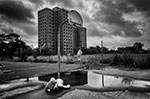
|  | | | two from ages ago I found and thought I would try editing them again.
what do people think?
1

2

Alias
www.nicholas-adams.co.uk |
|
quinwound

Location: Rochester

| |  | Re: re-edits
<Reply # 1 on 3/11/2008 9:47 AM >
| | | | I think that the second one is a stronger composition, and a more interesting subject matter.
Both of you photographs has the very clear vanishing point in the center of your picture. This has the effect of a black hole in your photographs because these lines to the center send your viewers eye directly to the center of the photograph skipping over the main part of your photo that is shaped like a donut around the center of the black hole.
I think you are on the right track though. Good photographs. The next time you go out shooting consider placing something so you don't have converging lines that lead to nowhere, or the center of your photo. Block them by trying different angles, props, etc...
|
|
metawaffle
   
King of Puns
Location: Brisbane!
Gender: Male

Purveyor of Fine Lampshades
| | | Re: re-edits
<Reply # 2 on 3/11/2008 9:51 AM >
| | | | The first looks good - hooray!
The second looks horrible - sorry.

http://www.longexposure.net |
|
aikefu
Location: SW Ohio
Gender: Male

Yes.
| | | Re: re-edits
<Reply # 3 on 3/11/2008 6:59 PM >
| | | | The second one is composed better, but it also tilts CCW very noticeably. They're also a little too dark, and you have to strain your eyes a bit to look at them, particularly 02.
They're still excellent pictures though.
You are now breathing manually. |
|
Martino

Location: Almere - NL
Gender: Male
2,5 days 5691 km, 1200 cigarettes, 131 beers, 67 locations, 3 girs and 2 cars! I absolutely rule!
| | | Re: re-edits
<Reply # 4 on 3/12/2008 11:29 AM >
| | | | both good shots, but to much saturation for me
http://www.flickr.com/photos/martino_ |
|
cambrianguy
 
| | Re: re-edits
<Reply # 5 on 3/14/2008 3:02 AM >
| | | | The first one is nice... good sense of height and scale. The second one, however, is not so good. I don't care much for this crop on it and the saturation is a bit overdone. It's also crooked and not level.
|
|
Air

Location: Canada
| | Re: re-edits
<Reply # 6 on 3/14/2008 7:21 PM >
| | | | First one, like the angle, although I usually hate HDR it lends itself well to that crusty grimy environment. Its a keeper.
Second shot, I don't like it all. It looks like a pano on angle, lots of distracting elements in the photo, and the HDR is way to overdone.
Hope that helps!
"The extraordinary beauty of things that fail." - Heinrich von Kleist |
|
Alias
Location: UK
Gender: Male
www.nicholas-ada ms.co.uk
| | | Re: re-edits
<Reply # 7 on 3/15/2008 10:05 PM >
| | | | I agree with everyone now that second shot is awful
www.nicholas-adams.co.uk |
|
nohbdy
Gender: Male
| | Re: re-edits
<Reply # 8 on 3/16/2008 12:54 AM >
| | | | i love the 2nd one, i want to have sex with it, no im not joking
|
|
|
|
All content and images copyright © 2002-2024 UER.CA and respective creators. Graphical Design by Crossfire.
To contact webmaster, or click to email with problems or other questions about this site:
UER CONTACT
View Terms of Service |
View Privacy Policy |
Server colocation provided by Beanfield
This page was generated for you in 171 milliseconds. Since June 23, 2002, a total of 741760405 pages have been generated.
|
|
