 |
|
|
UER Store
|
|
 order your copy of Access All Areas today!
|
|
|
|
Activity
|
|
910 online
Server Time:
2024-05-05 09:05:56
|
|
|
 traumahound
   
Location: mortville
Gender: Female
 | |  | |  | |  | |  | ccf
< on 2/24/2008 9:54 PM >
|  | | | 1.
2.
3.
4.

5.
6.
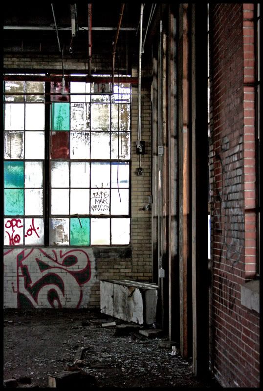
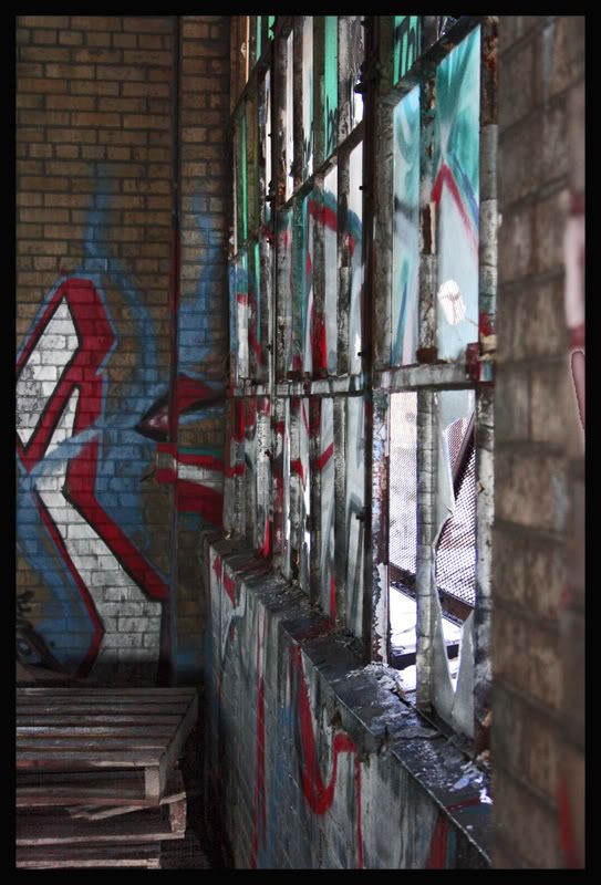
in number three specifically how can i make that not look so fake? that is sheet metal but i think that's pretty obvious.
i like my coffee black just like my metal |
|
stigofthedump

Location: Busan, South Korea
Gender: Male

| | Re: ccf
<Reply # 1 on 2/25/2008 2:42 AM >
| | | | 1, 2, and 5 are my favs. With 3, i think you have a couple of options, As it stands its pretty ugly and cluttered. The graffiti looks nice, but the table on the right seems to be jutting into the pic. I'd either concentrate pon the graffiti or go wider and include the table in the composition.
|
|
yumology

Location: Arizona
Gender: Male

| | Re: ccf
<Reply # 2 on 2/25/2008 3:33 AM >
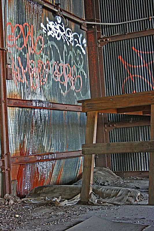
| | | | I like the tones of #2.
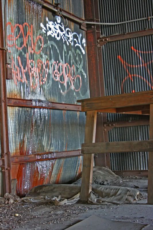
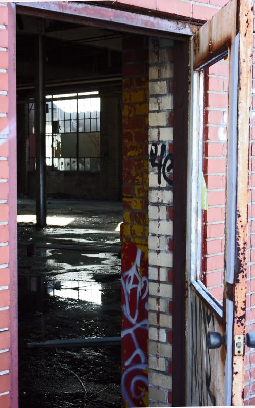
I like the aspect of #6, the open door, whats inside, could be anything! lets go see!
|
|
seicer
  
Location: New York
Gender: Male
| | | Re: ccf
<Reply # 3 on 2/25/2008 4:37 AM >
| | | | Damn, that place is still standing?
Abandoned |
|
zmuh11

Location: St. Louis
Gender: Male

| | Re: ccf
<Reply # 4 on 2/25/2008 5:13 PM >
| | | | You are definitely improving.
One thing I suggest, and this is just my preference, but if you are going to use borders use the same border for each photo. It just makes your sets consistent and more professional looking in my opinion.
Looking good, 3 and 4 need work though. #3 needs to look less fake, and #4 needs composition help.
|
|
don_corleyone
Location: F/RoX
Gender: Male

I have abandonment issues
| | Re: ccf
<Reply # 5 on 2/25/2008 7:07 PM >
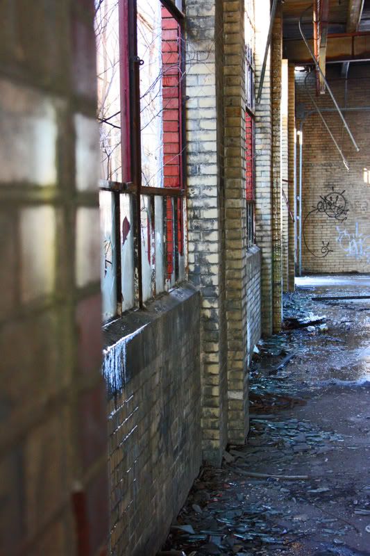
| | | | i don't know if you did it on purpose, but that left wall on #1 is OOF, and since it takes up 1/4 of the frame, it's pretty annoying. number 5 works a lot better for me.
number 3 is really soft, which is what i think you're talking about being fake. it looks 2 dimensional. USM should fix that.
leave the gun. take the cannoli.
|
|
don_corleyone
Location: F/RoX
Gender: Male
I have abandonment issues
| | Re: ccf
<Reply # 6 on 2/25/2008 7:10 PM >
| | | | Posted by don_corleyone
i don't know if you did it on purpose, but that left wall on #1 is OOF, and since it takes up 1/4 of the frame, it's pretty annoying. number 5 works a lot better for me.
number 3 is really soft, which is what i think you're talking about being fake. it looks 2 dimensional. USM should fix that.
|
EDIT: like this:
leave the gun. take the cannoli.
|
|
tron_2.0

Location: Ohio
Gender: Male

| |  | | | Re: ccf
<Reply # 7 on 2/26/2008 12:34 AM >
| | | | Posted by seicer
Damn, that place is still standing?
|
Not really.
All the interesting stuff is gone.
[quote][i]Posted by yokes[/i]
I find your lack of coziness.... disturbing.
[/quote] |
|
|
|
All content and images copyright © 2002-2024 UER.CA and respective creators. Graphical Design by Crossfire.
To contact webmaster, or click to email with problems or other questions about this site:
UER CONTACT
View Terms of Service |
View Privacy Policy |
Server colocation provided by Beanfield
This page was generated for you in 328 milliseconds. Since June 23, 2002, a total of 740609560 pages have been generated.
|
|
