 |
|
|
UER Store
|
|
sweet UER decals:

|
|
|
 gr8fzy1
 
Location: Waterbury, CT
Gender: Male
Fewer and Fewer...
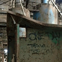
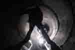
 | |  | |  | |  | Same place ,multiple shots...
< on 12/31/2007 6:31 PM >
|  | | | I'm going to be posting more pictures from Nova Mill soon, but before I do I would like a few opinions. I have been taking composition for granted, and wanted to make up for that. SO on my last trip I took multiple shots of certain areas, and would like your opinions on them before I put together my set.
Alright? Here we go...
Packet 1:

or

Packet 2:

or

Packet 3:

or

Packet 4:

or

Packet 5:

or

Packet 6: (last one, promise!)

or

Softly creeping through
Empty hallways decades old,
glimpsing history. |
|
yota94
 
Location: AEQUITS.VERITAS. CALI.
Gender: Male
| | Re: Same place ,multiple shots...
<Reply # 1 on 12/31/2007 6:48 PM >
| | | | i like number two!!!! its yummy
UER might as well be crack...
oh and Thats TOYOTA...dick. |
|
H3TZL
Gender: Male

| | Re: Same place ,multiple shots...
<Reply # 2 on 1/2/2008 2:33 AM >
| | | | 1. a
2. a
3. a
4. a
5. Neither thrills me.
6. b
|
|
yumology

Location: Arizona
Gender: Male

| | Re: Same place ,multiple shots...
<Reply # 3 on 1/2/2008 6:12 AM >
| | | | 1: i dont know
2: a (you don't really add more to the ground in the portrait shot, the landscape one does add more of the wall which is better because of it)
3: b (in the first one i don't notice the weeds, its cool to see them, but i think you could of tilted the camera higher to get more of the building, but its good as is too)
4: a definitely, much cooler with broken window
5: a. i understand it more than in b
6: i like b better, but i dont know why
|
|
gr8fzy1
Location: Waterbury, CT
Gender: Male
Fewer and Fewer...
| | | | Re: Same place ,multiple shots...
<Reply # 4 on 1/2/2008 3:51 PM >
| | | | Posted by yota94
i like number two!!!! its yummy
|
Ummm...okay, but which one in #2, a or b?
Posted by H3TZL
1. a
2. a
3. a
4. a
5. Neither thrills me.
6. b |
So, you like things a little on the darker side in Packet #1?
Most people seem to be going for the first one in Packet #2...don't know why...
Oh my god, you actually LIKE that washed out pic in Packet #3? That's a first...
Yeah, I kinda like the broken glass in Packet #4 too...
Packet #5 IS kinda dull isn't it...maybe I'll skip that pic and redo it later...
Yeah, I like the whole "line of sight" thing going on it Packet #6.
Posted by yumology
1: i dont know
2: a (you don't really add more to the ground in the portrait shot, the landscape one does add more of the wall which is better because of it)
3: b (in the first one i don't notice the weeds, its cool to see them, but i think you could of tilted the camera higher to get more of the building, but its good as is too)
4: a definitely, much cooler with broken window
5: a. i understand it more than in b
6: i like b better, but i dont know why |
I wasn't sure myself, there were actually three pictures taken of the area in Packet #1, but the first was blurred a little bit and was too far away for my taste. I'm rather fond of b because it shows one of the entrances to the walkway I've been fanaticizing over.
I was torn over that Packet. One the one hand, I liked that expanse of wall in shot a, but I LOVED the ice in shot b. Also, shot a seems to have a little bit of barrel distortion that I haven't been able to correct to my satisfaction.
You didn't notice the weeds in the first one because because shot a was taken from the third floor, while shot b was taken from the second floor. Also the window on the second floor was filled with safety class and all that wire would have gotten in the was...plus my tripod is only 42 inches, so the camera was hand held.
Hehehe...yeah broken window FTW!
B in Packet #5 could be anything, couldn't it? Only in A do you have a clue that is's an elevator pully.
I believe it's because the line of...things...draws your eyes to other areas of the picture.
Thank you for your time everyone!
Softly creeping through
Empty hallways decades old,
glimpsing history. |
|
Martino

Location: Almere - NL
Gender: Male
2,5 days 5691 km, 1200 cigarettes, 131 beers, 67 locations, 3 girs and 2 cars! I absolutely rule!
| |  | Re: Same place ,multiple shots...
<Reply # 5 on 1/2/2008 4:04 PM >
| | | | 1 a
2 neither
3 a
4 b
5 neither
6 b
http://www.flickr.com/photos/martino_ |
|
Core

Location: MI
Gender: Male

Warning: Some side effects may occur
| | | Re: Same place ,multiple shots...
<Reply # 6 on 1/2/2008 6:28 PM >
| | | | 1. Neither, to me they both seem crooked a bit also what are you trying to convey with the photo? Space? the objects in the room? Light? Shadow? It's a photo of a messy room with no real focal point to it.
2. B, again the first was tilted a touch. The wall is very obviously the focal point and it's plainness is accented by the clutter on the floor, ceiling and walls surrounding it.
3. Neither, there is nothing to the photos. Are you focusing on the snow? the architecture? The machinery?
4. Neither, in a the window blows the photo and in the second, again what's the focal point of the photo? Nothing stands out and thus the photo doesn't stand out.
5. Neither, you have a definate focal point this time, but now you're so close to the subject you can't make out any detail. Also, b is out of focus.
6. Both, a is good but plain. I think it needs to be taken from another angle and if possible given some sort of scale, I stared at it for a bit before I figured out that it was rather large. B is excellently done, the only thing I would say is maybe step back a foot if possible to get more of the steel post closest to you.
|
|
zmuh11
Location: St. Louis
Gender: Male

| | Re: Same place ,multiple shots...
<Reply # 7 on 1/3/2008 4:18 AM >
| | | |
1. Either
2. A, Even though I find vertical shots more interesting, the inclusion of the stuff around the wall makes it more interesting. Needs a little cropping to bring it into a 2:3 ratio.
3. B, For sure the second one, except for that dark smudge, wtf?
4. A, Definitely
5. Either, I'm feeling more A, but I like the composition in both
6. Neither
Does that help?
|
|
gr8fzy1
Location: Waterbury, CT
Gender: Male
Fewer and Fewer...
| | | | Re: Same place ,multiple shots...
<Reply # 8 on 1/3/2008 7:35 PM >
| | | | Posted by Martino
1 a
2 neither
3 a
4 b
5 neither
6 b
|
1)Okay, good, I like that one better as well.
2)You don't like the wall? Not enough to keep you interest?
3)Score one more for the blown out shot...
4)Why b? More atmospheric?
5)Yeah, the more I look at them, the more they kinda blow...
6)Yay!
Posted by Core
1. Neither, to me they both seem crooked a bit also what are you trying to convey with the photo? Space? the objects in the room? Light? Shadow? It's a photo of a messy room with no real focal point to it.
2. B, again the first was tilted a touch. The wall is very obviously the focal point and it's plainness is accented by the clutter on the floor, ceiling and walls surrounding it.
3. Neither, there is nothing to the photos. Are you focusing on the snow? the architecture? The machinery?
4. Neither, in a the window blows the photo and in the second, again what's the focal point of the photo? Nothing stands out and thus the photo doesn't stand out.
5. Neither, you have a definate focal point this time, but now you're so close to the subject you can't make out any detail. Also, b is out of focus.
6. Both, a is good but plain. I think it needs to be taken from another angle and if possible given some sort of scale, I stared at it for a bit before I figured out that it was rather large. B is excellently done, the only thing I would say is maybe step back a foot if possible to get more of the steel post closest to you. |
1)Yeah, kind of a little bit of everything you suggested actually. I looked around for a few minutes, but couldn't see anything in my mind that deserved more attention than the other...so I just snapped the shot. It's slightly crooked because the ice messed with my tripod, so I used an overturned cabinate.
2)Thank you, I actually put some thought into that one. I liked the wall, but I also liked the ice formations on the floor: they were an odd combination of flat sheets with fine lacey frost on top.
3)I was really just snapping a photo of that roof top alcove, using the weeds to give it some character instead of start walls and ice.
4)The focal point is what's OUTSIDE the window, namely the roof of the secondary freight elevator. That's why B was taken much closer, with the camera right up against the glass.
5)One of these years I will learn to use my camera's macro setting correctly...
6)Yeah sorry, no real sense of size in that first one The bar that those insulating roller things are on is actuall a little over an inch thick. I was using the macro lense setting on my camera for B, if I had stepped back the photo would have fuzzed out.
Thanks for the critique Core, you gave me a lot to think about for future shoots...
Posted by zmuh11
1. Either
2. A, Even though I find vertical shots more interesting, the inclusion of the stuff around the wall makes it more interesting. Needs a little cropping to bring it into a 2:3 ratio.
3. B, For sure the second one, except for that dark smudge, wtf?
4. A, Definitely
5. Either, I'm feeling more A, but I like the composition in both
6. Neither
Does that help? |
1)Either never helps anybody...
2)Thanks for the suggestion, but I like my 3:4 ratio better, as it's easier for me to work with.
3)Thanks, and the darks smudge is part of the safety glass. Had the camera presses against the window, between the wire.
4)Another vote for A...
5) I choose Neither, I'm dropping them from the set...
6)Too uninteresting?
Alright, I'm off to post the set now...it's a big one...
Softly creeping through
Empty hallways decades old,
glimpsing history. |
|
DeMiNe0
  
Location: Brooklyn, NY
Gender: Male
DeMiNe0.CoM
| |  | |  | | | | | Re: Same place ,multiple shots...
<Reply # 9 on 1/3/2008 7:46 PM >
| | | | P1: #1 - It looks less cluttered, although #2 does look sharper.
P2: #2 - I think the Vert shot is much better for that picture. It also helps me focus in more on one object, instead of looking around the picture at the other commotion going on.
P3: #2 - #1 is over exposed.
P4: #2 - I like the clear view. Too much going on in #1.
P5: #2 - I LOVE the detail on the cables. You don't see it that well on #1.
P6: #2 - I like the shadows in this one. It's a close one though.
HtTp://WwW.DeMiNe0.CoM |
|
Core
Location: MI
Gender: Male
Warning: Some side effects may occur
| | | Re: Same place ,multiple shots...
<Reply # 10 on 1/6/2008 10:31 PM >
| | | | You're welcome, you have some good skills it's just developing them. I took a b&w photo class and an art design class that I learned alot from at my community college. Something like that would help alot if you have the time and money.
|
|
LtotheJ
Location: CT
Gender: Male

| | | | Re: Same place ,multiple shots...
<Reply # 11 on 1/10/2008 4:27 AM >
| | | | nice stuff alot of nice frames here, upgrade the cam and ull be in biz.
|
|
gr8fzy1
Location: Waterbury, CT
Gender: Male
Fewer and Fewer...
| | | | Re: Same place ,multiple shots...
<Reply # 12 on 1/10/2008 6:01 PM >
| | | | Posted by LtotheJ
nice stuff alot of nice frames here, upgrade the cam and ull be in biz.
|
Ahhh...if only.....if only..............
Softly creeping through
Empty hallways decades old,
glimpsing history. |
|
|
|
All content and images copyright © 2002-2024 UER.CA and respective creators. Graphical Design by Crossfire.
To contact webmaster, or click to email with problems or other questions about this site:
UER CONTACT
View Terms of Service |
View Privacy Policy |
Server colocation provided by Beanfield
This page was generated for you in 140 milliseconds. Since June 23, 2002, a total of 739736666 pages have been generated.
|
|
