 |
|
|
UER Store
|
|
sweet UER decals:

|
|
|
|
Activity
|
|
774 online
Server Time:
2024-05-06 17:20:49
|
|
|
 Felonious Monk
  
Location: Between Bridgeport and Branford
Gender: Male
This text is personal.
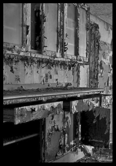
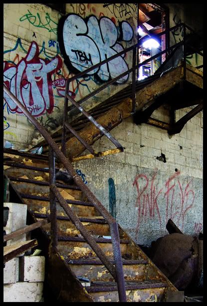
 | |  | |  | |  | 3 photos I think could be improved.
< on 11/27/2007 1:32 AM >
|  | | | 1.
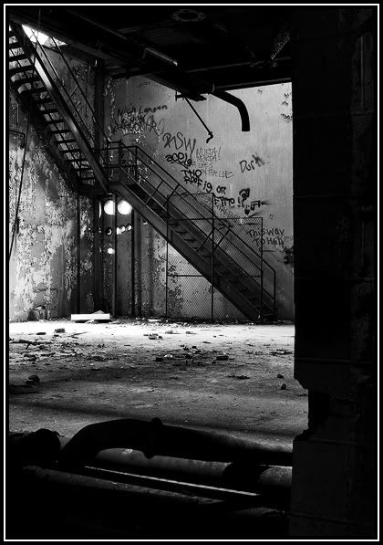
2.
3.
Tell me how to improve. I want to learn. Don't hold back.
"i've been trying for almost a year to get Colfax to one of my events to give it some credibility" - bfinan0
|
|
Bones

Location: st.paul, minnesota
Gender: Male
| | | | Re: 3 photos I think could be improved.
<Reply # 1 on 11/27/2007 2:57 AM >
| | | | 1. I think this one is really good, good contrast and the way that wall frames the staircase is really neat
2. Its lacking composition, and its a bit blurry. Doesn't really have that good of contrast.
3. I'm really digging the way this one turned out, the colors and contrast are great.
out and under the town |
|
Krescentia
Location: Oklahoma
Gender: Female

[Zerstörer der Herzen]
| | Re: 3 photos I think could be improved.
<Reply # 2 on 11/27/2007 5:26 PM >
| | | |
I like how they turned out.. I'm not so great on figuring out how to make pictures look better.. specially pictures that look great as is.
Only thing I see is the second one seems a tiny bit blurry.
Es kommt wie es kommt. |
|
Nyssa

Location: Los Angeles
Gender: Female
Totally Sharky Complete
| | Re: 3 photos I think could be improved.
<Reply # 3 on 11/27/2007 7:35 PM >
| | | | 1. The white stripe at the bottom really draws my eyes away from the picture. I'd darken it a little bit, just to keep attention more on the stair area. Other than that, I really like it.
2. It's blurry, which wouldn't be so bad if there wasn't so much going on in the picture with all the lines and shadows tossed by the peeling paint. The composition itself isn't very dynamic, even if it wasn't blurry, though it could probably be somewhat recovered if the contrast was brought up. If it was mine, I'd scrap it.
3. Two things: (1) the blow out at the top of the stairs... not so much. (2) If you look at the way the bottom part of the stairs lay from this angle, it kinda fucks with your head. If you notice, the front railing runs at the same angle as the back half of the bottom of the stairs and covers it, and then there is the bizarre melding of the front vertical rail with a piece of graffitti on the wall behind it. It looks absolutely weird. If you go back to that location, I'd squat down to be able to see the space between the bottom railing and the stairs, so you get six evenly apart parallel lines running downward as opposed to five, with one being bulkier than the other. You could also bring up the yellows in the picture a bit, I think it would bring a little life into it. And total props on getting the Pink Floyd tag in there.
"The most beautiful thing we can experience is the mysterious. It is the source of all true art and all science. He to whom this emotion is a stranger, who can no longer pause to wonder and stand rapt in awe, is as good as dead: his eyes are closed." - Albert Einstein |
|
JuiceBox889
Location: New Jersey
Gender: Male

| | | Re: 3 photos I think could be improved.
<Reply # 4 on 11/27/2007 8:21 PM >
| | | | 1. This is a good photo. I think it's just a tad bit over exposed though. I'm really not feeling the blown out floor. It leads my eye out of the picture, away from the staircase (which seems to be your subject). It has great contrast. Whatever site you hosted these with strips your exif info, but it doesn't look like you shot these in B&W mode anyway, but rather did a conversion (that's what I was looking for if you didn't catch on ;)). I like the angle. Get rid of the border (that goes for all of them, not feeling it at all).
2. It's out of focus, flat and boring. If you backed up a bit, it might have helped the composition a bit. If you took these on B&W mode, instead of doing a conversion then that is why it looks so flat. Work on your focus more however.
3. It has good exposure, great colors, but the composition is a bit off. You cut off the side of the staircase, which is your subject. If you didn't intend for it to be your subject then you're doing it wrong. You shouldn't really have anything of your subject cut off. You can't really set a rule in stone with photography, there is ALWAYS going to be an exception with rules. However, in this photo cutting off the side of the staircase screws with the contrast. Also, that railing that just meshes the wall and staircase together really screws it up. I would try just a slightly higher angle, after you've found a way to get the whole staircase into the frame ;) The blowout up top detracts from the photo as well. That's just timing. Try to pick your shots during a time when the lighting is perfect for your photo. I know all too well that this is not possible all the time, let alone most of the time. But, that's how it could have been better.
It looks like you know what you're doing, you just need to keep shooting. Practice practice practice. That's the only way you'll improve. Shoot until you think you're going to break the damn button off your camera. Hope this helps.
In this eerie night I will fly. I will dance in the circle of pain,
walking in this unknown empty land,
so confused for what's wrong or right. Searching for my inner power. - Nightrage-Circle of Pain |
|
|
|
All content and images copyright © 2002-2024 UER.CA and respective creators. Graphical Design by Crossfire.
To contact webmaster, or click to email with problems or other questions about this site:
UER CONTACT
View Terms of Service |
View Privacy Policy |
Server colocation provided by Beanfield
This page was generated for you in 140 milliseconds. Since June 23, 2002, a total of 740831272 pages have been generated.
|
|
