 |
|
|
UER Store
|
|
 order your copy of Access All Areas today!
|
|
|
|
Activity
|
|
775 online
Server Time:
2024-05-07 19:30:55
|
|
|
 JustINSANE
  
Location: NJ/Boston
Gender: Male
 | |  | |  | Three's Company
< on 4/2/2007 2:04 PM >
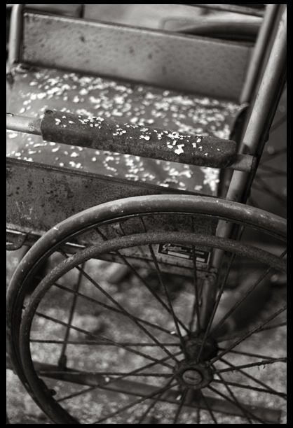
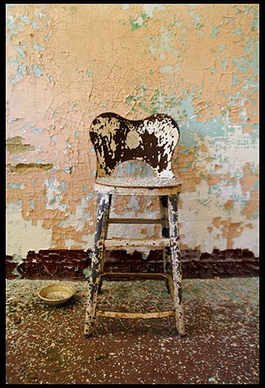
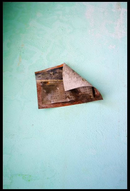
|  | | | I was having a hard time deciding weather or not to post these in my last post. So now I thought what the heck. Let me know what you think rip em apart.
"brocore" |
|
D the Shadowman
 
Location: Utica NY
Gender: Male

| | |  | Re: Three's Company
<Reply # 1 on 4/2/2007 2:15 PM >
| | | | 1st is nice. Need more images!
D the Shadowman
Utica NY
|
|
Jeff!
Location: Boston, MA
Gender: Male

| | Re: Three's Company
<Reply # 2 on 4/2/2007 5:44 PM >
| | | | i really enjoy the composition of all three
plus the colors in 2 and 3 are great
|
|
yellow_wallpaper
Location: Victoria, Canada

If you're not dirty, you're not doing it right.
| | Re: Three's Company
<Reply # 3 on 4/2/2007 6:25 PM >
| | | | I really like the second one, but I feel like I'm leaning to the right trying to center it. Maybe take a step sideways next time so the legs line up? Nice colour in them though.
"...let us step into the night and pursue that flighty temptress, adventure." - Dumbledore |
|
JustINSANE
Location: NJ/Boston
Gender: Male
| | | Re: Three's Company
<Reply # 4 on 4/2/2007 11:10 PM >
| | | | | I really like the second one, but I feel like I'm leaning to the right trying to center it. Maybe take a step sideways next time so the legs line up? Nice colour in them though. |
yeah the legs on that stool were a little wacked up
"brocore" |
|
IrIsHmOm
Location: San Joaquin Valley, CA
Gender: Female

I'll kill your face...
| | | | Re: Three's Company
<Reply # 5 on 4/2/2007 11:12 PM >
| | | | Dundertits will like the first one.. LOL. I like it as well.
|
|
Dowcet
   
Location: Middletown, ct

| | | Re: Three's Company
<Reply # 6 on 4/3/2007 2:56 AM >
| | | | #3 really caught my eye, because I just love pastel blues so much. There is an amazing quality of space here, the calendar seems like it is floating in heaven or something.
Unfortunately, I think most of the value is in the subject, and its undermined by poor execution. It seems like the focus isn't right, and the exposure to uneven. The dark corner is more of what I'd like the whole wall to look like. I would love to see this subject redone with the technical image quality you achieved in #1. I think the composition would also be improved if the calendar were slightly higher in the frame, and maybe the whole thing was closer in so we could see more detail.
A lot of potential here, I hope to see another version of this shot!
|
|
JustINSANE
Location: NJ/Boston
Gender: Male
| | | Re: Three's Company
<Reply # 7 on 4/4/2007 2:36 PM >
| | | | Posted by IrIsHmOm
Dundertits will like the first one.. LOL. I like it as well.
|
huh? thanks I guess?
"brocore" |
|
Pura Vida

Location: Santa Barbara, CA
Gender: Male

| | Re: Three's Company
<Reply # 8 on 4/4/2007 11:26 PM >
| | | | Posted by Dowcet
#3 really caught my eye, because I just love pastel blues so much. There is an amazing quality of space here, the calendar seems like it is floating in heaven or something.
Unfortunately, I think most of the value is in the subject, and its undermined by poor execution. It seems like the focus isn't right, and the exposure to uneven. The dark corner is more of what I'd like the whole wall to look like. I would love to see this subject redone with the technical image quality you achieved in #1. I think the composition would also be improved if the calendar were slightly higher in the frame, and maybe the whole thing was closer in so we could see more detail.
A lot of potential here, I hope to see another version of this shot!
|
^
What he said.
|
|
|
|
All content and images copyright © 2002-2024 UER.CA and respective creators. Graphical Design by Crossfire.
To contact webmaster, or click to email with problems or other questions about this site:
UER CONTACT
View Terms of Service |
View Privacy Policy |
Server colocation provided by Beanfield
This page was generated for you in 109 milliseconds. Since June 23, 2002, a total of 740953953 pages have been generated.
|
|
