 |
|
|
UER Store
|
|
 order your copy of Access All Areas today!
|
|
|
|
Activity
|
|
376 online
Server Time:
2024-04-18 22:18:44
|
|
|
 dills84

 | |  | 6 shots... serious crtique wanted.
< on 1/14/2007 9:54 PM >
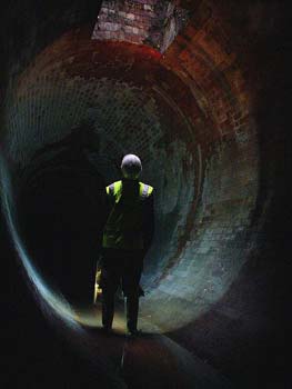
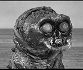
|  | | | Here are 6 shots from a trip yesterday. It was really foggy out, but i tried to make the best of it. let me know what you think. Serious criticism wanted.
Thanks...
1

2

3

4

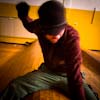
5 (self portrait)

6

you can see the whole set at:
http://www.bleedin...nails.php?album=76
[last edit 1/14/2007 10:17 PM by dills84 - edited 1 times]
|
|
Bones
 
Location: st.paul, minnesota
Gender: Male
| |  | |  | Re: 6 shots... serious crtique wanted.
<Reply # 1 on 1/14/2007 10:14 PM >
| | | | 1.I like it, but it just seems a touch too dark.
2. A little too dark, and it looks like the focus is off a little.
3. Very Good.
4. It seems to be missing something, too much blank space.
5. Good
6. Good
out and under the town |
|
stoop_master

Location: south uk
Gender: Male
| | | Re: 6 shots... serious crtique wanted.
<Reply # 2 on 1/14/2007 10:38 PM >
| | | | Without doubt 2 is off the hook. Love it!!!!! Best of the bunch.
Although they look quite photoshop intensive, good work
st00p
www.sub-urban.com www.st00p.net |
|
TomUE
 
Location: Mukilteo WA.
Gender: Male
| |  | |  | | | | | Re: 6 shots... serious crtique wanted.
<Reply # 3 on 1/14/2007 10:49 PM >
| | | | Amazing the fog worked to your advantage in the last two. The second one the angle seemed just a touch too extreme.
|
|
desmet

When the going gets weird, the weird turn pro.
| | | | Re: 6 shots... serious crtique wanted.
<Reply # 4 on 1/14/2007 10:51 PM >
| | | | 1 - I like this a lot. The white on the sides is distracting, but not sure how else you could shoot this to avoid that.
2 - This is my favorite of your shots from yesterday by far. The angle works, the lighting works, everything works. Can't tell if you desaturated the whole image except for the reds, or if you just desaturated everything and only the reds are showing up because of that crazy fog but either way I like it. Only having certain things in color can go wrong easily but this is good.
3 - This one doesn't thrill me. I think maybe shooting more of a closeup of the controls might be better. Even if you wanted to keep that rope in there, it would be good to tighten up the framing a lot and focus the interest in.
4 - The walls at this place are like abstract paintings. I like the vignetting a lot. The two things attached to the wall would be better if they were on the thirds lines, but no way to shoot that without a zoom.
5 - Good stuff. Like the glow effect on this.
6 - A little dense on the right side, but otherwise very nice.
|
|
dills84
| | Re: 6 shots... serious crtique wanted.
<Reply # 5 on 1/16/2007 7:28 AM >
| | | | Thanks guys... helpful info was much appreciated. i'd love to hear more.
|
|
Pariah

Location: MD
Gender: Female

| | Re: 6 shots... serious crtique wanted.
<Reply # 6 on 1/18/2007 4:07 PM >
| | | | I really like #5...what did you do to it?
|
|
tait
Location: toronto
Gender: Male

meow
| | | Re: 6 shots... serious crtique wanted.
<Reply # 7 on 1/18/2007 4:20 PM >
| | | | 1. I love this shot, my only thought is maybe a bit of dodging or burning on the edges, just something to get rid of that dull kind of colouration.
2. Not much can be said, it's another great shot. I'm not too sure on the angle but it seems to work. A bit of dodging on the bicycle would bring more focus onto it and make it alot easier to see. I wouldn't use too much though, the dark exposure works really well in complimenting the atmosphere.
3. As said by someone else, it doesn't do much for me. I would have done something with the controls filling the frame. There's some great rust texture and the ropes which would make for a beautiful black and white.
4. I like it. The vignetting around the top might be a bit much, it kinda throws off the balance but overall it's top notch.
5. I was never a fan of the whole gaussian blur thing so obviously this shot is a bit of a turnoff. Beside that, the composition is great and the vignetting really adds to it.
6. Not too much to be said, it's a great documentative shot. I would have maybe moved the camera to the left just wee bit, but I can't really say that since I wasn't there. Great atmosphere.
Hoped my input has helped in someway.
[last edit 1/18/2007 4:21 PM by tait - edited 1 times]
|
|
ryan
This member has been banned. See the banlist for more information.
Location: Providence RI
Gender: Male

F/gayz
| | | | Re: 6 shots... serious crtique wanted.
<Reply # 8 on 1/18/2007 4:20 PM >
| | | | I Love this place its so fun. PS Terror sucks. HA just kidding.
I climb stuff!
Remember! Shop smart. Shop S-Mart \http://www.myspace.com/xitstheendx |
|
micro
  
Gender: Male
Slowly I turned
| | Re: 6 shots... serious crtique wanted.
<Reply # 9 on 1/18/2007 4:48 PM >
| | | | 1. What am I looking at? This might be an interesting object, but because you killed all the definition in the shadows, there isn't really much to look at here. The piece sticking out that's out of focus is kind of distracting, too.
2. Too dark, blurry and dull-looking. It looks like there might've been some interesting elements in the room, but they get lost in the overall muddiness of the shot.
3. I don't mind this one. I'd probably take a sliver off the right and bottom edges though. You have the breaker panel in the centre of the shot, but the other elements make it look off-balanced. Something looks odd with the DOF too or maybe you had a fingerprint or something on the lens?
4. Peeling paint. Meh. The superfluous vignette you added to the top doesn't rescue this one either. It doesn't matter what effect you chuck on this, it's still just a wall.
5. Not a bad portrait. I'd lose the effect though cuz it's looking pretty 2001.
6. Again, too dark and blurry. There's nothing really to look at here either. I guess there are some seats there on the right side, but you can barely make them out so they don't really add anything to the shot.
|
|
Glass
Location: Chicago
as one does
| | | Re: 6 shots... serious crtique wanted.
<Reply # 10 on 1/18/2007 5:27 PM >
| | | | 1) I like the fact you can't tell what it is. It looks damn evil. Some vignetting might be cool on it.
2) It would be stronger if the the subject was more identifiable as a bike... but it's still neat.
3) I think it's kinda boring.
4) Cool wall, but the pic lacks balance and purpose. It's a picture of a wall.
5) Render Light Source + Diffuse Glow Mask?
6) Wish it was wider (to the left), but this is my favorite of your set.
|
|
dills84
| | Re: 6 shots... serious crtique wanted.
<Reply # 11 on 1/20/2007 7:29 AM >
| | | | appreciate the honesty guys.
The dark area at the top of number 3 is actually a large shadow cast from an overhanging balcony.
The item in shot 1 was actually a Blood centrifuge for separating blood and plasma particles. pretty cool find in this old medical building.
I was underexposing most shots from the day. i wanted to capture the fog and the creepy atmosphere with darker exposures... unfortunately alot of it came out a touch too dark.
thanks again. i'd love to hear more.
[last edit 1/20/2007 7:30 AM by dills84 - edited 1 times]
|
|
UrbanExGirl27
Location: Pittsburgh, PA
Gender: Female
| | | Re: 6 shots... serious crtique wanted.
<Reply # 12 on 2/1/2007 1:33 AM >
| | | | 1 and 5 are nice... especially 1. the others are decent but not breathtaking like 1.
-Zvati- |
|
|
|
All content and images copyright © 2002-2024 UER.CA and respective creators. Graphical Design by Crossfire.
To contact webmaster, or click to email with problems or other questions about this site:
UER CONTACT
View Terms of Service |
View Privacy Policy |
Server colocation provided by Beanfield
This page was generated for you in 109 milliseconds. Since June 23, 2002, a total of 738442317 pages have been generated.
|
|
