 |
|
|
UER Store
|
|
 order your copy of Access All Areas today!
|
|
|
 nickinglis

Location: Massachusetts
Gender: Male

my border says nickinglis.com, get offended.
 | |  | |  | Industrial Decay
< on 12/13/2006 10:06 PM >
|  | | | Would love to get some legit critique on these shots. Thanks.
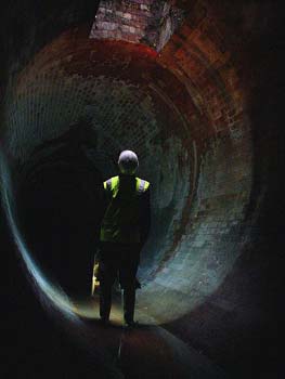
1.

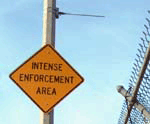
2.

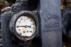
3.

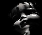
4.

NickInglisDotCom - My borders offend UER members. |
|
hjstom
   
Location: Taunton, MA
Gender: Male

| | Re: Industrial Decay
<Reply # 1 on 12/15/2006 1:32 PM >
| | | | I really like the first one. the second is good too
|
|
stoop_master

Location: south uk
Gender: Male
| | | Re: Industrial Decay
<Reply # 2 on 12/15/2006 3:27 PM >
| | | | Got to be one of the worst borders I have ever seen!
Photo's don't need borders
www.sub-urban.com www.st00p.net |
|
nickinglis
Location: Massachusetts
Gender: Male
my border says nickinglis.com, get offended.
| | | Re: Industrial Decay
<Reply # 3 on 12/15/2006 3:49 PM >
| | | | Posted by stoop_master
Got to be one of the worst borders I have ever seen!
Photo's don't need borders
|
Posting them here was an afterthought, don't think I put this much effort into posting on UER, they were already setup like this for my deviantart account. This is pretty useless feedback... so many people use borders, you'd be fighting about half of the photographic community in stating so firmly that "Photos don't need borders".
Posted by hjstom
I really like the first one. the second is good too
|
Thanks hjstom, appreciate it.
NickInglisDotCom - My borders offend UER members. |
|
Dowcet

Location: Middletown, ct
| |  | Re: Industrial Decay
<Reply # 4 on 12/15/2006 4:28 PM >
| | | | I think the border is OK except for the logo... the bigger and fancier and the more it overlaps with the image, the more it distracts from the photo. I've seen much worse, but to really take a look at your photos, I basically have to scroll up to cut the logo off. But the black border with the white line is fine.
I would say your composition is best in #1 and #2. In these images you balance clear points of primary and secondary interest, all in good spots of the frame. I personally don't find them particularly interesting points of interest though. In general, but especially in #3, your compositions do feel a bit cramped. That can add a sense of unease you might be going for, but in this case I think it just leaves out context that could make the images more interesting or whole-feeling. Try taking whatever shot you think looks right, then take a few steps back and another shot, and compare them when you get home
One thing #2 would have going for it is the color, but the image quality itself is kind of blue and washed out, which I would suggest you compensate for... without losing the natural look, make that red and yellow pop a bit more with the levels tool.
The focus, especially on #1 and #3 seems bad. Some people like a hazy look, but here I just think it looks like your using a cheap camera... if you are (I know I am), I understand you have to make the best of what you got, but either way I would make sure you use a tripod and make sure the focus and DOF are done with care. Maybe some Unsharp Mask filter would help, but I don't know.
Hope this is helpful, I look forward to seeing another round.
|
|
nickinglis
Location: Massachusetts
Gender: Male
my border says nickinglis.com, get offended.
| | | Re: Industrial Decay
<Reply # 5 on 12/15/2006 4:58 PM >
| | | | Thanks a ton Dowcet, that's exactly what I was looking for for critique. Thanks for taking the time in all of that. I'm using a decent SLR camera, but not uber fancy.
I think the focus is a little off just due to positioning in my hands and low light, my tripod leg broke when I was walking in the location. I had the aperature open a little longer than I probably should have while holding it and ended up with some ever so slight focus issues that I didn't see until I got home.
I'm going to see if I can play around with the colors on #2 to get that a little warmer looking, I think that'll bring some of that together better.
I really like the idea of finding the shot and then taking a few steps back. I think that's going to really help. Thanks dowcet, can't wait to post for critique again!
NickInglisDotCom - My borders offend UER members. |
|
Soho
Location: Boston MA, USA
Gender: Male

paths to the center of a circle are many
| | Re: Industrial Decay
<Reply # 6 on 12/16/2006 7:20 AM >
| | | | This is the honest truth. If you are afraid that what I am about to say might spoil your creativity then do not continue reading.
I'm glad you chose to continue reading. The subject has potential; however, you are taking a very tourist-oriented approach. It appears as if you walk into a room and take photos of what stands out immediately. You do chose somewhat interesting angles, yet, they are not what appears to be the most appropriate. These aren't the worst shots; yet, their value depends on your intentions. You should analyze your purpose in taking these photos. Are you documenting the site or are you taking a more artistic approach, or both? As for these specific images they are mediocre at best. When a "set" is published or released it usually has some theme. The images contribute to the theme; your images do have a theme, that being the interior of an abandoned building. What else do they have in common? It seems yellow is the predominant colour in all of the images, but that says very very little for your talent. The "legit" criticism is that you won't make it into any gallery with frames like these, sorry, but you either change and learn or you lose. 1 isn't sharp enough and you cut off the top of what appears to be the main subject. 2 is ok but the white on the left side looks blown out. 3 has horrible DOF with the angle- and it looks like your flash blew out a white hole to the left and above the switch farthest right. What appears to be the main subject in all of your images, excluding 4, is on the right side. 4 has not longitude to latitude correlation. The subject is a horizontal rectangle in a vertical rectangle frame. It seems locked in place.
I am not keen on "attacking" these photos; however, if you aspiration is to create a set of photographs which is admirable then you're going to have to learn one way or another. You can take what you wish from this comment, or completely disregard it. Call me some random asshole on the internet- or think about what I have said.
Using a tripod is often what makes part of the difference between a professional and amateur "looking" photo. As for the excuse of a photographer's camera being shitty, that is bullshit. One of the more talented pros around had a 30+ gallery composed of shots taken with a 4MP plastic "cheapie".
 Soho Soho
[last edit 12/16/2006 7:21 AM by Soho - edited 2 times]
|
|
Hi/Po
 
Location: Earth
Gender: Male
| | Re: Industrial Decay
<Reply # 7 on 12/16/2006 7:14 PM >
| | | | Posted by Soho
The "legit" criticism is that you won't make it into any gallery with frames like these, sorry, but you either change and learn or you lose.
|
Agreed, are you just trying to advertise your website or something?
|
|
nickinglis
Location: Massachusetts
Gender: Male
my border says nickinglis.com, get offended.
| | | Re: Industrial Decay
<Reply # 8 on 12/18/2006 2:47 PM >
| | | | Posted by Soho
Soho
|
Hahaha. Nice blue paw.
Although I appreciate the feedback, I think you're full of crap.
You do make a valid point about DOF... the same point was already made by people before you. Good job reading.
Posted by Soho
The "legit" criticism is that you won't make it into any gallery with frames like these, sorry, but you either change and learn or you lose.
|
The originals don't have the borders... you think I'd try to get into a gallery with these borders? If I was showing I clearly wouldn't show with those... I have those borders on there for my deviantart account. Deviantart shows a lot of thumbnails and I use the large frame to make my 'nails recognizable. I was pretty sure we had the border covered in previous posts... again, great job reading.
Oh but wait, you can read... you copied all of the previous feedback on the individual shots. Way to think for yourself.
btw... where are your pictures Soho? For someone with no pictures on here whatsoever you sure do talk a lot of shit. You're probably just some ugly kid who lacks the confidence to say things like this in real life... so you post them on UER. Yay for the lowest common denominator.
I appreciate your ability to make me laugh.
NickInglisDotCom - My borders offend UER members. |
|
schmoo

Location: San Fran, CA
Gender: Female

fun sized
| | | Re: Industrial Decay
<Reply # 9 on 12/18/2006 9:03 PM >
| | | | I don't understand why in this post, the main point of contention here was the fram e and the URL watermark. I see tons of great photographers here using borders without a peep. Even when I posted photos a few weeks ago, someone had said that borders would make my photos better. A comment I chose to ignore because it's irrelevant when critiquing the actual photograph. But my point is, the inconsistency of criticism here is sometimes not very heartening.
That said, the photo is the most important part. I think that the last photo is my favorite, but perhaps because it is the one that seems to have the best focus. I totally understand not getting the shot technically perfect due to circumstance and not realizing it until you get home and open up the files on your computer. Overall the pictures are a bit soft but I don't think these are by far the worst attempts I've ever seen in this forum. I love the dramatic lighting of #1, though working with curves might help it have a bit more "pop." #2 seems a bit too cool for my taste (though you've already addressed this) but #3 has some great textures. I always love photos that really show off what old paint can do.
Schmootography.com
Other stuff |
|
Soho
Location: Boston MA, USA
Gender: Male
paths to the center of a circle are many
| | Re: Industrial Decay
<Reply # 10 on 12/18/2006 10:14 PM >
| | | |
It is most unfortunate that you have chosen to demean an individual in this manner. My intent was not to provoke you; however, you seem to be quite offended. Quite frankly you have one or two things to learn about dealing with individuals. For example you state:
"btw... where are your pictures Soho? For someone with no pictures on here whatsoever you sure do talk a lot of shit. You're probably just some ugly kid who lacks the confidence to say things like this in real life... so you post them on UER. Yay for the lowest common denominator."
This appears to be a retaliatory statement made in response to criticism. Perhaps questioning the validity of my statements and responding with proper arguments against my statements would be better.
I see that you did not take the time to comprehend what I have written. My use of the word "frames" has no correlation to your "picture frames", as you appear to be convinced. By frames I mean photographs, and this is a slang term which has been in use for quite some time. My comment regarding frames intended to be: your pictures are nice; however, they are certainly not publication quality or exhibition quality for that matter. My photographs are not here on this site because just as you said, this is simply a trivial forum. My images are copyrighted and I am not about to release them publicly in digital format- regardless of quality.
Again regarding your comment, I must say that this is real life. This forum is as real as the people behind it. As for my "shit talking" you have not provided any evidence which suggests that my critique was invalid. And as for the probability of of me being "just some ugly kid who lacks the confidence to say things like this in real life" you are fortunately mistaken. Indeed it is fascinating that you chose not to attack my words; however, what you have chosen to attack an aspect of myself which no person can readily prove. It seems as luck was on your side this time.
Photography is subjective with objective elements, you ask for the objective supplements of your photography to be analyzed; and thus it shall be. Did you look back at your pictures with what I had said in mind, and determine if I was correct? I think not. Monsieur you will never make it as a photographer if you cannot learn from other people, especially if those people are your audience and peers.
The lowest common denominator consists not of the "ugly kids with no self confidence" as you seem to imply. The lowest denominator consists of individuals who present their mind with no forethought, retaliate, react, and more importantly are not willing to accept the truth.
You really want to see some of my images here you go. These are copyrighted etc... these are pretty bad so don't worry about me becoming an ax murderer if you steal them.
http://i147.photob...14/uvv01/lion2.jpg
http://i147.photob...14/uvv01/lion1.jpg
[last edit 12/19/2006 12:04 AM by Soho - edited 3 times]
|
|
350D
Location: Toronto Ontario
Gender: Male
| | | Re: Industrial Decay
<Reply # 11 on 12/18/2006 11:57 PM >
| | | | In my humble opinion...
1 - The machine itself does look interesting, but there are so many other elements in the shot that i think distract the eye.
2 - This is the best one. The colours are bright and im a sucker for signs and such. Once again tho i think there is too much in the frame. Mabey focus more on the writing and get some of the yellow of the wall in the background in.
3 - is blurry and the harsh light in the centre ruins it.
4 - is boring, nothing to capture the eye or imagination. And i think the harsh light under the numbers distracts.
Take what you will, but critques like these do help you get better.
|
|
nickinglis
Location: Massachusetts
Gender: Male
my border says nickinglis.com, get offended.
| | | Re: Industrial Decay
<Reply # 12 on 12/20/2006 3:47 PM >
| | | | Posted by sheepzeit
I don't understand why in this post, the main point of contention here was the frame and the URL watermark. I see tons of great photographers here using borders without a peep.
That said, the photo is the most important part. I think that the last photo is my favorite, but perhaps because it is the one that seems to have the best focus. I totally understand not getting the shot technically perfect due to circumstance and not realizing it until you get home and open up the files on your computer. Overall the pictures are a bit soft but I don't think these are by far the worst attempts I've ever seen in this forum. I love the dramatic lighting of #1, though working with curves might help it have a bit more "pop." #2 seems a bit too cool for my taste (though you've already addressed this) but #3 has some great textures. I always love photos that really show off what old paint can do.
|
Thanks for the feedback sheepzeit. I plan on taking a few of these over again because I personally enjoy the subject matter, this time with a tripod to try and combat some of the softness. I think my image sensor needs to be cleaned as well, I'm noticing some similar noise in all of my pictures, that may help as well. I'm going to keep working on these to see if I can perfect these particular photos and bring them back here when I do.
Soho. Nice lions. Still laughing.
NickInglisDotCom - My borders offend UER members. |
|
laslow
Location: Tewksbury, MA
you have quite a temper for someone who takes pictures of flowers
| | Re: Industrial Decay
<Reply # 13 on 12/20/2006 10:55 PM >
| | | | i started looking at these until i saw the advertisement+border
|
|
nickinglis
Location: Massachusetts
Gender: Male
my border says nickinglis.com, get offended.
| | | Re: Industrial Decay
<Reply # 14 on 12/21/2006 3:20 PM >
| | | | Posted by laslow
i started looking at these until i saw the advertisement+border
|
Seriously though, what about putting a watermark and border on a picture makes people at UER so offended?
NickInglisDotCom - My borders offend UER members. |
|
laslow
Location: Tewksbury, MA
you have quite a temper for someone who takes pictures of flowers
| | Re: Industrial Decay
<Reply # 15 on 12/21/2006 9:31 PM >
| | | | Posted by nickinglis
Seriously though, what about putting a watermark and border on a picture makes people at UER so offended?
|
it's not offending, it's just ugly.
if it was a tastefully blended logo (like good coffee) and a low-profile border, we wouldn't be complaining.
for example, adrian thomas can get away with it, because he probably has some background in graphic design or such.
you asked for critique. if you put an advertisement and a border we're going to critique them, too.
[last edit 12/21/2006 9:33 PM by laslow - edited 2 times]
|
|
|
|
All content and images copyright © 2002-2024 UER.CA and respective creators. Graphical Design by Crossfire.
To contact webmaster, or click to email with problems or other questions about this site:
UER CONTACT
View Terms of Service |
View Privacy Policy |
Server colocation provided by Beanfield
This page was generated for you in 140 milliseconds. Since June 23, 2002, a total of 739431434 pages have been generated.
|
|
