 |
 |
|
UER Store
|
|
sweet UER decals:

|
|
 |
 Wenn
   
Location: Pennsylvania
Gender: Female

 | |  | |  | Critique please...
< on 11/28/2006 7:54 PM >
|  | | | Could you please critique? Thank you.
1.

2.

3.

|
|
PunkUE
   
Location: Attleboro
Gender: Male

 | |  | |  | |  | Re: Critique please...
<Reply # 1 on 11/28/2006 7:57 PM >
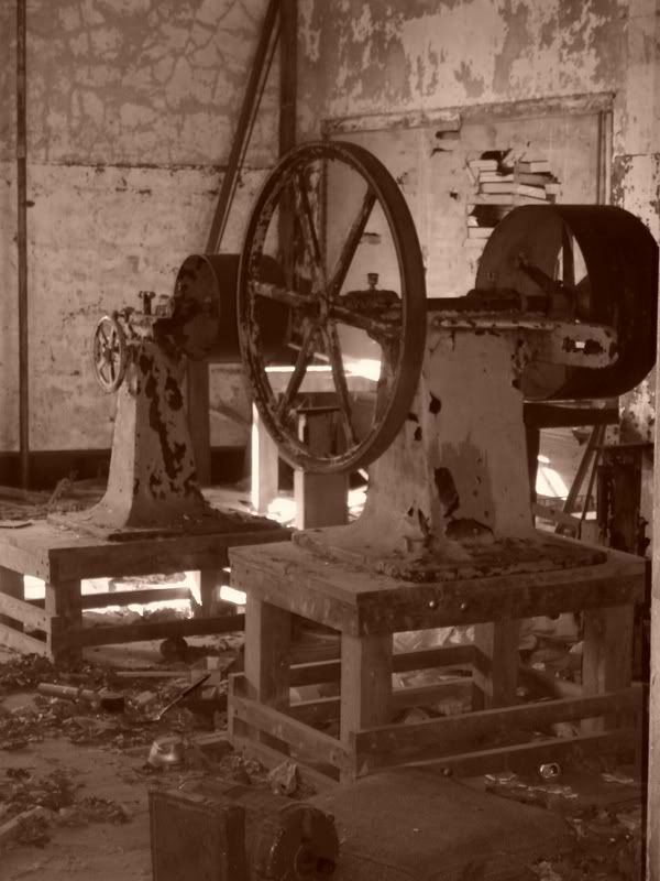
|  | | | Number 2 is nice, but I would have personally taken a few steps back.
"Shhhhh! The movie's gonna start and I dont want to miss the previews." |
|
femaledragonx
     
Location: Detroit & Everywhere Else I can dream up to go to

The singularity is near
 | |  | Re: Critique please...
<Reply # 2 on 11/28/2006 8:17 PM >
|  | | | yes, #2 is very nice. a slightly different framing would have been even better, but it looks nice the way it is as well. very rich colors and textures.
"Collective fear stimulates herd instinct, and tends to produce ferocity toward those who are not regarded as members of the herd." -Bertrand Russell
"How we spend our days is, of course, how we spend our lives." ~Annie Dillard |
|
Bluntanamo Bay

Location: NC
Gender: Male
 | |  | |  | Re: Critique please...
<Reply # 3 on 11/28/2006 10:18 PM >
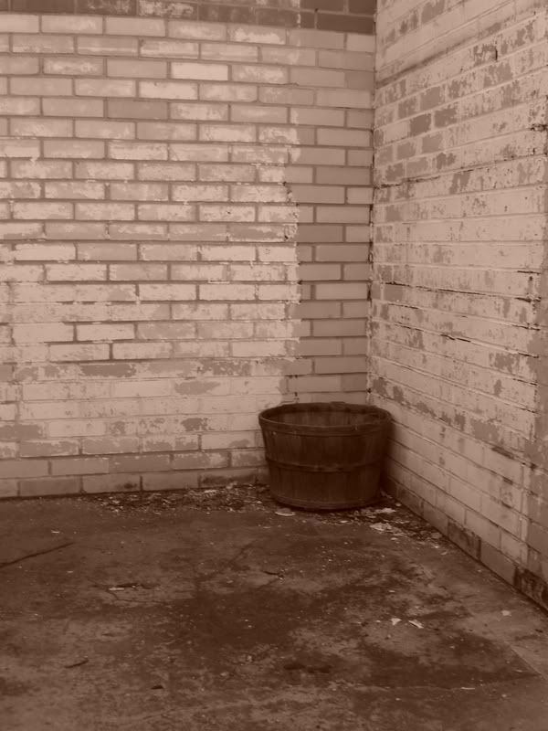
|  | | | 1. Good shot, and it captures the loneliness of abandonment. If you can go back, try getting down closer to the level of the pot and then moving back a little to get more in the frame. This will isolate it more and reinforce the emphasis of it as the subject matter.
2. Very nice shot. Good colors too.
3. Something about the framing makes me uneasy, but it's still solid. Don't forget to really move around your subject to get more unusual angles. Try taking a knee and looking up at it.
I am personally not a fan of the color effects in 1 and 3 (the name of it escapes me for some reason.) In some instances it works well to antique your photo, but I don't think it's working here.
|
|
Wenn
   
Location: Pennsylvania
Gender: Female

 | |  | |  | Re: Critique please...
<Reply # 4 on 11/29/2006 4:53 PM >
|  | | | Here's a shot in color (without the sepia)...

|
|
yota94
  
Location: AEQUITS.VERITAS. CALI.
Gender: Male

 | |  | Re: Critique please...
<Reply # 5 on 11/30/2006 6:39 AM >
|  | | | Posted by Wenn
Here's a shot in color (without the sepia)...

|
i like this better....and i agree with everyone that #2 is AWSOME
UER might as well be crack...
oh and Thats TOYOTA...dick. |
|
hedd
    
Location: Ottawa, ON, CA
Gender: Male

 | |  | |  | Re: Critique please...
<Reply # 6 on 12/1/2006 9:03 PM >
|  | | | Look at a histogram of #s 1 and 3 and you'll immediately see what's missing.
- BG |
|
tippa
      
Location: Pittsburgh, PA

boner jamz
 | |  | Re: Critique please...
<Reply # 7 on 12/1/2006 9:23 PM >
|  | | | focus. might have just been the sepcrapia. other than that they look pretty good.
[last edit 12/1/2006 9:24 PM by tippa - edited 1 times]
Not a single fuck given...
|
|
desmet
   

When the going gets weird, the weird turn pro.
 | |  | |  | |  | Re: Critique please...
<Reply # 8 on 12/2/2006 2:27 AM >
|  | | | 1 - Kind of boring, but you should crop this 8x10 to get rid of some of the height. If possible at 8x10 crop it to where the wall will meet the corner.
2 - Good, though I would rather see this landscape and a little closer in. The top is great but the middle and bottom aren't really interesting.
3 - You're not totally off with your composition, but I would like to see this farther back so that the edge of the picture was right at the edge of both machines.
1 and 3 need curves/levels...not enough contrast and the blacks aren't black. The sepia looks bad. I like sepia, but however you did the sepia didn't work out well...try another method of toning it.
[last edit 12/2/2006 2:28 AM by desmet - edited 1 times]
|
|
|
|
All content and images copyright © 2002-2024 UER.CA and respective creators. Graphical Design by Crossfire.
To contact webmaster, or click to email with problems or other questions about this site:
UER CONTACT
View Terms of Service |
View Privacy Policy |
Server colocation provided by Beanfield
This page was generated for you in 93 milliseconds. Since June 23, 2002, a total of 741265450 pages have been generated.
|
|


