 |
|
|
UER Store
|
|
 order your copy of Access All Areas today!
|
|
|
|
Activity
|
|
571 online
Server Time:
2024-05-11 21:41:32
|
|
|
 Urban Pirate
  
Location: Salt Lake City
Gender: Male
 | |  | Power Plant
< on 11/5/2006 11:32 PM >
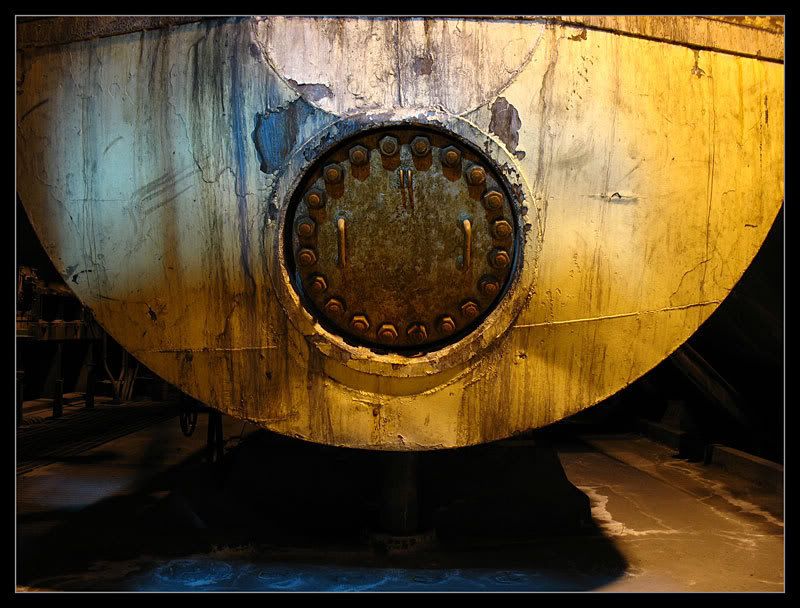
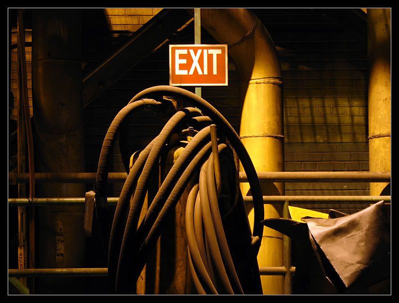
|  | | | Photos of the power plant of a steel factory.
1.
2.

3.
4.
5.
6.

Pirate.
www.urbantrespass.com |
|
mortimer
  
Location: teronno
| |  | Re: Power Plant
<Reply # 1 on 11/6/2006 12:02 AM >
| | | | Excellent work. Seriously good, nice shots, not cliched at all. The composition is superb.
#1 is perfect. Don't touch it.
#2 is really nice technically (ignore anyone who might bitch about 'blown highlights' - it's only highlights that are an integral part of the photograph that matter). I love that there's just enough detail to make out the lightbulb. It's a bit oversharpened.
#3 is almost a good shot - it's almost perfectly square, but a bit off, and (I'm guessing you were really close, with a really wide aperture) the centre's not completely sharp. Nice idea, it's almost there.
#4 is great, nice lines, good tones, I just wish the light was off to the left side rather than where it is. It just seems a bit off-balance as is. Otherwise great.
#5 and #6 are brilliant. My only complaint (easily remedied if you agree, if not ignore this) is that the colour is so yellow. I understand that that's the way it was while you were there, but getting rid of most of the tungsten colour, just leaving a hint, will make them much easier on the eyes, and still give the feeling of the dank lighting if you leave some of it there. #6 seems to have a bit of blue and magenta fringing going on in the bricks in the background, but it's fairly easily corrected.
Killer work, keep it up. 1, 5 and 6 are absolutely great, and very much unlike the average ue photo as well. If you keep shooting like this, please post photos more often.
yep. |
|
Melt
 
Location: Canada
Gender: Female
| | Re: Power Plant
<Reply # 2 on 11/6/2006 12:09 AM >
| | | | Awesome shots
Overall I really like the yellow tones going on. The photographs are really good.
Number 2 has a bit of an issue with the light in it. It is really gray compared to the surrounding, almost to dark. The space around it looks amazing though.
Number 4 could probably use some of the bottom pipe being cropped out. I don't think it really helps and its loss I think would make the photo nicer!
I totally love number 3 though. It is my favourite! Excellent photographs!!
|
|
argonian

Location: Toronto, ON
Gender: Female

"Now with added cats!"
| | Re: Power Plant
<Reply # 3 on 11/6/2006 12:36 AM >
| | | | I think they are great.
#1 bothered me a bit because I thought it was almost perfect, so I copied it, threw it in photoshop and rotated it 1.25 CCW and liked it much better.
#2 seems oversharpened and the blown out bits bother me. I find it too harsh.
#3 doesn't really do anything for me
the rest are absolutely stunning! especially #4
Que pasa, baby? |
|
kjohnnytarr
Location: Columbia, Missouri
Gender: Male

Team Asbestos: CoMO
| |  | Re: Power Plant
<Reply # 4 on 11/6/2006 1:51 AM >
| | | | That's very cool. I do really like the grime of it.
I've decided I don't much like uber close up shots of a detail on a wall or something because they just don't give a feel of the location, but in your case I make an exception because you've tied the whole set together well.
It seemed like a good idea at the time... |
|
baleze
 
Location: Montreal
Gender: Male

I don't really hate children. I just can't finish a whole one.
| | Re: Power Plant
<Reply # 5 on 11/6/2006 2:23 AM >
| | | | Super sharp, nice warm colors, no technical issue whatsoever.
#4 is a little weak in my opinion. And by weak I mean "not as good as the other ones".
http://www.flickr....otos/30228457@N05/
http://baleze.deviantart.com/
what |
|
mortimer
Location: teronno
| | | Re: Power Plant
<Reply # 6 on 11/6/2006 2:49 PM >
| | | | Add 17 and 18 from the set in the other forum, replacing 2 and 3 from this set, and you've got a killer set (*this is solely an opinion of course).
yep. |
|
Bones
Location: st.paul, minnesota
Gender: Male

| | | | Re: Power Plant
<Reply # 7 on 11/7/2006 3:06 PM >
| | | | I love them all except for 4 its just not that interesting to me.
out and under the town |
|
hedd
Location: Ottawa, ON, CA
Gender: Male

| | | Re: Power Plant
<Reply # 8 on 11/13/2006 11:02 PM >
| | | | I'll try not to repeat what mortimer said too much but he was bang-on with just about everything he said.
1. Great colors and tones here, and well composed, but the middle seems sharper while the right side seems to be a hair out of focus. Might be an aperture problem... or if it was intentional then I don't like it 
2. I instantly thought it was over-sharpened too... the edges of the light and the stairs make it obvious. Again, colour and composition are great.
3. Would be a decent shot if it were sharper.
4. An interesting shot because there are so many texture transitions from top to bottom, and I think those gritty pipes in the centre are the most interesting and well-lit which makes them a good subject. Nice job.
5. Not a fan of this one at all... the exit sign looks too modern, and looks like it was masked out of whatever you used to give the colour cast to the rest of the photo.
6. The light-play in this shot is spectacular... I would have cropped a bit more of the floor out to balance it and get that scale in absolute dead centre, but beyond that I love this shot. And I disagree with mortimer here and think that the colour tint adds volumes to this shot.
Great work guy! Thanks for posting.
- BG |
|
bourke
Location: Minneapolis
Gender: Female

| | | Re: Power Plant
<Reply # 9 on 11/16/2006 5:07 PM >
| | | | I love all the pictures, most UE pictures are just photos, this is art. To me anyway.
|
|
brandnewteeth

Location: Atlanta, Georgia
Gender: Male
Carry the torch that's never lit.
| | Re: Power Plant
<Reply # 10 on 11/16/2006 8:55 PM >
| | | | 1, 2, and 5.. I love this set.
mutantMandias: You're everywhere. You're the wind. You're the air. You're the bnt. brandnewteeth is like the Cyrus of Marietta gangs. CAN YOU DIG IT?
dsankt: BNT rocks shiny penny loafers. I heard he explores in them cos it puts a spring in his step for the laddies.
Contagion: I still think BrandNewTeeth is a prick, no matter what. Bitch ate all of my thanksgiving leftovers! |
|
|
|
All content and images copyright © 2002-2024 UER.CA and respective creators. Graphical Design by Crossfire.
To contact webmaster, or click to email with problems or other questions about this site:
UER CONTACT
View Terms of Service |
View Privacy Policy |
Server colocation provided by Beanfield
This page was generated for you in 93 milliseconds. Since June 23, 2002, a total of 741398314 pages have been generated.
|
|
