|
|
|
UER Store
|
|
 order your copy of Access All Areas today!
|
|
|
|
Activity
|
|
915 online
Server Time:
2024-05-02 20:57:44
|
|
|
 tullo
   
Location: Belleville New Jersey
Gender: Female
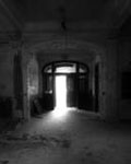
 | |  | |  | |  | Hotel- Critique to Death!!
< on 10/3/2006 4:51 AM >
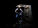
|  | | | Ok seriously, pick these apart. I've been feeling a little uninspired lately when I pull my photos out of my camera, so I tried a few new things that I don't normally do. Also I tried shooting in raw format for the first time, which wasn't so bad. Thanks in advance.
1. border- yay or nay?

2

3

4

5

6

7

8

9

10

11
Edit- taken out because I was dumb and shouldn't have posted this pic.
[last edit 10/3/2006 3:07 PM by tullo - edited 1 times]
http://www.designedbreakdown.com |
|
tullo
Location: Belleville New Jersey
Gender: Female
| | | | Re: Hotel- Critique to Death!!
<Reply # 2 on 10/3/2006 2:43 PM >
| | | | Posted by hedonisticvanity
names AND social security numbers. wow. thats... scary. i like the drawers of sod. what kind of RAW conversion software did you run it through?
|
Um....the one that opens when I drag the raw photo from adobe bridge to adobe photoshop? Lol. Oh geez. That's all I know. Is there a better one you can recommend?
http://www.designedbreakdown.com |
|
desmet

When the going gets weird, the weird turn pro.
| | | | Re: Hotel- Critique to Death!!
<Reply # 3 on 10/3/2006 3:05 PM >
| | | | I'd be happy to lend some critique if you want to take down the names and SS#'s...no reason to repeat the owner of the facility's mistake by posting that info online. That's the kind of stuff that makes it VERY easy for identity thieves and other criminals.
|
|
tullo
Location: Belleville New Jersey
Gender: Female
| | | | Re: Hotel- Critique to Death!!
<Reply # 4 on 10/3/2006 3:08 PM >
| | | | Posted by desmet
I'd be happy to lend some critique if you want to take down the names and SS#'s...no reason to repeat the owner of the facility's mistake by posting that info online. That's the kind of stuff that makes it VERY easy for identity thieves and other criminals.
|
Got it. That kind of crossed my mind when I posted that- stupid on my part. Apologies.
http://www.designedbreakdown.com |
|
desmet
When the going gets weird, the weird turn pro.
| | | | Re: Hotel- Critique to Death!!
<Reply # 5 on 10/3/2006 4:43 PM >
| | | | Thanks, not trying to tell you what to do or anything, just didn't think that one was a good idea.
1 - I like the colors in the leaves picking up the color in the chair, but the angle is kind of boring.
2 - Cool colors, boring angle. The chair shot thing is kind of overdone.
3 - I like the composition, the angle, and the focus on this one, but I would like to see a little more of the paper. The center of interest in the shot is the paper and it's not strong enough to carry the picture.
4 - Boring
5 - I like the light and texture of the grass. I might try to darken the midtones a tad.
6 - This might work but I would darken the midtones a lot to try and add more drama to the light.
7 - I think you should have shot this one either straight on, or at a more severe angle. The angle feels a little to accidental.
8 - I wish that corner of the drawer was in the shot, but I like this.
9 - Nothing specific but this just doesn't come together for me.
10 - I like this, though I would straighten itso the verticals are vertical.
|
|
kjohnnytarr
 
Location: Columbia, Missouri
Gender: Male
Team Asbestos: CoMO
| | | Re: Hotel- Critique to Death!!
<Reply # 6 on 10/3/2006 4:47 PM >
| | | | 2 5 and 8 I like. I wish you could read the paper in that one pic better.
It seemed like a good idea at the time... |
|
DelbertGrady

Location: Northeast PA
Gender: Male
Just looking around...
| | | Re: Hotel- Critique to Death!!
<Reply # 7 on 10/3/2006 4:57 PM >
| | | | Some pretty nice shots of that place... I'm really liking #8.
|
|
mortimer

Location: teronno
| | | Re: Hotel- Critique to Death!!
<Reply # 8 on 10/3/2006 6:03 PM >
| | | | 1/2: If you had more of these, all with the same angle, I'd like them. They're nice chairs. Some things are overdone, like chairs, wheelchairs, open door hallways and mail slots, but it is possible do something interesting with them. They're overdone for a reason - they make nice photos. And really, they're overdone on uer, not really in the rest of the world.
As for the border, nay to that border, yay to a clean one (unless that's actually a rough-cut neg carrier border from a colour darkroom, but it's not, so don't go there).
3/5/6/7: Nice light, boring subjects and/or angles. Sometimes shooting something straight on works well, simply because most people (and photography teachers) will tell you not to.
4: I like the almost monochromatic but very pink/peach feel of this. Nice composition, nice atmosphere. If you have cs2, straighten out the lines with the lens correction filter, that line the ceiling makes angled slightly across the top drives me nuts. If not, just tilt the whole thing ever so slightly counter clockwise.
8: Nice, great light, good subject, just wish the bottom corner of the drawer was still there.
9: Nice idea, might be better if the key in the front was the focus, either that or more out of focus. And crop out whatever that white thing is on the right.
10: I've seen this shot here many times, would probably work better straight or more angled. Might also benefit from being more front-focused.
Nice photos, good exposures/colours overall.
yep. |
|
tullo
Location: Belleville New Jersey
Gender: Female
| | | | Re: Hotel- Critique to Death!!
<Reply # 9 on 10/3/2006 6:47 PM >
| | | | Thank you, I appreciate all honesty in all of your comments, so I can get better at this.
http://www.designedbreakdown.com |
|
Drie
Rat-Hole Chic
Location: Hudson Valley NY
Gender: Female
bringing it back.
| | | Re: Hotel- Critique to Death!!
<Reply # 10 on 10/9/2006 11:07 PM >
| | | | #5 is the most accurate pic of that grass ive ever seen. Its exactly that color. pretty.
Drie - www.synestheticlight.com
"In the absence of the living, there still exists a life." |
|
|
|
All content and images copyright © 2002-2024 UER.CA and respective creators. Graphical Design by Crossfire.
To contact webmaster, or click to email with problems or other questions about this site:
UER CONTACT
View Terms of Service |
View Privacy Policy |
Server colocation provided by Beanfield
This page was generated for you in 140 milliseconds. Since June 23, 2002, a total of 740230967 pages have been generated.
|
|