 |
|
|
UER Store
|
|
 order your copy of Access All Areas today!
|
|
|
|
Activity
|
|
804 online
Server Time:
2024-05-03 02:06:22
|
|
|
 Drie
   
Rat-Hole Chic
Location: Hudson Valley NY
Gender: Female
bringing it back.
 | |  | |  | Show show showwww!
< on 9/26/2006 3:20 PM >
|  | | | Im doing a show soon, kind of a best of old stuff thing, as a favor to someone who's having a hard time getting peeople to hang at his place in the moment. Do any of these suck? and im sorry if some of you have seen some of this stuff a million times. these are my i dont knows.
[last edit 9/28/2006 1:56 PM by Avatar-X - edited 1 times]
Drie - www.synestheticlight.com
"In the absence of the living, there still exists a life." |
|
Brooks
 
Location: Fall River Ma
Gender: Male
| | | Re: Show show showwww!
<Reply # 1 on 9/26/2006 3:25 PM >
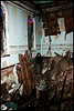
| | | | I enjoy 1 3 and 6 number 7 looks like a hotel I visited up in new york
|
|
maypost

Location: North, South, East, West, all around... then down to the underground
Gender: Male
Exploring if for n00bz0rz
| | Re: Show show showwww!
<Reply # 2 on 9/26/2006 3:30 PM >
| | | | 6 stands ou the most but all of then have their good points.
Exploring is like tattoos... They stopped being cool in 2005
|
|
mortimer
Location: teronno
| |  | Re: Show show showwww!
<Reply # 3 on 9/26/2006 3:51 PM >
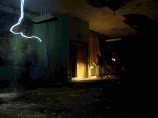
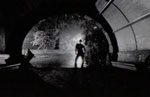
| | | | #1 is nice. Not making the hole in the floor the emphasis is good for this. Plus I dig the light door/dark interior contrasting with the dark door/light interior. Nice and subtle, hard to do with a dramatic missing floor.
#2 I don't care for so much, the light coming from behind you that's on the wall on the top right really bothers me for some reason - almost looks like a reflection on a window you shot through. Maybe big print size would make a difference. The lines are a bit off as well (impossible to fix, I know, but it still bothers me).
#3, again nice and subtle. It wouldn't work without the shadow at the top. Nice one.
#4 No focus, no real subject, the background looks like it's leaning to the right - this is the weakest one here IMO.
#5 is nice and simple, good composition, works well. Could benefit from a little perspective correction, to straighten out the slight shrink towards the left - this would be far more powerful if all the lines were perfectly square and straight.
#6 and #7 - beautiful. Nice subjects, composition, colours, crops - I love everything about both of these.
Overall, very nice. Drop 2 and 4, they're bringing the rest of these down.
Just curious - are these digi or film? How are you printing?
yep. |
|
Drie
Rat-Hole Chic
Location: Hudson Valley NY
Gender: Female
bringing it back.
| | | Re: Show show showwww!
<Reply # 4 on 9/26/2006 6:34 PM >
| | | | These are digi, and i use a printer in connecticut, wet mount them to foam core and coat them with this stuff thats meant for something completely different but makes them sort of, er...floaty. thanks for the feedback!
Drie - www.synestheticlight.com
"In the absence of the living, there still exists a life." |
|
Explorer Zero
 
| | | Re: Show show showwww!
<Reply # 5 on 9/27/2006 11:59 PM >
| | | | I think 6 is the least interesting
I think 1 & 2 are most excellent
|
|
ryan
This member has been banned. See the banlist for more information.
Location: Providence RI
Gender: Male

F/gayz
| | | | Re: Show show showwww!
<Reply # 6 on 9/28/2006 1:21 PM >
| | | | I love the last one. Mainly because that place is so kick ass!
I climb stuff!
Remember! Shop smart. Shop S-Mart \http://www.myspace.com/xitstheendx |
|
handskills

Location: Jer zay
Gender: Male
visual distress
| | | Re: Show show showwww!
<Reply # 7 on 10/6/2006 11:53 PM >
| | | | The couch and the shot with the table are outstanding. I'm not feeling the others as much.
|
|
GotPaisley!
Location: Lost.
Gender: Female
Exploring Gypsy!
| | Re: Show show showwww!
<Reply # 8 on 10/6/2006 11:55 PM >
| | | | I absolutely love the couch photo!
There must be quite a few things a hot bath won't cure, but I don't know any of them.
~Sylvia Plath, The Bell Jar
|
|
The Cob!

Location: Arizona
Gender: Male

No Refunds!
| | | Re: Show show showwww!
<Reply # 9 on 10/7/2006 9:18 AM >
| | | | Posted by 2Xplorations
I think 6 is the least interesting
I think 1 & 2 are most excellent
|
|
|
Homme
| | Re: Show show showwww!
<Reply # 10 on 10/7/2006 5:39 PM >
| | | | #6 is over-cropped. It stands out as the weakest, and doesn't really belong in this set.
#2 isn't quite up to snuff either. Great location, great elements - but it somehow isn't coming together for you with this shot.
#3 is beautiful. I disagree with the previous poster who thought the shadow across the top helped the composition. I'd argue that it should be mostly cropped out, as well as the horizon line adjusted to be more, well, horizontal.
#4 could use a re-crop. If you crop out the left and right somewhat (between the shadow and the first missing tile on the left, and somewhere in the middle of the pillar on the right) it would refocus your attention to the relationship between the large (stone?) rectangle in the mid-ground, and the darkened square on the back wall.
#5 nice photo, nothing super special. Fix the distortion on the left before you mount it.
#7 is great. The next time you're there - go early and clear out all those tables to some far corner behind you. As hands-on as that is, the resulting photograph would be insane.
#1 is phenomenal. I'd like to see it, maybe, not quite as closely cropped on the left. But it's still working.
[last edit 10/7/2006 5:39 PM by Homme - edited 1 times]
|
|
|
|
All content and images copyright © 2002-2024 UER.CA and respective creators. Graphical Design by Crossfire.
To contact webmaster, or click to email with problems or other questions about this site:
UER CONTACT
View Terms of Service |
View Privacy Policy |
Server colocation provided by Beanfield
This page was generated for you in 92 milliseconds. Since June 23, 2002, a total of 740261937 pages have been generated.
|
|


