 |
|
|
UER Store
|
|
sweet UER decals:

|
|
|
 350D
  
Location: Toronto Ontario
Gender: Male
 | |  | |  | critique me....
< on 7/16/2006 6:06 PM >
|  | | | I may have an oppertunity to sell some of my photos and i need some constructive critism. Iv picked some of my favourites and id like to know what people think.
Sorry about the link but the photos have been sharpened and they look like ass when i post them like that in the threads.
http://www.flickr....72157594194385098/
|
|
dundertits
    
Location: at the beginning

Cave Cave Deus Videt
| | Re: critique me....
<Reply # 1 on 7/16/2006 6:23 PM >
| | | | Damn,,
That suitcase is mega---phat....that is a keeper...and hell it is downsized out the ass...
Kabbalah is an undramatic tradition that requires great patience and stability. One of the reasons for this tempo is that everyone has to mature his potential gradually and thoroughly at his natural pace. In this way his life's work unfolds at the right moment in his own and the cosmos's time.
Z.B.S. Halevi -- Kabbalah |
|
I am the Bear
 
Location: Seattle Wa
Gender: Male

| | Re: critique me....
<Reply # 2 on 7/16/2006 6:40 PM >
| | | | i'm numbering these photos starting with the picture in the upper left corner, then clicking the "next" button. just to avoid any confusion.
#1. is a good picture with good values. some people may think its perfect. but it just doesn't excite me much. maybe if there was bright light streaming through that grate, i'd get excited.
#2. this is more appealing than the first one. you did a good job of applying the narrow depth of field. it works for me. highlights the foreground. i also like how the focus is on the left. i always like that more, and i suspect the reason has something to do with the fact that i read from left to right (like everyone else).
#3. another one with heavy contrast, its a better BW photo than #1 in my humble opinion. its wonderful how the darkest areas in the photo are tucked between the brightest areas (the patch of bricks inside the arch). a lot of stuff to look at, well framed. i like it
(this is going to be a long critique, wow)
#4. i'm going to just say its nice, centered, easy to enjoy, but i'm not excited about it.
#5. its not straight. that kinda bothers me. rotate it clockwise a bit.
#6. its cool. its bold and a kind of minimalist approach. but its also got life to it. however, i think i would like it more in color. but only if thats a blue sky.
#7. very dramatic, that white spot on the wall feels too bright. could you possibly burn that in?
#8. another dramatic one. very crisp. i feel like something can be done to improve it, but i cant think of what. sorry
#9. ooh neat. i can tell this was color, but you unsaturated it almost completely. (what if its not? then i look like an idiot) i'd hang it in my room. its very pretty and i suspect the small black slot in the wall amid the white smears has a lot to do with it.
#10. pretty clouds. this is not my style though. my mother, however, would probably buy it in a heartbeat.
#11. you really like dramatic shots, dont you? splendid. usually when people take hallway shots, they use a tilted frame. obviously, you did not. i think its splendid.
in retrospect, my favorites were #3 and #9. my least favorites were #1 and #10.
(longest reply EVER)
|
|
sarnelefant
Location: Navarre, FL
Gender: Female

| | | Re: critique me....
<Reply # 3 on 7/16/2006 8:07 PM >
| | | | http://www.flickr....72157594192344370/
I really like this photograph. This should be your #1. It looks like something from a Magnum photographer. Unfortunately, I think the 10 you chose as your personal favorites weren't very dynamic.
Whoops...I really like this one too:
http://www.flickr....72157594144415854/
by the way, I think that if you choose to display your images in B/W, you shouldn't display the color version as well.
[last edit 7/16/2006 8:11 PM by sarnelefant - edited 1 times]
|
|
I am the Bear
Location: Seattle Wa
Gender: Male
| | Re: critique me....
<Reply # 4 on 7/16/2006 8:19 PM >
| | | | Posted by sarnelefant
http://www.flickr....72157594192344370/
I really like this photograph. This should be your #1. It looks like something from a Magnum photographer. Unfortunately, I think the 10 you chose as your personal favorites weren't very dynamic.
Whoops...I really like this one too:
http://www.flickr....72157594144415854/
by the way, I think that if you choose to display your images in B/W, you shouldn't display the color version as well.
|
wow i agree. i like those two a lot. makes me wonder what else you have hidden away...
|
|
350D
Location: Toronto Ontario
Gender: Male
| | | Re: critique me....
<Reply # 5 on 7/16/2006 8:43 PM >
| | | | Thanks for the input feel free to recomend shots you like if you want to. At this point im just trying to narrow the good ones down to 10.
"by the way, I think that if you choose to display your images in B/W, you shouldn't display the color version as well."
whats your reasoning behind this if you dont mind me asking
|
|
sarnelefant
Location: Navarre, FL
Gender: Female
| | | Re: critique me....
<Reply # 6 on 7/16/2006 8:59 PM >
| | | | Posted by 350D
whats your reasoning behind this if you dont mind me asking
|
Someone said it well on another post....something like what you display should be your best and final product. So what's the point in showing both images? There must have been some reason you decided the color image wasn't to your liking, or perhaps that you felt the B/W would be more dramatic...so why post the color? I don't know...maybe I'm being narrow-minded, but I think B/W should be very intentional. And by displaying both, it doesn't seem you shot the images with B/W in mind. Does this make any sense, or am I completely off my rocker?
|
|
Arch-Image
Location: DFW
Gender: Male
"This gene pool could use a little chlorine."
| | | Re: critique me....
<Reply # 7 on 7/16/2006 9:48 PM >
| | | | I'll start with saying Bear is right, long winded comment ...
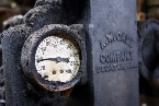
Bottom line, you have some awesome shots, but there’s shots other than ones you chose I think are better. A few of those are slightly blurred and jittery looking which really put me off. I love the shot of the pipes but in full size it’s not as sharp as it should be as an example.
some examples of ones I liked ....
Very nice for machinery ....
http://www.flickr....72057594068145722/
Something about this shot just grabs me emotionally. It brings everything together for me about this having been an orphanage and I hear the kids, screaming laughing and crying all at once. (Sorry to get so dramatic but really reaches me)
http://www.flickr....72157594144225413/
Great Color
http://www.flickr....72057594048899498/
Great use of color and textures
http://www.flickr....72057594048936124/
Had to stop at the above location but I had to add this one, great shot, reminds me a lot of something Steiglitz would have shot, very nice!
This one you chose from lister I really like http://www.flickr....72057594068145722/
"Your kid may be an honor student but YOU'RE still an IDIOT!" |
|
350D
Location: Toronto Ontario
Gender: Male
| | | Re: critique me....
<Reply # 8 on 7/17/2006 2:33 AM >
| | | | The slightly blurred and jittery look comes from the fact that i still have the starter lense for the rebel xt. Iv heard people say its not THAT bad, and at first it wasnt but now the shots come out so soft. anywho thanks for the input ill keep in mind some of your suggestions. anymore critquing out there...
|
|
Arch-Image
Location: DFW
Gender: Male
"This gene pool could use a little chlorine."
| | | Re: critique me....
<Reply # 9 on 7/17/2006 2:42 AM >
| | | | Posted by 350D
The slightly blurred and jittery look comes from the fact that i still have the starter lense for the rebel xt. Iv heard people say its not THAT bad, and at first it wasnt but now the shots come out so soft. anywho thanks for the input ill keep in mind some of your suggestions. anymore critquing out there...
|
In the smaller size shots they dont look bad at all, I think the pipes shot, which I really like, would probably look great at 5x7 and maybe even 8x10, in some it could even add to the shot in some ways. As for the softness, it's sorta interesting I went to a photo exhibit last weekend of 100 photos from the carter museum archives, which probably has one of the best collections in the world of photography, lot's of old masters and it was sort of nice to see the grey scales and softness of so many of the photos. Sometimes I think in our "digital" age we go for such strong sharpness we forget how nice a soft shot with lots of greys can be! Good Luck on the sales!
"Your kid may be an honor student but YOU'RE still an IDIOT!" |
|
|
|
All content and images copyright © 2002-2024 UER.CA and respective creators. Graphical Design by Crossfire.
To contact webmaster, or click to email with problems or other questions about this site:
UER CONTACT
View Terms of Service |
View Privacy Policy |
Server colocation provided by Beanfield
This page was generated for you in 93 milliseconds. Since June 23, 2002, a total of 739499880 pages have been generated.
|
|
