 |
 |
|
UER Store
|
|
 order your copy of Access All Areas today!
|
 |
 |
|
Activity
|
|
811 online
Server Time:
2024-05-12 16:35:10
|
|
 |
 JustINSANE
  
Location: NJ/Boston
Gender: Male

 | |  | |  | 4 more to take apart
< on 6/14/2006 5:47 PM >
|  | | | 


"brocore" |
|
Ian
     
This member has been banned. See the banlist for more information.
Location: The County of Kings
Gender: Male

"Great architecture has only two natural enemies: water, and stupid men."
 | |  | Re: 4 more to take apart
<Reply # 1 on 6/14/2006 6:52 PM >
|  | | | OK, I always give an honest critique, so please take non of this personally
1 is terrible. it's a blown-out window with nothing interesting to draw the eye. the only even remotely engaging part of it is the little hook sticking up above the first set of panes.
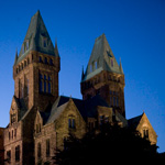
2 looks overly photoshopped or manipulated somehow. there's too much blue/cyan in the mix - looks like you were trying to bring out the sky artificially, the colors make me cringe. other than that, I would have included more of the smokestacks. the sky would have been there in any case; having some more interesting material would make the shot better.
3 is the best of the lot, although I get the sense from the greytones that it's a desaturated colour image, which never looks as good as true B&W. the lightbulb immediately grabs the eye, which is good. however, the rest of the interesting detail is all shadowed out, while the boards in the background draw the eye out of the frame. i'm not really sure how to improve this one, but it's a good start for you.
4 is sorta interesting, but so overexposed that it couldn't possibly work.
I'd say the main things you should be focusing on are composition and exposure control.
|
|
POOP
 
Location: Connecticut
Gender: Male

Hey Ed!
 | |  | |  | Re: 4 more to take apart
<Reply # 2 on 6/14/2006 6:57 PM >
|  | | | do you shoot with film?
my camera is better than yours! |
|
JustINSANE
  
Location: NJ/Boston
Gender: Male

 | |  | |  | Re: 4 more to take apart
<Reply # 3 on 6/14/2006 7:19 PM >
|  | | | i shoot with a EOS Canon digital rebel Xt
and number that's how it came out i shot it that way only thing i did on photoshop was crop a tiny part of the building out on the bottom
thanks
"brocore" |
|
maggiedotcom
 
Gender: Female
 | |  | |  | |  | Re: 4 more to take apart
<Reply # 4 on 6/14/2006 7:29 PM >
|  | | | Posted by Leviathan
3 is the best of the lot, although I get the sense from the greytones that it's a desaturated colour image, which never looks as good as true B&W. the lightbulb immediately grabs the eye, which is good. however, the rest of the interesting detail is all shadowed out, while the boards in the background draw the eye out of the frame. i'm not really sure how to improve this one, but it's a good start for you.
|
to improve this one, which i agree is the best of the bunch, i would say to pay attention to the lines on the wall and the line of the board/pipe the light is hanging from. they aren't aligned perfectly horizontally, throwing the composition off. if you realign the photo, you'd probably be best off realigning the pipe above the bulb (which is brighter than the lines of the wall). it'd be a very very easy and simple way to improve the picture.
also, it might not be your thing but a little border never hurt anyone.

[last edit 6/14/2006 7:38 PM by maggiedotcom - edited 2 times]
|
|
lasthourstand
  
Location: Syracuse, NY
Gender: Male

You've got head pigeons!
 | |  | |  | |  | Re: 4 more to take apart
<Reply # 5 on 6/14/2006 7:35 PM >
|  | | | Number 1: The windows being so blown out really ruins the image. Not a lot to grab your attention.
Number 2: Looks too artificial. The whole image has a cyan color cast. Not very interesting compositionally, too much negative space that doesn't interact at all with the positive space.
Number 3: The center of focus is pulled up towards the support beam instead of on the bulb. Not a lot of highlights, might considering pushing the contrast up.
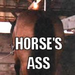
Number 4: Very interesting, but overexposed. I'd like to see the front wheel in the bottom of the shot.
Overall, the set has problems with exposure and composition. Maybe you're encountering some metering problems, not sure. Number 4 is my favorite out of the group. Hope this helps with future shoots.
Today is your way out... |
|
JustINSANE
  
Location: NJ/Boston
Gender: Male

 | |  | |  | Re: 4 more to take apart
<Reply # 6 on 6/14/2006 7:54 PM >
|  | | | ok i'll keep it mind next time i shoot
THANKS!
"brocore" |
|
|
|
All content and images copyright © 2002-2024 UER.CA and respective creators. Graphical Design by Crossfire.
To contact webmaster, or click to email with problems or other questions about this site:
UER CONTACT
View Terms of Service |
View Privacy Policy |
Server colocation provided by Beanfield
This page was generated for you in 140 milliseconds. Since June 23, 2002, a total of 741477019 pages have been generated.
|
|

 order your copy of Access All Areas today!

