|
|
|
UER Store
|
|
 order your copy of Access All Areas today!
|
|
|
 argonian
   
Location: Toronto, ON
Gender: Female

"Now with added cats!"
 | |  | first post here...be mean
< on 5/15/2006 10:51 PM >
|  | | | I am trying to learn. You can do anything to the pictures, but please explain what you did and what I should do as if I was a child. I am a bit slow.
The camera is a Fuji s9000.
I tried to follow Glass' rules. If I screwed up, forgive me.
1.
2.
3.
Que pasa, baby? |
|
YellowSnow

Gender: Male

| | Re: first post here...be mean
<Reply # 1 on 5/16/2006 12:27 AM >
| | | | Ahhhh! Why did you take your mask off in 1? Now you're lungs are fucked.
Anyways, nice pictures, I like all of 'em.
>_> |
|
argonian
Location: Toronto, ON
Gender: Female
"Now with added cats!"
| | Re: first post here...be mean
<Reply # 2 on 5/16/2006 12:45 AM >
| | | | Posted by YellowSnow
Ahhhh! Why did you take your mask off in 1? Now you're lungs are fucked.
Anyways, nice pictures, I like all of 'em.
|
I have no mask. That was there. The picture was taken in a locker room for fellows who worked with coke ovens. I should have taken it though, my throat still hurts.
Que pasa, baby? |
|
pirate3

Location: oakville, ontario
Gender: Female
| |  | Re: first post here...be mean
<Reply # 3 on 5/16/2006 1:34 AM >
| | | | I like your compositions
i don't like your "I'm slow" comment
your work shows thought and insight...more confidence please
I'd like to see more detail from the shadows of the lock in the third pic
perhaps try a few compositions for the third with key being more head-on
#2 could be nice isa black and white shot
nice work, keep posting
|
|
NAN
 
Location: rochester NY

bathroom expert
| | | Re: first post here...be mean
<Reply # 4 on 5/16/2006 1:44 AM >
| | | | I like them! I would like to see a few more. The lighting is really nice
Through the darkness of future's past
The magician longs to see
Once chants out between two worlds Fire, walk with me |
|
argonian
Location: Toronto, ON
Gender: Female
"Now with added cats!"
| | Re: first post here...be mean
<Reply # 5 on 5/16/2006 2:09 AM >
| | | | To be clear, I would prefer critiques on my pictures to critiques on my personality. On the other hand, I did say be mean.
Que pasa, baby? |
|
Dowcet
 
Location: Middletown, ct
| |  | Re: first post here...be mean
<Reply # 6 on 5/16/2006 3:12 AM >
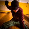
| | | | In #1, I would have held the camera down a little closer to the windowsill, and pointed it in a line of sight that was more parallel then perpendicular to it. Perhaps more importantly, a very good rule of thumb to keep in mind is that ***you don't usually want any digonal lines that point into the corner*** like that, because its like an arrow pointing your eye AWAY from the subject. Its especially ruinous in this composition because there is that interesting patch of orange all the way in the very corner. I would have tried to positioned that to be a kind of secondary subject that balances the respirator. The respirator is a pretty boring subject, but I like the purple / black / orange combo, and the quality of the light, and the strong lines.
In #2, the most obvious problem I see is too much solid black space. Used right that can be good, but here its just a waste.
I think #3 had a lot of potential. The colors and textures make the subject in this one slightly more interesting to me then the other two... A little too tightly cropped for my taste though. I would also have tried to shoot the door perfectly vertical (or rotated in photoshop)... Like the black space thing, experimenting with odd angles can be a very good idea, but I'm not sure if it works here.
I look forward to your next back of pictures!
|
|
argonian
Location: Toronto, ON
Gender: Female
"Now with added cats!"
| | Re: first post here...be mean
<Reply # 7 on 5/16/2006 11:37 PM >
| | | | Posted by Dowcet
In #1, I would have held the camera down a little closer to the windowsill, and pointed it in a line of sight that was more parallel then perpendicular to it. Perhaps more importantly, a very good rule of thumb to keep in mind is that ***you don't usually want any digonal lines that point into the corner*** like that, because its like an arrow pointing your eye AWAY from the subject. Its especially ruinous in this composition because there is that interesting patch of orange all the way in the very corner. I would have tried to positioned that to be a kind of secondary subject that balances the respirator. The respirator is a pretty boring subject, but I like the purple / black / orange combo, and the quality of the light, and the strong lines.
In #2, the most obvious problem I see is too much solid black space. Used right that can be good, but here its just a waste.
I think #3 had a lot of potential. The colors and textures make the subject in this one slightly more interesting to me then the other two... A little too tightly cropped for my taste though. I would also have tried to shoot the door perfectly vertical (or rotated in photoshop)... Like the black space thing, experimenting with odd angles can be a very good idea, but I'm not sure if it works here.
I look forward to your next back of pictures!
|
#1 - I should be going back soon and will try the shot again, from numerous angles. I have never thought of that diagonal line issue. I will try to keep it in mind. Regarding the respirator, unfortunately, I am truly a sucker for a boring subject, that is something I can't and shant change.
#2 - I have had numerous talks from people about my love for black. I think it goes along with my love for the boring subject. I have actually gotten allot better with it over the last few months, but it will be a hard thing to break away from.
#3 - I got nothing to say, but I will straighten it in photoshop and see what I think.
Thanks for taking the time to criticize me! It can only help!
Que pasa, baby? |
|
Glass
Location: Chicago
as one does
| | | Re: first post here...be mean
<Reply # 8 on 5/20/2006 10:16 PM >
| | | | Hey, don't think we've met!
I like what you're doing with the darkness in the first two, but note that the dynamic range suffers with that style. The third I don't like because of the awkward composition.
1)
I like the best. I would like to bring back a little shadow behind the headstrap just the highlight the texture of the dirty window a little better. The small color pallette really helps you in this photo, so I'd want to throw it in photoshop and remove the snippet of orange in the upper left.
2)
Could be sharper, and I might like it better in black and white because of the distracting color difference between the back and foreground.
3)
Like I said above, it is just composed beyond what you can do in photoshop. I would have liked a better background, like a dark figure in that right half, or even the stereotypical chair.
Glassius
|
|
argonian
Location: Toronto, ON
Gender: Female
"Now with added cats!"
| | Re: first post here...be mean
<Reply # 9 on 5/20/2006 11:45 PM >
| | | | Glass
Thanks for looking and for your comments.
I have cropped out the orange in 1 and it is much better. Unfortunately I don't know photoshop so well so I would need explicit instructions to do anymore with the picture.
Regarding 2, I haven't been using digital for very long and I still haven't gotten use to the idea of bw digital. I am an old fashioned lady, who fiercly fights new fangled technology, but always loses. So soon enough I will be in a better position to view it in black and white, just not right now.
Que pasa, baby? |
|
Glass
Location: Chicago
as one does
| | | Re: first post here...be mean
<Reply # 10 on 5/20/2006 11:48 PM >
| | | | What version of photoshop are you using? I know five or so good methods of getting *GOOD* monochrome and black and white.
|
|
argonian
Location: Toronto, ON
Gender: Female
"Now with added cats!"
| | Re: first post here...be mean
<Reply # 11 on 5/20/2006 11:59 PM >
| | | | cs2
Que pasa, baby? |
|
Glass
Location: Chicago
as one does
| | | Re: first post here...be mean
<Reply # 12 on 5/21/2006 12:01 AM >
| | | | If you're used to film the best way is probably going to be through the channel mixer. Click the 'monochrome' box and you can change color levels.
Tell me if that works for you: if not, many more methods to go!
Glass
|
|
argonian
Location: Toronto, ON
Gender: Female
"Now with added cats!"
| | Re: first post here...be mean
<Reply # 13 on 5/21/2006 12:18 AM >
| | | | Seriously, I know nothing of Photoshop. I had to go through help to find what you were talking about. Anyhow, I managed to do it and I am not happy. I will fiddle some more and see what I think. I just am having problems emotionally accepting bw digital. I hope to be over this by the end of next month.
Thanks again for your advice and encouragement.
Que pasa, baby? |
|
argonian
Location: Toronto, ON
Gender: Female
"Now with added cats!"
| | Re: first post here...be mean
<Reply # 15 on 5/21/2006 12:41 AM >
| | | |
Thanks for the link. If you have any other photoshop guide/tip links feel free to pass them along.
Que pasa, baby? |
|
mortimer
Location: teronno
| | | Re: first post here...be mean
<Reply # 16 on 5/23/2006 5:47 PM >
| | | | #2 would be quite nice as a square, without the windows at all.
Adobe has quite a few decent tutorials on their website dealing with all kinds of fun (and all kinds of useless) stuff.
Also, if these are from Lackawanna, for the love of all that's holy, don't go anywhere near the welfare buildings without your own mask, that whole section on the other side of the canal is seriously toxic.
yep. |
|
Glass
Location: Chicago
as one does
| | | Re: first post here...be mean
<Reply # 17 on 5/23/2006 5:49 PM >
| | | | Posted by mortimer
Adobe has quite a few decent tutorials on their website dealing with all kinds of fun (and all kinds of useless) stuff.
|
i.e. their "Create Your Own Lighting Bolt!" tutorial.
Hahaha!
|
|
mortimer
Location: teronno
| | | Re: first post here...be mean
<Reply # 18 on 5/23/2006 9:09 PM >
| | | |
| i.e. their "Create Your Own Lighting Bolt!" tutorial. |
Yeah, and there was that one about adding flames and stuff...never mind, go here instead:
http://www.luminou...orials/index.shtml
Incidentally the only place I found a decent explanation and tutorial on hdr (as in how to use it properly instead of using it as a cheap, gimmicky special effect filter).
yep. |
|
argonian
Location: Toronto, ON
Gender: Female
"Now with added cats!"
| | Re: first post here...be mean
<Reply # 19 on 5/24/2006 12:22 AM >
| | | | Posted by mortimer
#2 would be quite nice as a square, without the windows at all.
|
I will give it a whirl
Posted by mortimer
Also, if these are from Lackawanna, for the love of all that's holy, don't go anywhere near the welfare buildings without your own mask, that whole section on the other side of the canal is seriously toxic.
|
I was actually on that side, without a mask, for a whole day. It finally convinced me to buy a mask. My throat was sore for a week and I still find myself losing my voice. I assumed it was a bit of the black lung, from the black clouds I kept walking through that were blowing off the piles.
Que pasa, baby? |
|
|
|
All content and images copyright © 2002-2024 UER.CA and respective creators. Graphical Design by Crossfire.
To contact webmaster, or click to email with problems or other questions about this site:
UER CONTACT
View Terms of Service |
View Privacy Policy |
Server colocation provided by Beanfield
This page was generated for you in 125 milliseconds. Since June 23, 2002, a total of 739888747 pages have been generated.
|
|