|
|
|
UER Store
|
|
 order your copy of Access All Areas today!
|
|
|
 desmet
   
When the going gets weird, the weird turn pro.
 | |  | |  | |  | Serenity
< on 5/12/2006 2:20 AM >
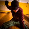
|  | | | My trip last weekend, photographically. I have a loooot of stuff to process and I'll be posting more as it goes up on my site. I'd appreciate any feedback or critique people have.
(1) Around the Corner

(2) Sheltered Corner

(3) Warming

(4) Serenity in Yellow

(5) Temperature Controlled

|
|
JonnyVpa

Location: Atlanta, GA and Scranton, PA (Hometown)
Gender: Male

ROTTEN FUCK!!!
| |  | | | Re: Serenity
<Reply # 1 on 5/12/2006 5:56 AM >
| | | | Very nice.... Very Sharp.... i like em... it was much different from many pics i see on this forum....
Nice Job
If I had a Rocket Launcher, some son of a bitch will die - Bruce Cockburn |
|
Axle
  
Location: Milton, ON
Gender: Male
Sieg oder Tod
| | Re: Serenity
<Reply # 2 on 5/12/2006 1:47 PM >
| | | | very clean work. There's only one problem I have in my view...4 is a little busy, but it could just be me.
Celer at Audax
Para la Victoria Siempre Alemanes! |
|
flapjack
Location: Manhattan, New York
Gender: Male
| | | Re: Serenity
<Reply # 3 on 5/12/2006 1:59 PM >
| | | | 4 and 5 really stand out!
|
|
Glass
 
Location: Chicago
as one does
| | | Re: Serenity
<Reply # 4 on 5/12/2006 3:20 PM >
| | | | I like #4. The rest have blown highlights...
Thanks for breaking the 3-week-long dark (not) spooky asylum photo roll-on.
Grassimus
|
|
Ian
This member has been banned. See the banlist for more information.
Location: The County of Kings
Gender: Male

"Great architecture has only two natural enemies: water, and stupid men."
| | Re: Serenity
<Reply # 6 on 5/12/2006 3:56 PM >
| | | | 1 doesn't do anything for me; it's well composed and the colours are good, but I dunno - it's a nice shot, but that's really it.
I like two a lot, blown highlights nonwithstanding. Great composition.
3 is pretty well done for what it is, but I think I've seen too many of this shot (the bright light hitting the floor from a window.
4 rocks; I like the angle a great deal.
5 is good, but would be better if you hadn't cropped so closely on the right. I think a little more pipe there would greatly improve it.
|
|
flapjack
Location: Manhattan, New York
Gender: Male
| | | Re: Serenity
<Reply # 7 on 5/12/2006 5:11 PM >
| | | | Posted by Leviathan
5 is good, but would be better if you hadn't cropped so closely on the right. I think a little more pipe there would greatly improve it.
|
I was thinking about 5 again. I think this shot might be a little better if you shot it with a longer lens and tried to eliminate some of the perspective on the left hand knobs. I am assuming that that is a flat wall you are shooting at.
|
|
desmet
When the going gets weird, the weird turn pro.
| | | | Re: Serenity
<Reply # 8 on 5/12/2006 5:33 PM >
| | | | Posted by Glass
I like #4. The rest have blown highlights...
Thanks for breaking the 3-week-long dark (not) spooky asylum photo roll-on.
Grassimus
|
Only 2 and 3 have blown highlights and 3 was on purpose (it's a bracket and blend but the "clean" version sucked...no feeling). 2 bummed me the fuck out though. I wanted to bust out the tripod but unfortunately that shot just happened to be in a rather critical area.
Thanks for the feedback!
|
|
desmet
When the going gets weird, the weird turn pro.
| | | | Re: Serenity
<Reply # 9 on 5/12/2006 5:34 PM >
| | | | Posted by robdobi
saturation seems a wee bit high.
|
Yea, I struggle with that. I used a lot of Fred Miranda's Velvia Vision on these. Some people like the colors the best, some people think they're oversaturated. I go back and forth agreeing with both.
Thanks!
|
|
desmet
When the going gets weird, the weird turn pro.
| | | | Re: Serenity
<Reply # 10 on 5/12/2006 5:37 PM >
| | | | Posted by Leviathan
1 doesn't do anything for me; it's well composed and the colours are good, but I dunno - it's a nice shot, but that's really it.
I like two a lot, blown highlights nonwithstanding. Great composition.
3 is pretty well done for what it is, but I think I've seen too many of this shot (the bright light hitting the floor from a window.
4 rocks; I like the angle a great deal.
5 is good, but would be better if you hadn't cropped so closely on the right. I think a little more pipe there would greatly improve it.
|
Thanks a lot man, this is very helpful.
I was actually thinking about some of your work when I shot 5. I almost walked past it but I was like "I gotta try something different". 
|
|
desmet
When the going gets weird, the weird turn pro.
| | | | Re: Serenity
<Reply # 11 on 5/12/2006 5:40 PM >
| | | | Posted by flapjack
I was thinking about 5 again. I think this shot might be a little better if you shot it with a longer lens and tried to eliminate some of the perspective on the left hand knobs. I am assuming that that is a flat wall you are shooting at.
|
Ohhhh man. What a good fucking idea. I shoot mostly with my 16-35 and I took that shot literally on top of that subject. It's actually the same room as #4, so you can see how tight it was. I should have shot from the other side of the tub and even put on the 24-70 if I had to. This is really great feedback...I am so into wide shots that sometimes I forget to use tele to my advantage. Thanks a lot for this comment.
|
|
Ian
This member has been banned. See the banlist for more information.
Location: The County of Kings
Gender: Male
"Great architecture has only two natural enemies: water, and stupid men."
| | Re: Serenity
<Reply # 12 on 5/12/2006 6:22 PM >
| | | | Posted by flapjack
I was thinking about 5 again. I think this shot might be a little better if you shot it with a longer lens and tried to eliminate some of the perspective on the left hand knobs. I am assuming that that is a flat wall you are shooting at.
|
absolutely agree
less tight cropping on the right, and a more flattened perspective via a telephoto and this shot would be stunning
|
|
|
|
All content and images copyright © 2002-2024 UER.CA and respective creators. Graphical Design by Crossfire.
To contact webmaster, or click to email with problems or other questions about this site:
UER CONTACT
View Terms of Service |
View Privacy Policy |
Server colocation provided by Beanfield
This page was generated for you in 187 milliseconds. Since June 23, 2002, a total of 739885558 pages have been generated.
|
|