|
|
|
UER Store
|
|
 order your copy of Access All Areas today!
|
|
|
|
Activity
|
|
973 online
Server Time:
2024-04-25 16:48:35
|
|
|
 turkey
 
Gender: Male

 | |  | Re: Critique Please
<Reply # 1 on 5/5/2006 11:35 PM >
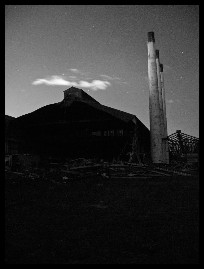
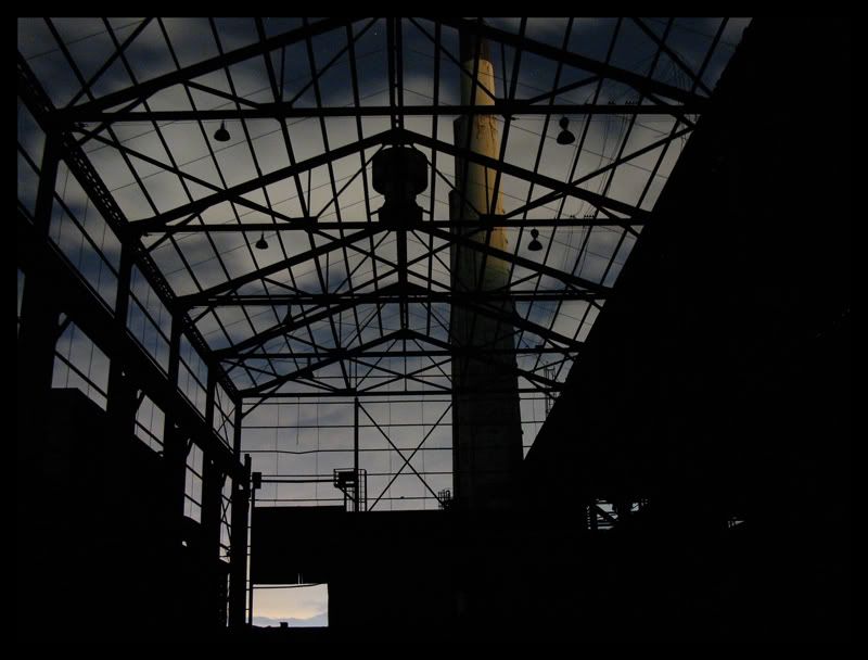
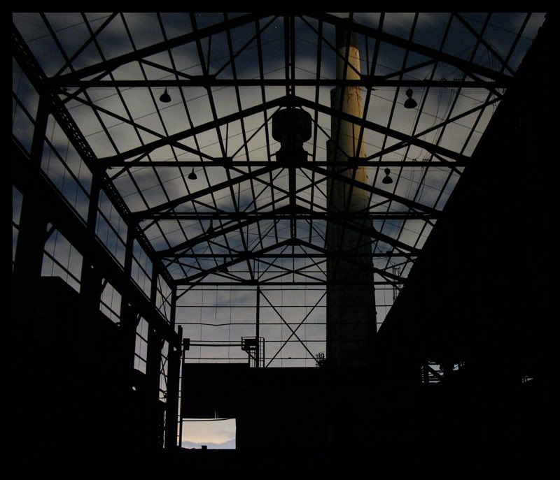
|  | | | 5's my favourite, really like the way the sky contrasts with the beams...
turk ;)
If its do'able, do it! |
|
the_doctor
Location: Boston area
Gender: Male
It's probably dangerous
| |  | Re: Critique Please
<Reply # 2 on 5/6/2006 3:32 PM >
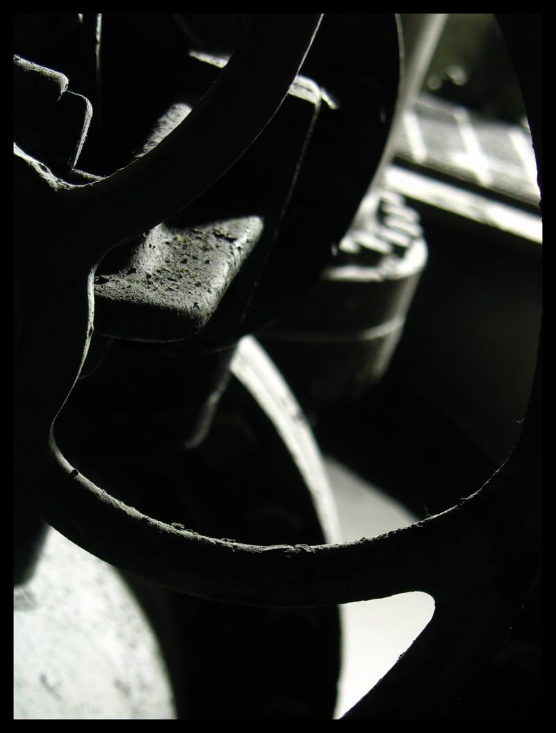
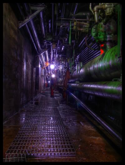
| | | | 3 is the best
|
|
Glass
      
Location: Chicago
as one does
| |  | Re: Critique Please
<Reply # 3 on 5/7/2006 11:04 PM >
| | | | 5 is exceptionably print-worthy. Blow that up, frame it.
Glass
PS.
In the future please make all of the photos the same size.
Also, to the other frequenters of the critiques board: be constructive;
| Post by flamable2213 is the best |
is NOT a critique, review or even praise. It's just there.
|
|
Urban Pirate
Location: Salt Lake City
Gender: Male
| | Re: Critique Please
<Reply # 4 on 5/7/2006 11:30 PM >
| | | | Posted by Glass
PS.
In the future please make all of the photos the same size.
|
My apologies for that, Photobucket resized two of them for some reason. I'm working on fixing it right now, otherwise I appreciate the comment Glass.
-Pirate
www.urbantrespass.com |
|
Urban Pirate
Location: Salt Lake City
Gender: Male
| | Re: Critique Please
<Reply # 5 on 5/7/2006 11:34 PM >
| | | | Nevermind, I didn't know I could only edit the post within 24 hours. But here are the two that were resized:
Pirate
www.urbantrespass.com |
|
pirate3

Location: oakville, ontario
Gender: Female
| | | Re: Critique Please
<Reply # 6 on 5/7/2006 11:39 PM >
| | | | I like the sharp purples and greens you seem to favour but the y seem a tad strong
#4 does very little for me, its composition bothers me
5 is beautiful , the subtle colouring and tones really make it for me
|
|
Dowcet
Location: Middletown, ct
| | | Re: Critique Please
<Reply # 7 on 5/8/2006 12:11 AM >
| | | | I definitely agree with Pirate3 on the colors.
#4 is quite grainy, and I'd love to see a little more detail in the dark corner. I think the composition would be improved if you cropped out a bunch of the ground on the bottom.
|
|
flapjack
Location: Manhattan, New York
Gender: Male
| | | Re: Critique Please
<Reply # 8 on 5/8/2006 12:44 AM >
| | | | I'll pick on two. I like the first one, but I find it a little out of balance with two competing focal points and their position in the frame. (I'd almost be inclined to focus on that thing on the right. It's kind of cool.) The other thing I try to do with straight on shots is to keep the perspective to a minimum or at least make sure it balances out. What I mean I can see a lot more of the side of that thing on the right and none of the side of the thing on the left. Square up to the shot and shoot from as far back as possible to cut down on that. IF you shot this way it might balance things out for me so reframing may not be necesary.
With number five I love every thing about it but the black area on the right is way to heavy and throws the balance of this shot off. Although I hate square cropping this shot would rule as a square crop starting from the left side.
[last edit 5/8/2006 12:46 AM by flapjack - edited 1 times]
|
|
Glass
Location: Chicago
as one does
| | | Re: Critique Please
<Reply # 9 on 5/8/2006 12:57 AM >
| | | | Wow! What a difference seeing them bigger-
The colors are great!
-Glass
|
|
Urban Pirate
Location: Salt Lake City
Gender: Male
| | Re: Critique Please
<Reply # 10 on 5/8/2006 1:48 AM >
| | | | Posted by flapjack
I'll pick on two. I like the first one, but I find it a little out of balance with two competing focal points and their position in the frame. (I'd almost be inclined to focus on that thing on the right. It's kind of cool.) The other thing I try to do with straight on shots is to keep the perspective to a minimum or at least make sure it balances out. What I mean I can see a lot more of the side of that thing on the right and none of the side of the thing on the left. Square up to the shot and shoot from as far back as possible to cut down on that. IF you shot this way it might balance things out for me so reframing may not be necesary.
With number five I love every thing about it but the black area on the right is way to heavy and throws the balance of this shot off. Although I hate square cropping this shot would rule as a square crop starting from the left side.
|
I can what you mean on the first shot, I'll try re-shooting it if I get the opportunity. I tried your suggestion out on #5. First is a perfectly square crop starting on the left and extending as far as possible while still remaining perfectly square:
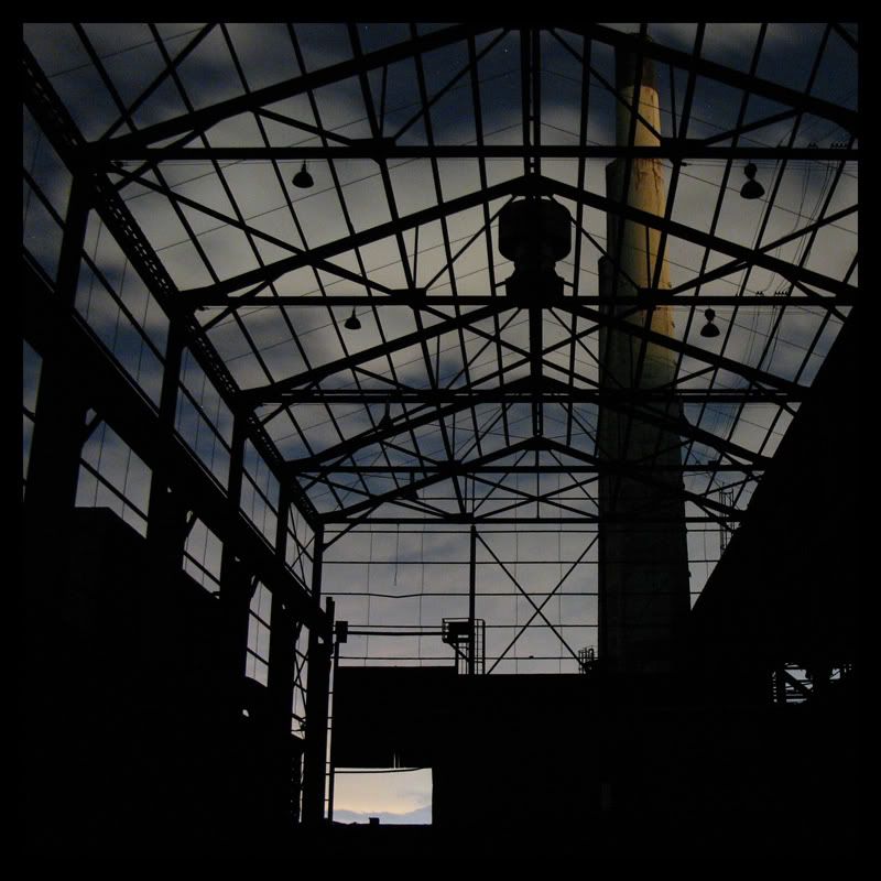
And just to see I tried another crop that included slightly more space on the right making it no longer perfectly square:
I'd like to hear your thoughts on these two as to whether they improve on the original or not. Thanks for the suggestion!
www.urbantrespass.com |
|
Glass
Location: Chicago
as one does
| | | Re: Critique Please
<Reply # 11 on 5/8/2006 1:53 AM >
| | | | If you're not opposed to photoshop, I'd make that far door's sky slightly high contrasted and more yellow-orange.
Glass
|
|
pirate3
Location: oakville, ontario
Gender: Female
| | | Re: Critique Please
<Reply # 12 on 5/8/2006 2:20 AM >
| | | | try what glass said with boosting that far doors sky to be more of a focal point in the second crop and that is one NICE pic you've got there
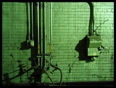
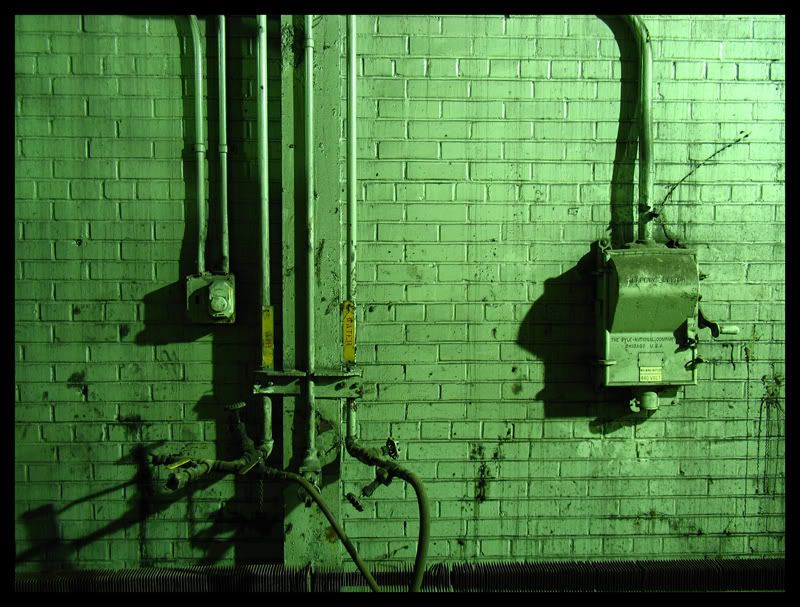
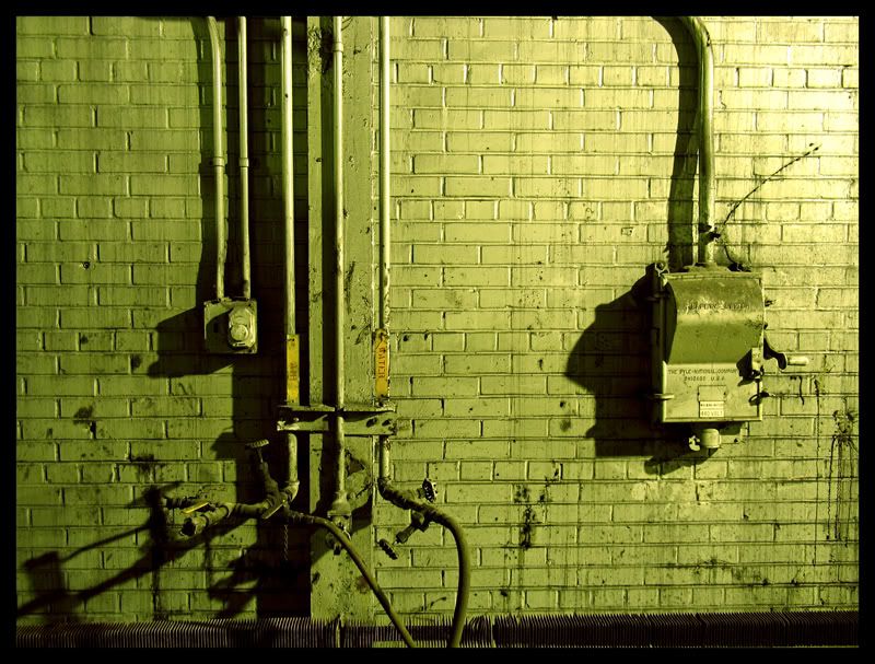
that first one of yours with the predominantly green colour....did you photoshop that green?
if so I recommend toning it down or introducing hints of some complimentary or even contrasting colours
its a little too flat
there's something small on the wall that looks like it could be slightly yellow which gives me hope.....I need to see more than just green, I'm thinking toned down golds, yellows and browns
|
|
flapjack
Location: Manhattan, New York
Gender: Male
| | | Re: Critique Please
<Reply # 13 on 5/8/2006 3:23 AM >
| | | | I'm liking the square. If I was going to shoot it again I would move over about 10 or 15 feet to the left. Frame it the same way. I might like to have the lines converging in a different place. Maybe starting the crop over 10 or 15 pixels. Not sure though. Just thinking.
|
|
Urban Pirate
Location: Salt Lake City
Gender: Male
| | Re: Critique Please
<Reply # 14 on 5/8/2006 9:41 PM >
| | | | Posted by flapjack
I'm liking the square. If I was going to shoot it again I would move over about 10 or 15 feet to the left. Frame it the same way. I might like to have the lines converging in a different place. Maybe starting the crop over 10 or 15 pixels. Not sure though. Just thinking.
|
Yeah, I know what you mean about moving the positioning over a bit. The only reason I shot it where I did was because I was trying to hide from a patrol vehicle while trying to get the shot. Hopefully I can make another trip and not have to worry about it. Again, thanks for the helpful comments.
Pirate
www.urbantrespass.com |
|
Urban Pirate
Location: Salt Lake City
Gender: Male
| | Re: Critique Please
<Reply # 15 on 5/8/2006 9:58 PM >
| | | | Posted by pirate3
try what glass said with boosting that far doors sky to be more of a focal point in the second crop and that is one NICE pic you've got there
that first one of yours with the predominantly green colour....did you photoshop that green?
if so I recommend toning it down or introducing hints of some complimentary or even contrasting colours
its a little too flat
there's something small on the wall that looks like it could be slightly yellow which gives me hope.....I need to see more than just green, I'm thinking toned down golds, yellows and browns
|
Alright I've got two for you to look at now. First to answer your question, the green one has not been Photoshopped aside from fixing the lens distortion. So the green was a product of the lights in the room plus the white balance setting I used. I tried doing some editing to see if I could get some other colors into the picture. Tell me what you think:
I also took Glass's suggestion and made that doorway more of a focal point. I just can't decide if I did it a little TOO much. But here it is:
www.urbantrespass.com |
|
SLCblue
Location: Salt Lake City
Gender: Male

THINK OF THE SIDECAR!
| | | Re: Critique Please
<Reply # 16 on 5/8/2006 10:23 PM >
| | | | Posted by Urban Pirate
I also took Glass's suggestion and made that doorway more of a focal point. I just can't decide if I did it a little TOO much. But here it is:
|
Too much. I liked it originally...it balanced the lower half of the shot quite well. Now my eyes are averted away from the not-roof and the stacks to the yellowish square, which really isn't the focus of the shot. I should've busted out my tripod right there too...damn you for being so daring with the evil truck 
I really didn't like any of my photos from that trip very much. Don't know why.
|
|
Jonsered
Location: Back in New Mexico where I belong
Gender: Male
Dressed for a scarecrow ball.........
| |  | | | Re: Critique Please
<Reply # 17 on 5/8/2006 10:27 PM >
| | | | Honestly, I like the deeper green brick wall better. As far as the doorway in the long building shot, I think maybe you went just a shade too far with brightening the doorway itself. It doesn't seem to blend as well with the darker purple tones of the sky that show in through the windows.
I have changed my personal exploring ethics code. From now on it will be: "Take only aimed shots, leave only hobo corpses." Copper scrappers, meth heads and homeless beware. The Jonsered cometh among you, bringing fear and dread.
|
|
|
|
All content and images copyright © 2002-2024 UER.CA and respective creators. Graphical Design by Crossfire.
To contact webmaster, or click to email with problems or other questions about this site:
UER CONTACT
View Terms of Service |
View Privacy Policy |
Server colocation provided by Beanfield
This page was generated for you in 250 milliseconds. Since June 23, 2002, a total of 739098436 pages have been generated.
|
|