 |
|
|
UER Store
|
|
sweet UER decals:

|
|
|
 dev
  
Passed away September 23rd, 2006.
 | |  | round ei8ht
< on 4/21/2006 5:10 AM >
|  | | | 


more stuff from january.
january was a good month.
--dev
|
|
Glass
    
Location: Chicago
as one does
| |  | Re: round ei8ht
<Reply # 1 on 4/21/2006 6:54 AM >
| | | | STUNNING color in the first shot!
|
|
dev
Passed away September 23rd, 2006.
| | Re: round ei8ht
<Reply # 2 on 4/21/2006 7:01 AM >
| | | | i was happy with the lack of chromatic aberration.
|
|
Glass
Location: Chicago
as one does
| | | Re: round ei8ht
<Reply # 3 on 4/21/2006 7:41 AM >
| | | | 1) [covered]
2) I like it, but it's one of those "done" shots, you know? The hallway low-angle where everything's falling apart?
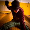
3) Like I said in my PM, I don't like the two on the far left... it sets what's otherwise a very calming photo very off-balance (dual subjects are tricky that way). I would have put one of them sittin on the vent on the right or something... I forgive you, though; it looks like a snapshot rather than a very agonizingly planned frame.
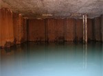
4) I just don't like this... the highlights so blown on that fist piller wrecks the pattern of the mushroom-pillar shape. Also the crookedness makes it hard to follow.
-Glass
|
|
Mr. Yuk

| | Re: round ei8ht
<Reply # 4 on 4/22/2006 7:26 PM >
| | | | Posted by Glass
4) I just don't like this... the highlights so blown on that fist piller wrecks the pattern of the mushroom-pillar shape. Also the crookedness makes it hard to follow.
|
I have to disagree with you on these points. The crookedness is what makes this shot work well for me. The only complaint I have it that it would have been nice if Dev had centered the image based on the reflections. It's the reflections that balance out the blown highlights.
<E
|
|
sam
Location: se england
| | Re: round ei8ht
<Reply # 5 on 4/22/2006 9:56 PM >
| | | | i have to say i really like the third one. it's the variations in content and the light. the skyline looks like a model-sized skyscraper collection, and then in front, lit differently because of the red, is what looks like a poorly built parody of the buildings in the distance, then it's different again with the greenish scrubby lawn, and then what looks like a roof, and then i noticed the people.
normally i hate people in pics but they don't look as if they knew they were being photographed, and one of the coats blends in with the roof so they're not immediately noticeable, and they look interested in what's in front of them rather than being too posey.
then after all that there's the amount of extra detail, various posts and poles, paving, the knight shaped cloud, the yellow square thing, the pale brown building, loads of different heights, and then back to the shambles in the middle.
i do like technically brilliant pics but i think i prefer lots of content and detail over a perfectly lit corridor picture. so yeh, bravo! i'd have that on my wall.
8)
sam
www.section61.com - uk ue mag
www.nobodythere.co.uk - ue pics archive |
|
|
|
All content and images copyright © 2002-2024 UER.CA and respective creators. Graphical Design by Crossfire.
To contact webmaster, or click to email with problems or other questions about this site:
UER CONTACT
View Terms of Service |
View Privacy Policy |
Server colocation provided by Beanfield
This page was generated for you in 218 milliseconds. Since June 23, 2002, a total of 739820981 pages have been generated.
|
|
