 |
|
|
UER Store
|
|
sweet UER decals:

|
|
|
 stealthy
   

You got a problem bro?
 | |  | Please critique / destroy (dial-up warning)
< on 4/19/2006 1:25 PM >
|  | | | 1. Move towards the light

2. A sign w/ no meaning

3. The relic of a former era

4. (no title)

5. Time won't let me
6. Amassing of clouds & earth

7. A party in wonderland
|
|
Mutt
 
Moderator
Location: Bunbury, Western Australia

Support your local Funeral Director ----- Drop Dead!
| |  | Re: Please critique / destroy (dial-up warning)
<Reply # 1 on 4/19/2006 2:51 PM >
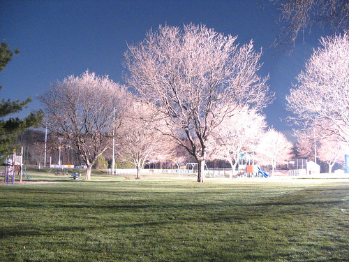
| | | | The clouds and earth one is nice, but if the animal was a bit further to the right of the shot it would be better. Perhaps a bit of PS work would get rid of the wide angle lens distortion.
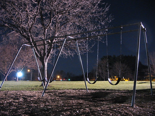
The swing set shot bothers me with the bright light off to the side.
The building shot is crooked. A slight angle adjustment and crop might help but its still just a blah shot.
All men are cremated equal. |
|
Core
 
Location: MI
Gender: Male

Warning: Some side effects may occur
| | | Re: Please critique / destroy (dial-up warning)
<Reply # 2 on 4/19/2006 4:35 PM >
| | | | No1 is crooked and the light is annoying.
No2 is a straight on shot that is pretty boring.
No3 is nice and fairly interesting, if you moved to the left a bit you could capture some detail of the underside.
No4 is crooked and bland/boring.
No5 I like although the light could be toned down.
No6 is completly uninteresting to me.
No7 is really cool, the trees look snow white, although I think the light could have been moved farther to the right as it is washing out the right side of the pic.
[last edit 4/19/2006 4:36 PM by Core - edited 1 times]
|
|
eldubcru
Location: Lake Wales
Gender: Male

EL DUB CRU
| | Re: Please critique / destroy (dial-up warning)
<Reply # 3 on 4/19/2006 4:46 PM >
| | | | Man, these guys are hard core, but I guess they get to the point. I don't know how long you have been in photography but keep it up. I like photography myself and I am not that good but I am working on it. I love some of the shots, my fav. is the swingset. Keep it up man.
EL DUB CRU for Life! |
|
Urban Pirate
Location: Salt Lake City
Gender: Male
| | Re: Please critique / destroy (dial-up warning)
<Reply # 4 on 4/19/2006 7:51 PM >
| | | | Numbers two and three are my personal favorites. Two is a somewhat generic, straight-on shot however I like the shadows and colors and it works fairly well. Three is a good shot and does a good job of grabbing my attention. I would like to see more of that particular subject; it looks like you could really play around with it and take some great shots.
www.urbantrespass.com |
|
Glass
  
Location: Chicago
as one does
| | | Re: Please critique / destroy (dial-up warning)
<Reply # 5 on 4/19/2006 9:35 PM >
| | | | I'm more for the UE-theme shots, but they're alright. I think you need to up your post-processing effort, choose less dramatic titles, and straighten things out.
I think the third is the best of the set.
-Glass
|
|
ryan
This member has been banned. See the banlist for more information.
Location: Providence RI
Gender: Male

F/gayz
| |  | | | Re: Please critique / destroy (dial-up warning)
<Reply # 6 on 4/19/2006 9:40 PM >
| | | | loving the clouds i always admire a good sky
I climb stuff!
Remember! Shop smart. Shop S-Mart \http://www.myspace.com/xitstheendx |
|
pirate3
Location: oakville, ontario
Gender: Female
| | | Re: Please critique / destroy (dial-up warning)
<Reply # 7 on 4/19/2006 10:08 PM >
| | | | Love the last one
although I think you could have changed the composition for more impact
right now the trees take second stage to an expanse of blah grass
it could be cool to push one of those swings on the swing set during a long exposure
just a thought
|
|
stealthy
You got a problem bro?
| | Re: Please critique / destroy (dial-up warning)
<Reply # 8 on 4/19/2006 11:38 PM >
| | | | Thank you all for your comments.
All of the above photos had no post-processing performed upon them whatsoever, because I'm generally uncomfortable with editing my photos after the fact. But, I'll definetly give it a shot tonight or tomorrow.
As for how long I've been doing photography, since 26 Dec 2005 (day after I got this camera for christmas). I think I've progressed a fair bit in my work. Here is a photo taken on 28 January this year. I somewhat like the idea of it, but it was an impromptu shot, if you will - and consequently it's rather blurry and whatnot.
Glass - the titles were just some last-minute things that just seemed to "work" in my mind. I'm sure if I actually sat down and put some thought into it, I could get some better names.
Pirate3 - I was actually thinking of doing that, after uploading the photos two days ago. I'm probably going to go back there this weekend and redoing some shots.
Again, thank you all for your critiques 
-stealthy
|
|
the_doctor
Location: Boston area
Gender: Male
It's probably dangerous
| | | Re: Please critique / destroy (dial-up warning)
<Reply # 9 on 4/20/2006 12:25 AM >
| | | | I love everyone, but for some reason I dont really like 7, its just personal i think, but very nice
|
|
desmet
When the going gets weird, the weird turn pro.
| | | | Re: Please critique / destroy (dial-up warning)
<Reply # 10 on 4/20/2006 12:33 AM >
| | | | 1 - Not altogether that exciting. Lacks a strong enough subject.
2 - This I like. The sign being in the middle is kind of straightforward but the various things on the wall behind it give it some tension. I like.
3 - Boy, what a great color palette. How lucky can you get finding a car that matches both the trees and ground. Very cool picture. The way I would improve this would be to tweak out the angle you shot it from. Shoot it reeeaaal low and close at the widest angle you have. Keep the trees and ground in there, just maybe try to fill the frame with more car and less of the blue sky which doesn't really go with the pallette of the picture. Some sky is fine, but it's just a teensy bit distracting. Good picture as is though.
4 - I think that building is really interesting. This would be better if you could isolate just the building and the odd profile of it's roof against the sky. The prob would be the tree getting in the way.
6 - Little too straightforward, and too much distraction in the background. If you could shoot it from lower and use a larger aperture to get a bokeh on the background it would be better. I love the tone of the lighting on the swings and tree. The colors are cool.
7 - A lower shot zoomed in more would make the dog more of a subject and less of a distraction, and cut out the empty part of the blue sky which is not necessary. Keep the same feel just shoot it a little differently.
8 - No defined subject and blown highlights.
Good work mang...especially that car pic. I love that. Keep up the good work!
|
|
|
|
All content and images copyright © 2002-2024 UER.CA and respective creators. Graphical Design by Crossfire.
To contact webmaster, or click to email with problems or other questions about this site:
UER CONTACT
View Terms of Service |
View Privacy Policy |
Server colocation provided by Beanfield
This page was generated for you in 109 milliseconds. Since June 23, 2002, a total of 739809894 pages have been generated.
|
|
