 |
|
|
UER Store
|
|
 order your copy of Access All Areas today!
|
|
|
 journeylady
     
Location: Kitchener
Gender: Female

 | |  | ready to be destroyed
< on 4/12/2006 1:59 PM >
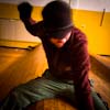
|  | | | I so rarely post here, but I want the destruction this time. I'm experimenting with saturization. I 'shopped these with my sister's computer and I'm not sure if I should get a program that can do this at home or not. If I'm not doing anything cool then I'm not going to bother.
PS: Compressing them so they can be posted has made them a little blurry but it's the colours I'm mainly looking for the critique on.
It's a tragedy.
It's exactly like a greek tragedy.
We should only be Greeks. |
|
mortimer

Location: teronno
| |  | Re: ready to be destroyed
<Reply # 1 on 4/12/2006 3:20 PM >
| | | | Too much on the second one. When you lose the detail in the colour, pull it back. The first one's better, although it looks like there's a backwards 'L' of extra saturation on the right side of the door and across the bottom.
Personally, I think hyper-saturation takes away from the feel of an abandoned space, but if it was bright and cheery in person, then that's the way it was. I'd basically try to match the way it seemed to your eyes in person.
yep. |
|
Glass
  
Location: Chicago
as one does
| | | Re: ready to be destroyed
<Reply # 2 on 4/14/2006 11:48 PM >
| | | | Photobucket is your friend.
I don't like either shot, it's nothing really special... the composition is very standard and the colors are lacking.
Wish you put an angle on it.
Glass
|
|
journeylady
Location: Kitchener
Gender: Female
| | Re: ready to be destroyed
<Reply # 3 on 4/15/2006 12:18 AM >
| | | | Posted by Glass
Photobucket is your friend.
I don't like either shot, it's nothing really special... the composition is very standard and the colors are lacking.
Wish you put an angle on it.
Glass
|
Thanks!
It's good to know what I can do to improve.
It's a tragedy.
It's exactly like a greek tragedy.
We should only be Greeks. |
|
Glass
Location: Chicago
as one does
| | | Re: ready to be destroyed
<Reply # 4 on 4/15/2006 12:33 AM >
| | | | Posted by journeylady
Thanks!
It's good to know what I can do to improve.
|
No, thank YOU for being the only person who isn't taking critiques personally.
|
|
journeylady
Location: Kitchener
Gender: Female
| | Re: ready to be destroyed
<Reply # 5 on 4/15/2006 12:43 AM >
| | | | Posted by Glass
No, thank YOU for being the only person who isn't taking critiques personally.
|
It would be pretty silly to take it personally. I asked for criticism, not for shitty pictures to be praised.
I may be going back there tomorrow and I'll give it a try with an angle if I do.
It's a tragedy.
It's exactly like a greek tragedy.
We should only be Greeks. |
|
Glass
Location: Chicago
as one does
| | | Re: ready to be destroyed
<Reply # 6 on 4/15/2006 1:00 AM >
| | | | Posted by journeylady
It would be pretty silly to take it personally. I asked for criticism, not for shitty pictures to be praised.
I may be going back there tomorrow and I'll give it a try with an angle if I do.
|
Red door + red filter + black and white = what I would do.
|
|
pirate3
Location: oakville, ontario
Gender: Female
| | | Re: ready to be destroyed
<Reply # 7 on 4/15/2006 1:04 PM >
| | | | try shooting head on but low down
see if you can shoot from a height try alot of different angles
I like the black and white idea, go for a yellow. filter so the door is full of greys
if it were black or really white I think the attention would be too central
I'm drawn to the dark door frame and pebbley grey of the wall
think of how you could emphasize those vines that creep along the wall
shooting low down but from a distance would give you a sense of the path you walk down to get to the door
cracking the door open slightly would also be very cool
|
|
pirate3
Location: oakville, ontario
Gender: Female
| | | Re: ready to be destroyed
<Reply # 8 on 4/15/2006 1:10 PM >
| | | | your original post is wondering whether to get photoshop
I would say you should continue to explore ways of altering images
just because this one didn't quite suit saturating the red, doesn't mean you shouldn't keep on pushing your ideas
there are a number of free image software programs
picasa for example will organize your images but you can shit around with levels and its free through google
consider mood:
I would go for intense greens in the groundcover rather than intensifying the door colour
the door is already central and imposing how can you get the eye to roam further into the pic and develop mood?
|
|
|
|
All content and images copyright © 2002-2024 UER.CA and respective creators. Graphical Design by Crossfire.
To contact webmaster, or click to email with problems or other questions about this site:
UER CONTACT
View Terms of Service |
View Privacy Policy |
Server colocation provided by Beanfield
This page was generated for you in 125 milliseconds. Since June 23, 2002, a total of 739870678 pages have been generated.
|
|


