 |
 |
|
UER Store
|
|
sweet UER decals:

|
 |
 |
|
Activity
|
|
799 online
Server Time:
2024-04-19 20:27:31
|
|
 |
 dev
  
Passed away September 23rd, 2006.
 | |  | round 6ix
< on 4/5/2006 5:45 PM >
|  | | | just three this time.


|
|
Glass
       
Location: Chicago

as one does
 | |  | |  | Re: round 6ix
<Reply # 1 on 4/5/2006 6:55 PM >
|  | | | 1)
Good color. Blown highlights. Wish it was straighter or more angled. WB is off too.
2)
Good concept, needs to be sharper though. Higher saturation would be preferable too.
3)
Don't like it at all: Flat colors, lacking composition, lacking subject.
~Glass
|
|
YellowSnow
 
Gender: Male

 | |  | Re: round 6ix
<Reply # 2 on 4/7/2006 3:20 AM >
|  | | | I like the first one, but not the second two.
>_> |
|
blackhawk
  
This member has been banned. See the banlist for more information.
Location: Mission Control

UER newbie
 | |  | |  | Re: round 6ix
<Reply # 3 on 4/7/2006 4:17 AM >
|  | | | I'm not going to say much of anything about the pics because it looks like you risked your life to shoot them. Damn that floor is soupy! What were you shooting with?
Just when I thought I was out... they pulled me back in.
|
|
angeloks
  
Location: Montreal, QC
Gender: Male

"To me, a camera is a license to explore."– Jerry Uelsmann
 | |  | Re: round 6ix
<Reply # 4 on 4/7/2006 4:40 AM >
|  | | | Actually, I love the second and third shot.
Well, the #3 definitely lack contrast and seems to be overexposed. Anyway, with a little PS, you can get something nice of this shot.
I took the liberty of messing around with your art. I guess that you won't be very angry... Well if you are... I'll remove it right away! Anyway I over did it a little, just to make my point!
Good work anyway!
3.

http://www.flickr.com/photos/pekdeche/ |
|
nd31
  
 | |  | Re: round 6ix
<Reply # 6 on 4/8/2006 10:18 PM >
|  | | | I agree with saturation and contrast as stated above.
Also, the second picture would be better if it were entirely vertical, not shot at an angle.
|
|
dev
  
Passed away September 23rd, 2006.
 | |  | Re: round 6ix
<Reply # 7 on 4/9/2006 5:10 AM >
|  | | | Posted by ndillon31
I agree with saturation and contrast as stated above.
Also, the second picture would be better if it were entirely vertical, not shot at an angle.
|
i've been erring on the side of caution with saturation and contrast; i shoot with the in-camera processing to -5 contrast, as this allows me an extra half-stop or so of dynamic range, but i haven't really been bringing it back in post. i'm always worried that i'm going "too far" with the photoshop.
also. the second picture, ironically, should be entirely different.
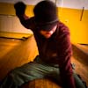
here's a (separate) shot of the same area, without post-process, from a different angle, with context in mind:

Actually, I love the second and third shot.
Well, the #3 definitely lack contrast and seems to be overexposed. Anyway, with a little PS, you can get something nice of this shot.
I took the liberty of messing around with your art. I guess that you won't be very angry... Well if you are... I'll remove it right away! Anyway I over did it a little, just to make my point!
Good work anyway! |
excellent. #3 was overexposed for sure, and the contrast in the subject was very much lacking... i was hoping to show that glow from the lower level that's dead in the middle of your remix, and i guess that i just didn't push it far enough. i'm always concerned that i'm pushing the digital post-processing "too far"... again, i'm just really cautious with the photoshop, because i'm just learning the tools, and don't wanna "fake it" too much.
thanks to everyone for the criticism, hopefully i'll have some new shit in the next couple of days.
|
|
|
|
All content and images copyright © 2002-2024 UER.CA and respective creators. Graphical Design by Crossfire.
To contact webmaster, or click to email with problems or other questions about this site:
UER CONTACT
View Terms of Service |
View Privacy Policy |
Server colocation provided by Beanfield
This page was generated for you in 93 milliseconds. Since June 23, 2002, a total of 738534244 pages have been generated.
|
|


