 |
 |
|
UER Store
|
|
 order your copy of Access All Areas today!
|
 |
 |
|
Activity
|
|
792 online
Server Time:
2024-05-07 18:50:43
|
|
 |
 mada
  
Noble Donor
Location: Orange County, California
Gender: Male

23437
 | |  | |  | |  | |  | 5
< on 2/16/2006 7:00 PM >
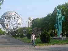
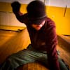
|  | | | A few of my recent favorites. What do you think? Please keep it to constructive criticism.


The following sentence is false. The preceding sentence is true.
|
|
nobody
     
Location: VANCOUVER B.C.
Gender: Male

5:55 is a state of mind
 | |  | Re: 5
<Reply # 1 on 2/16/2006 7:04 PM >
|  | | | #2 is awesome. It almost looks like you are standing above it looking down. N.
Operating Entirely With Bad Intentions |
|
0U812

Location: Lubbock, TX
Gender: Female
Texploration
 | |  | Re: 5
<Reply # 2 on 2/16/2006 7:32 PM >
|  | | | #2 is my favorite too. They're all good.
I figured out what's wrong with life:
It's other people. |
|
desmet
   

When the going gets weird, the weird turn pro.
 | |  | |  | |  | Re: 5
<Reply # 3 on 2/16/2006 7:36 PM >
|  | | | I think these would be better if they weren't so centered. I think you're putting too much right on the center lines. I know how it is...I've been doing the same thing myself lately...but I think some of these would be better if they weren't so centered.
I love #2. #3 is awesome but the vignetting is too severe and this is one I'd like better if it weren't so centered (not sure how you could shoot it like that...but still). I wouldn't mind a little vignetting on this...it gives it an interesting feel...but just a little less would be good.
#4 just doesn't have quite enough going on for me. #5...I know what you were going for but a eye-height completely centered photograph with a subject this simple is just not enough. I like what you were going for here, but I think you could capture it in a more interesting way.
|
|
Celluloid
  
Location: Chicago Northside
Gender: Female
 | |  | |  | |  | Re: 5
<Reply # 4 on 2/16/2006 11:29 PM >
|  | | | The first woulda been totally awesome had you also exposed a shot for the scene outside the windows then merged the two. As it is now, I can see that there's something out there and I wanna know what!
|
|
:: inuk
    
Location: Burnaby BC.
Gender: Male

Freelance Thinking
 | |  | Re: 5
<Reply # 5 on 2/17/2006 1:03 AM >
|  | | | 1. Love the lighting and tone, but found it boring. No real subject.
2. Good shot. Perhaps a sharper focus? I don't like the V effect, but that's hard to avoid.
3. Doesn't work for me. Try cropping the top or just avoiding the finger (?) at the top. The colour seems a little washed out. Here's a thought...
*hope you don't mind*

4. I like everything but the framing. I really want to see more of whatever is on the left, but I can't.
5. As desmet said, too centered. More carpet, less ceiling. Try from a lower height, try laying down.
Hope you find it constructive.
::
|
|
Ninjako
    
Location: Winnipeg
Gender: Male

I Wonder What's In Here
 | |  | Re: 5
<Reply # 6 on 2/23/2006 7:45 PM >
|  | | | The 3rd photo doesn't do it for me either, may be too bright.. I enjoyed the rest of the set though!
|
|
Ninjako
    
Location: Winnipeg
Gender: Male

I Wonder What's In Here
 | |  | Re: 5
<Reply # 7 on 2/23/2006 7:46 PM >
|  | | | An afterthought, I'm curious how number 3 would look in B&W .. I'm at work and don't have any image editing software however. Would you mind?
|
|
nd31
  
 | |  | Re: 5
<Reply # 8 on 2/25/2006 12:16 AM >
|  | | | I like the fifth especially. I think the second is weak in comparison to the others. If you had been standing a bit further back, and it was less of a view up, it might be better--it's still well composed, however.
|
|
:: inuk
    
Location: Burnaby BC.
Gender: Male

Freelance Thinking
 | |  | Re: 5
<Reply # 9 on 2/25/2006 1:29 AM >
|  | | | Posted by Ninjako
I'm curious how number 3 would look in B&W .. Would you mind?
|
Well, assuming my cropping wasn't an issue ...

I have never shot b&w because I don't think I have that 'kind' of eye. This is a basic desaturation and mild increase in lightness.
::
|
|
dev
  
Passed away September 23rd, 2006.
 | |  | Re: 5
<Reply # 10 on 2/25/2006 6:39 AM >
|  | | | 1: wonderful.
2: perspective is a bitch. still. good.
3: vignette-o-matic
4: -1.3EV k thanks.
5: best of set.
|
|
mada
  
Noble Donor
Location: Orange County, California
Gender: Male

23437
 | |  | |  | |  | |  | Re: 5
<Reply # 11 on 2/25/2006 7:40 AM >
|  | | | I agree. The second one is crap. I like it less every time I see it.
Posted by dev
4: -1.3EV k thanks.
|
Pardon my ignorance but what?
The following sentence is false. The preceding sentence is true.
|
|
dev
  
Passed away September 23rd, 2006.
 | |  | Re: 5
<Reply # 12 on 2/25/2006 8:04 AM >
|  | | | Posted by mada
I agree. The second one is crap. I like it less every time I see it.
Posted by dev
4: -1.3EV k thanks.
|
Pardon my ignorance but what?
|
i'd love to see it minus 1 (and 1/3) stop(s).
technically, i suppose, the exposure is right on, but i'd love it darker and more saturated.
anyhow: here.
photoshop:
(-50, brightness)
(+20, cyans, saturation)
(local contrast "enhancement" (super-wide, low-cut USM))

just tell me if you want my re-mix of your image gone; i can delete it at any time.
perhaps it's because my other two favourites from the set are very dark, and i want to make them match. ///
[last edit 2/25/2006 8:06 AM by dev - edited 1 times]
|
|
amybee

Location: queens nyc
Gender: Female

 | |  | |  | Re: 5
<Reply # 13 on 2/25/2006 6:10 PM >
|  | | | i really like #1, #4, and #5. i like that it feels abandoned. my favorite is probably 5 - it's very clean and a nice photo. nice work.
|
|
trojansxc91
   
Gender: Male

 | |  | Re: 5
<Reply # 14 on 2/28/2006 9:47 PM >
|  | | | my favorite is the last one, i love the first one too
|
|
nobody
     
Location: VANCOUVER B.C.
Gender: Male

5:55 is a state of mind
 | |  | Re: 5
<Reply # 15 on 2/28/2006 9:50 PM >
|  | | | Posted by mada
I agree. The second one is crap. I like it less every time I see it.
Pardon my ignorance but what?
|
I still like 2. N.
Operating Entirely With Bad Intentions |
|
Glass
       
Location: Chicago

as one does
 | |  | |  | Re: 5
<Reply # 16 on 3/1/2006 2:34 AM >
|  | | | "HONE HERE" is my favorite. The others don't turn me on as much: I see you're dealing a lot with color and not in form & texture.
|
|
pirate3

Location: oakville, ontario
Gender: Female
 | |  | |  | Re: 5
<Reply # 17 on 3/1/2006 3:22 AM >
|  | | | I'm totally with mynameisglass on this one
odd how some people just don't find number 3 appealing
but it really stood out
if I had to articulate my attraction to it:
reminds me a bit of jean-micheal basquiats paintings and john couplands work
photography that blurs a bit into abstract painting is very cool, anything that pushs the boundaries in any art realm is very cool
I like the darker more saturated version, the red really pops and the minty green is suddenly slightly sinister
overall, I like your work
but number 3 is fab
|
|
pirate3

Location: oakville, ontario
Gender: Female
 | |  | |  | Re: 5
<Reply # 18 on 3/1/2006 3:23 AM >
|  | | | grr
ooops thats number 4
|
|
blackhawk762

Location: Maryland
Gender: Male
In Tyler We Trust
 | |  | |  | |  | Re: 5
<Reply # 19 on 3/3/2006 2:52 PM >
|  | | | Well, like everyone else, the second is my favorite as well. The image is just so strong. It makes it seem like it goes on forever. It was a good idea not to show the top of the building. I think it might've been a little better if the top windows were parallel with the top of the photo as well as the bottom. Dunno if you know what I mean by that, but it's a good photo.
I like the last one, too. I like how it's not so busy.
"We have to show these men and women freedom by enslaving them, and show them courage by frightening them." "At the time, my life just seemed too complete, and maybe we have to break everything to make something better out of ourselves." "This was freedom. Losing all hope was freedom." |
|
|
|
All content and images copyright © 2002-2024 UER.CA and respective creators. Graphical Design by Crossfire.
To contact webmaster, or click to email with problems or other questions about this site:
UER CONTACT
View Terms of Service |
View Privacy Policy |
Server colocation provided by Beanfield
This page was generated for you in 78 milliseconds. Since June 23, 2002, a total of 740950733 pages have been generated.
|
|

 order your copy of Access All Areas today!


