 |
|
|
UER Store
|
|
sweet UER decals:

|
|
|
 Alias
   
Location: UK
Gender: Male

www.nicholas-ada ms.co.uk
 | |  | |  | Rip me to pieces
< on 2/13/2006 3:18 PM >
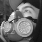
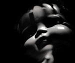
|  | | | A couple of pics for you guys to rip apart please.
1.
2.
3.
4.
5.
6.
7.
8.
9.
www.nicholas-adams.co.uk |
|
Atrocity

Location: Plano
Gender: Male
| |  | | | Re: Rip me to pieces
<Reply # 1 on 2/13/2006 4:06 PM >
| | | | First I wouldn't use such a huge water stamp, it's quite distracting from your work.
1: Looks really nice, it has that creepy kind of feel what kind of building is that?
2: This is a really cool portrait, looks like you got a crew to explore with you.
3: Not bad but I would try black and white or maybe zooming some more to make the center or focus pop out more.
4: Not too sure what to say lol
5: This looks very cool, it almost seems like lights are on it's so bright, if they are you should turn them off and see if you could get some nice rays going down through there.
6: Kind of looks like someone tagging the wall
7: This is an excellent photo. I love the contrat between the subject and the sky. 
8: Very interesting POV you got, were you laying on the pipes?
9: once again nice, not too sure what to say on this one either.
|
|
laslow
Location: Tewksbury, MA
you have quite a temper for someone who takes pictures of flowers
| | Re: Rip me to pieces
<Reply # 2 on 2/13/2006 4:33 PM >
| | | | #1
amazing
this is the kind atmosphere i strive for in b&w photos, and you capture it flawlessly
#6
this picture is really abstract
i like it
the first thing i did when i saw this picture is immediately put it in paintshop pro and rotated it 90 degrees
it gives it a surreal feel, but it still retains the same look

i don't care for the horribly distracting watermark
i suggest adding a border around the photos, and keeping it in them
may you tell me the camera(s) used for the photographs, etc?
[last edit 2/13/2006 4:35 PM by laslow - edited 1 times]
|
|
uair01
 
Location: Rotterdam.NL
Gender: Male
-=|x|=-
| | | Re: Rip me to pieces
<Reply # 3 on 2/13/2006 5:47 PM >
| | | | Great pictures overall! A few comments:
Framing of 2,3,5 could be better. It's not clear what the focal point of the picture is. I understand your problem in 5 - there's no good point to stand.
2 and 7 are very good, but I think they should be even better. I don't know what's missing, they're just 10% less than perfect. Composition?
"Not to look behind a door is an insult to the door, and the reality it is hiding." |
|
Alias
Location: UK
Gender: Male
www.nicholas-ada ms.co.uk
| | | Re: Rip me to pieces
<Reply # 4 on 2/13/2006 5:55 PM >
| | | | thanks for the comments:
1,2,3 were taken using a Pentax Z10 film camera on my first ever day out using a 35mm.
4 and 5 were taken using a Kodak LS755 which is a compact without using a tripod as it lack the mount for one.
6,7,8 and 9 were taken using the Fuji S5600/S5200 using a tripod or hard surface.
The pipe shot is taken from the end of the pipes.
PS sorry about the watermark, also none of these pictures have been altered in any way apart from slight softning in 6,7,8 and 9 due to having my camera on the wrong settings.
PPS
1,2,3,4 are all taken at West Park Asylum(England)
5 is at Severalls asylum
6 is at Hellingly asylum
the rest are at the guinness brewery which is being demolished as you read this.
www.nicholas-adams.co.uk |
|
desmet
When the going gets weird, the weird turn pro.
| | | | Re: Rip me to pieces
<Reply # 6 on 2/13/2006 6:18 PM >
| | | | 1 - This shot needs more contrast badly. I would use an adjustment layer so you can mask out some of the contrast enhancement in the few areas which already have good blacks. The areas with contrast look great, I just think the majority of the image needs way more.
2 - Love it.
3 - Needs to be rotated!
4 - Doesn't grab me that much, but there's nothing particularly wrong.
5 - This shot would be better from lower down and farther left. I'd try this in B&W.
6 - I like, but again this needs to be rotated! Lots of cocked pictures on here lately...not having the picture be straight is incredibly distracting to me.
7 - I like this except that there's not quite enough definition on the figure to have it stand out against the background.
8 - Meh...
9 - Nice angle. It looks dark, but it may just be this monitor.
|
|
Nelles22
 
Location: Nashville, TN
Gender: Male
| | Re: Rip me to pieces
<Reply # 7 on 2/18/2006 2:45 AM >
| | | | Great pics
I'd do a little work on #2, the grey haze on the corners is a bit distracting. If you are using photoshop maybe adjust the corners to true black using curves. Or just darkin it up a bit.
|
|
|
|
All content and images copyright © 2002-2024 UER.CA and respective creators. Graphical Design by Crossfire.
To contact webmaster, or click to email with problems or other questions about this site:
UER CONTACT
View Terms of Service |
View Privacy Policy |
Server colocation provided by Beanfield
This page was generated for you in 202 milliseconds. Since June 23, 2002, a total of 739741562 pages have been generated.
|
|
