 |
|
|
UER Store
|
|
sweet UER decals:

|
|
|
 tron_2.0
   
Location: Ohio
Gender: Male

 | |  | |  | |  | okay...rip me a new one
< on 1/25/2006 12:57 AM >
|  | | | Granted, some are horribly composed, and we all know which ones they are, but you know the drill i guess.


cant decide between that and this:


meh
[last edit 1/25/2006 1:27 AM by tron_2.0 - edited 1 times]
[quote][i]Posted by yokes[/i]
I find your lack of coziness.... disturbing.
[/quote] |
|
seicer
   
Location: New York
Gender: Male
| | | Re: okay...rip me a new one
<Reply # 1 on 1/25/2006 1:46 AM >
| | | | I like the colors on these photos...
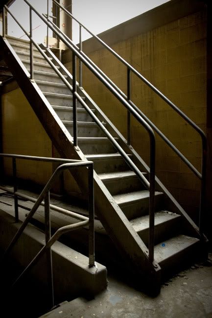
1: Great composition but perhaps you can back up and get the rest of the stairwell in... as in, from the top of the center handrail to the bottom.
2: I like this detail. A lone worker's locker, #22, stands ajar awaiting a new owner.
3: I like the first (vertical) one better, but the breaker and the switches above it should be incorporated, if possible.
4: Nice... I'm drooling.
5: Not too terribly interesting but not bad either.
Nice work!
Abandoned |
|
The Hitman's Daughter
 
Account Closed
Location: ottawa, canada
Gender: Female
hot pavement.
| | | Re: okay...rip me a new one
<Reply # 2 on 1/25/2006 3:52 AM >
| | | | good stuff. only suggestion is to back up a bit and make sure to get all of the object in the photo, like mentioned above.
richellesart.com
From now on and until the end of time, "Hip To Be Square" will conjure images of bloody bodies being hacked apart with axes.
|
|
Louie
| | | Re: okay...rip me a new one
<Reply # 3 on 1/26/2006 3:14 AM >
| | | | My only complaint is #3, it should have been omitted... it's not sharply focused, but it's not tastefully soft. It's just not right.
|
|
causalloop
Location: Santa Clara, CA
Gender: Male

| | | Re: okay...rip me a new one
<Reply # 4 on 1/26/2006 7:02 PM >
| | | | I'd have to agree with that last one, #3 is a bit fuzzy. Good composition though. You might try tweaking the levels in photoshop a bit, like in your last one, it's nice and contrasty, but there's not enough light in the picture so it looks a little underexposed. Liiiike this:

Or you could just blow the exposure out a lot and make it black and white. That always ends up looking pretty cool.
[last edit 1/26/2006 7:06 PM by causalloop - edited 1 times]
Just remember, wherever you go, there you are. |
|
tron_2.0
Location: Ohio
Gender: Male
| | | | Re: okay...rip me a new one
<Reply # 5 on 1/26/2006 8:05 PM >
| | | | Posted by causalloop
I'd have to agree with that last one, #3 is a bit fuzzy. Good composition though. You might try tweaking the levels in photoshop a bit, like in your last one, it's nice and contrasty, but there's not enough light in the picture so it looks a little underexposed. Liiiike this:
Or you could just blow the exposure out a lot and make it black and white. That always ends up looking pretty cool.
|
I purposely made it darker in photoshop simply to make the ladder seem to degrade into complete darkness.
Also, in response to the comment about no. 3, the throw switches were what I focused on, but I completely agree. Thank you for the comments.
[quote][i]Posted by yokes[/i]
I find your lack of coziness.... disturbing.
[/quote] |
|
Blauzon
Location: Boisbriand/Quebec
Gender: Male

| |  | | | Re: okay...rip me a new one
<Reply # 6 on 2/1/2006 1:40 AM >
| | | | i loveee the composition of the second and the last one awesome shot i did my own film look effect on your picture i know i hate when some people play with my picture but i really like yours
her's my version


Mon porte folio
Brunolauzon.com
Les allbran sa gout bon et sa fais des beau ...... |
|
simmorill

Location: Toronto
Gender: Female

Go big or go home.
| | Re: okay...rip me a new one
<Reply # 7 on 2/2/2006 2:00 AM >
| | | | In all honesty, the horizontal breaker box rocks my socks. It's that kind of thing that leaves me wanting more, it gives an idea of intrigue. I also love the locker. It speaks of abandonment.
It seemed like a good idea at the time. |
|
desmet
When the going gets weird, the weird turn pro.
| | | | Re: okay...rip me a new one
<Reply # 8 on 2/2/2006 2:06 AM >
| | | | I thought I posted in this thread already...oh well here goes...
1 - I like this one a lot. Technically I would say you could lose some of the left side, but for some reason I like it as is. Nice.
2 - Fantastic...nothing I would do differently.
3/4 - the second one is better, but I wish the stuff at the top wasn't cut off. The first one seems like it needs levels and hue/saturation.
5 - Great composition. If you had a tripod you could have shot another frame and gotten rid of the blown highlights, but I only noticed the blown highlights when I went to critique this...never noticed them before because of the strong subject. This is a great picture...I love the way the light falls on the stairs...
6 - One of those shots that has good elements but doesn't come together for me. It's OK, but the rest of these are much better.
Really nice work, especially #5....I love #5!
|
|
tron_2.0
Location: Ohio
Gender: Male
| | | | Re: okay...rip me a new one
<Reply # 9 on 2/2/2006 2:17 AM >
| | | | Posted by desmet
I thought I posted in this thread already...oh well here goes...
1 - I like this one a lot. Technically I would say you could lose some of the left side, but for some reason I like it as is. Nice.
2 - Fantastic...nothing I would do differently.
3/4 - the second one is better, but I wish the stuff at the top wasn't cut off. The first one seems like it needs levels and hue/saturation.
5 - Great composition. If you had a tripod you could have shot another frame and gotten rid of the blown highlights, but I only noticed the blown highlights when I went to critique this...never noticed them before because of the strong subject. This is a great picture...I love the way the light falls on the stairs...
6 - One of those shots that has good elements but doesn't come together for me. It's OK, but the rest of these are much better.
Really nice work, especially #5....I love #5!
|
i used a tripod in all of them.
no. 5 i had to tweak a bit. it was an extremely hard shot to get with digital. even then, it was hard to manipulate in photoshop. although here is a version that i redid that perhaps may be better:
i dunno if i even see much of a difference.
and i really have no idea what that blue thing is on the first (or second) step. i think it was a paintchip. although it looks like dust...
[last edit 2/2/2006 2:18 AM by tron_2.0 - edited 1 times]
[quote][i]Posted by yokes[/i]
I find your lack of coziness.... disturbing.
[/quote] |
|
desmet
When the going gets weird, the weird turn pro.
| | | | Re: okay...rip me a new one
<Reply # 10 on 2/2/2006 2:31 AM >
| | | | Posted by tron_2.0
i used a tripod in all of them.
no. 5 i had to tweak a bit. it was an extremely hard shot to get with digital. even then, it was hard to manipulate in photoshop. although here is a version that i redid that perhaps may be better:
|
Yea, I like it with the bright white better. If it's going to be a huge highlight with no detail, might as well have it be bright and not dreary-almost white. In the overall scheme of a really great picture, it doesn't matter.
The blue thing is wierd. You could clone it out if you wanted to.
|
|
tron_2.0
Location: Ohio
Gender: Male
| | | | Re: okay...rip me a new one
<Reply # 11 on 2/2/2006 2:55 AM >
| | | | Posted by desmet
Yea, I like it with the bright white better. If it's going to be a huge highlight with no detail, might as well have it be bright and not dreary-almost white. In the overall scheme of a really great picture, it doesn't matter.
The blue thing is wierd. You could clone it out if you wanted to.
|
true.
acctually, i zoomed into the blue thing...its a bottle cap.
[quote][i]Posted by yokes[/i]
I find your lack of coziness.... disturbing.
[/quote] |
|
Arch-Image
Location: DFW
Gender: Male
"This gene pool could use a little chlorine."
| | | Re: okay...rip me a new one
<Reply # 12 on 2/2/2006 3:25 AM >
| | | | I really like the geometrics of the stair shots and I like what you did with the burning in and going darker as you go down the stair
"Your kid may be an honor student but YOU'RE still an IDIOT!" |
|
blackhawk762
Location: Maryland
Gender: Male
In Tyler We Trust
| |  | | | Re: okay...rip me a new one
<Reply # 13 on 2/5/2006 1:05 AM >
| | | | Posted by tron_2.0
|
I think I'd like this one better if there were more of the lockers in the background and sort of show the repetition. I really like the texture of the locker. As simmorill said, it speaks of abandonment.
"We have to show these men and women freedom by enslaving them, and show them courage by frightening them." "At the time, my life just seemed too complete, and maybe we have to break everything to make something better out of ourselves." "This was freedom. Losing all hope was freedom." |
|
|
|
All content and images copyright © 2002-2024 UER.CA and respective creators. Graphical Design by Crossfire.
To contact webmaster, or click to email with problems or other questions about this site:
UER CONTACT
View Terms of Service |
View Privacy Policy |
Server colocation provided by Beanfield
This page was generated for you in 92 milliseconds. Since June 23, 2002, a total of 739737507 pages have been generated.
|
|
