 |
|
|
UER Store
|
|
sweet UER decals:

|
|
|
 ReRe

Location: n.h.
Gender: Female
RE RE! yay
 | |  | |  | some random pics to pick apart
< on 1/11/2006 3:02 AM >
|  | | | some pics i took before i broke my camera, see if anyone can name the places by looking at the pictures, you know while picking them apart. 
sorry computer illiterate
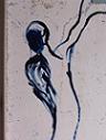
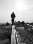
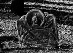
 #1 #1
 #2 #2
 #3 #3
 #4 #4
 #5 #5
 #6 #6
 #7 #7
[last edit 1/11/2006 3:28 AM by ReRe - edited 7 times]
|
|
Ratfink Dan
 
Location: Nashua NH
Gender: Male
| | | Re: some random pics to pick apart
<Reply # 1 on 1/11/2006 3:36 AM >
| | | | 1 and 4 are my favorite, 3 doesnt seem set up real good, but nice idea, 5s cool but it looks like its been messed with and that might have messed it up, and 6 need to be centered more, but im sure ull get a new camera some day and get to take some more
|
|
compwiz32190

Location: PA, United States
Gender: Male
| | | Re: some random pics to pick apart
<Reply # 2 on 1/12/2006 12:17 AM >
| | | | 4 and 6 are real good
|
|
Gazoo
 
Location: Barrie, ON
| |  | Re: some random pics to pick apart
<Reply # 3 on 1/12/2006 12:29 AM >
| | | | Great pics the last one is my favorite
I want to die while asleep like my grandfather,
not screaming in terror like the passengers in his car. |
|
desmet

When the going gets weird, the weird turn pro.
| | | | Re: some random pics to pick apart
<Reply # 4 on 1/12/2006 12:32 AM >
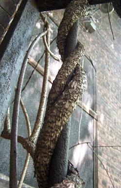
| | | | #1 - Awesome. Might be better if you could see the top of the light hitting the ground, but it might be too centered.
#2 - I can't name what is wrong, but it just doesn't do much for me. The texture is so cool though. Nothing wrong with this, just not for me.
#3 - Fantastic! I'd bump the contrast on the background, but that's nitpicking. I love the composition!
#4 - Cool as hell! Great composition, great colors...nice contrast between the lights that are facing you and those that aren't great shot!
#5 - Great, though I feel like it's not level. I'd have to see it bigger. Nice shot though. The mood of it is so sullen...the drips on the branches and the fog...this is just such a great shot.
#6 - good shot. I love the idea and the composition of most of it, but it feels caught between a straight on shot and an angle shot, and I don't like that you can only see half of the rightmost window. I still like it a lot though. The relationship between the clouds and the broken glass is great!
#7 - Again I might bump the contrast on the background. The relationship between the round arch and the square buildings is great, it just might be a little better if the buildings in the back were stronger and had more color depth. The soft shapes of the snow help finish off the arch, which works so well. Absolutely wonderful shot though...I wish I had taken it.
I really like your photographs...nice work.
|
|
ReRe
Location: n.h.
Gender: Female
RE RE! yay
| | | Re: some random pics to pick apart
<Reply # 5 on 1/12/2006 10:58 PM >
| | | | thanks for the replies, desmet and ratfinks gave some good tips
I'll be back!
|
|
n_millard
Location: Rhode Island
Lighting it Up
| | | | Re: some random pics to pick apart
<Reply # 6 on 1/17/2006 2:33 AM >
| | | | 1, 7, and 4 are my favourites
#4 is pretty cool, love the blue
#1, i normally don't like dust, but i love the way the light hits it
#7 like the arc, but more centered would be nice
|
|
Shai Hulud

Location: Evansville IN
Gender: Male

Shai, Team Phantom
| | Re: some random pics to pick apart
<Reply # 7 on 5/23/2006 3:48 AM >
| | | | I LOVE the way the dust reflects light in the first one. That's a great picture. The rest are pretty good as well. Good job, keep it up.
Me: Why is there snow on her car? ... Wait a minute, that isn't snow at all!
MutantMandias: Nothin' gets past you, man. Nothin'.
-TN Waltz n 'Splore Volume 2 |
|
Majickal
Location: Evansville, Indiana
Gender: Male
<3 Home Depot
| | | Re: some random pics to pick apart
<Reply # 8 on 5/29/2006 1:59 AM >
| | | | 1.) Excellent use of the dust reflecting the light, try using a tripod next time if you can, to level the camera. If you did use a tripod than my eyes are off center and ignore me.
2.) I like the way you caught the reflection in the nearby window whether you meant to or not. Nice use of black and white on this one and number 2.
3.) I like this, but it would be much better if you fixed up the contrast a little bit more, seems a bit fuzzy, but that's all I could really think of.
4.)Kickass.
5.)I LOVE the way you had a crystal clear background but artistically low contrast on the background of the picture. it brings out the sharpness of the subject even more.
6.) Buy a tripod.
7.) Didn't care for this one, a little lacking in character. I would have gotten some kind of evidence that the site was abandoned and used it as the subject. this would make a nice background but alone isn't so appealing.
Note: take all of these critiques with a grain of salt. Most of these required effort to dig up anything wrong with them. Except 6. It's nice but looks as if you didn't take time on it.
This is the sig |
|
|
|
All content and images copyright © 2002-2024 UER.CA and respective creators. Graphical Design by Crossfire.
To contact webmaster, or click to email with problems or other questions about this site:
UER CONTACT
View Terms of Service |
View Privacy Policy |
Server colocation provided by Beanfield
This page was generated for you in 140 milliseconds. Since June 23, 2002, a total of 739889126 pages have been generated.
|
|
