 |
|
|
UER Store
|
|
sweet UER decals:

|
|
|
 xrahy
      
Noble Donor
 | |  | 5 from xrahy-
< on 12/10/2005 1:41 AM >
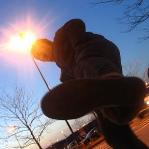
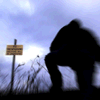
|  | | | Five photos:


Your honest and constructive criticism welcome.
Thanks,
xrahy
|
|
HauntedPA

Location: Anywhere and Everywhere
Gender: Female

What do you mean the rum is gone?!
| | Re: 5 from xrahy-
<Reply # 1 on 12/10/2005 11:14 AM >
| | | | There's something about #5 that's bugging me. Maybe it's because that type is out of focus or something...
Also in #4 a little more light would've probably helped. Just a bit too dark and found it hard to get my eye to move to the chair. (assuming that's where you wanted the eye to go)
The 1st three shots are great though...love the angle of the first one.
|
|
Andy "Not Dice" Dice

Location: We can live in dumpsters if we have to, MA
Gender: Male
UE'ing is for pussies, bro.
| |  | |  | Re: 5 from xrahy-
<Reply # 2 on 12/10/2005 5:22 PM >
| | | | Posted by HauntedPA
There's something about #5 that's bugging me. Maybe it's because that type is out of focus or something...
|
I think it's just the jpeg compression. The text is really small and details like that tend to get a little fuzzy in jpegs. Very subtly but very irritating. I bet the original photo is fine.
Awesome colors in #2. The composition could have been a little more intentional? All of the vertical lines are tilted like TWO degrees to the right. I dunno if you did it tilted on purpose but it bugs me a little. It just makes the shot less...well...intentional.
Nice work overall. I love extended exposures!
--- 456.photo.to --- |
|
seicer

Location: New York
Gender: Male
| | | Re: 5 from xrahy-
<Reply # 3 on 12/10/2005 5:48 PM >
| | | | #1 - I like the angle and composition.
#2 - Nice colors and angle. It gives the impression that you want to press the speaker button and yell at someone that is on the outside.
#3 - Nice scenic shot, snow is a bit gray though.
#4 - Argh! Another chair shot, but this one is quite nice. The light makes the object stand out and radiate against the background.
#5 - Can't really make this one out at first glance, but like others said, it is probably due to the quality of the JPEG resized and the size of the image physically itself.
Abandoned |
|
nd31
| | Re: 5 from xrahy-
<Reply # 4 on 12/10/2005 8:50 PM >
| | | | How'd you compress these? They seem overly sharp and jagged in some parts.
|
|
xrahy
Noble Donor
| | Re: 5 from xrahy-
<Reply # 5 on 12/11/2005 1:39 AM >
| | | | Posted by ndillon31
How'd you compress these? They seem overly sharp and jagged in some parts.
|
yeah, I see that too. I think it may have to do with using MS Paint to smallerize them. Also, several of them have been tweaked in PS, a program I have no idea how to use.
Thanks for the input, I hope to use it to my advantage.
xrahy
|
|
Caput_58
Location: Virginia, USA
Gender: Male
| | | Re: 5 from xrahy-
<Reply # 6 on 12/11/2005 2:11 AM >
| | | | These are all good shots, especially 1, so my comments are more nitpicking than anything else.
#1 shows signs of barrel distortion, which you may not mind, but it always bothers me. Notice the slight bend to the window frames. It's easily correctable with 'PTLens', a free PS plugin.
#2 is impressive in that you got a good exposure of the indoor and outdoor scene. I find the color balance to be a little too green for my tastes, though some people like to leave things like that, especially in long exposures. If not, I'll bet autolevels in PS would fix it up...
If #3 is sharp in a larger image, it would make a nice print. Again, I'd like to see the white balance improved so the snow is white, not yellow, but that is personal pref.
I've seen #4 before and I like it. If it were mine, I'd crop the out the lower left corner, keeping the aspect ratio fixed. That would eliminate the left hand window that is cut, as well as some of the black space. The chair is cool, the windows are interesting, and the pattern on the ceiling is awesome. But the black space on the bottom could go. Again, personal opinion, lots of people may disagree.
#5: I know what this is, where it is, and that it is awesome. This makes it a cool picture to me. To other, it might be a bit confusing, but screw them. I'm guessing you used PS to up the contrast? This was the right choice. You could cheat with this one and flip it from right to left, making the letters more legible, and therefore a bit more interesting to the avg viewer.
Next time, I'll tear your work to shreds just to keep things interesting. Possibly literally. I'll figure it out when the time comes.
|
|
|
|
All content and images copyright © 2002-2024 UER.CA and respective creators. Graphical Design by Crossfire.
To contact webmaster, or click to email with problems or other questions about this site:
UER CONTACT
View Terms of Service |
View Privacy Policy |
Server colocation provided by Beanfield
This page was generated for you in 82 milliseconds. Since June 23, 2002, a total of 740611389 pages have been generated.
|
|
