 |
|
|
UER Store
|
|
 order your copy of Access All Areas today!
|
|
|
|
Activity
|
|
913 online
Server Time:
2024-05-02 21:31:02
|
|
|
 350D
  
Location: Toronto Ontario
Gender: Male
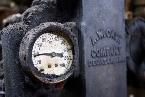
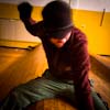
 | |  | |  | a couple of shots
< on 11/29/2005 2:11 PM >
|  | | | Im new to this site and thought this critique thing was cool so here you go. Keep in mind i dont really understand the very technical aspect of photography (i dont even own photoshop), but what the hell...
|
|
Glass
     
Location: Chicago
as one does
| | | Re: a couple of shots
<Reply # 1 on 11/29/2005 2:21 PM >
| | | | In the first picture I really love the specular light. What I don't like is the composition: it doesn't seem refined--more like a snapshot than 'artsy.' It's not balanced in shape, tone, or line so the resulting image is chaotic. I think a 20 degrees tilt with a closeup on something of interest would help a lot.
The second selection is print-worthy! The only thing I'd do is pop the contrast a little bit, bust to make the shadows of the stairs pop a little! Great job!
Oh-as per presentation: try to get a black texture border on it... it would help a lot. PS isn't a must for this.
|
|
Greg
Location: Canada
Gender: Male

How is this even 'exploration'? It's a loving house you've already been in you weirdo!
| | | Re: a couple of shots
<Reply # 2 on 11/29/2005 7:33 PM >
|  | | | Photo two is the better one out of the two.
|
|
Dowcet
Location: Middletown, ct
| |  | Re: a couple of shots
<Reply # 3 on 11/30/2005 12:30 AM >
| | | | Posted by mynameisglass
In the first picture I really love the specular light. What I don't like is the composition: it doesn't seem refined--more like a snapshot than 'artsy.' It's not balanced in shape, tone, or line so the resulting image is chaotic.
|
I would disagree, personally, I think #1 is a great composition. #2 seems little out of focus actually, but its really nice overall. I think glass is right that the contrast or something needs to be tweaked just a bit.
|
|
350D
Location: Toronto Ontario
Gender: Male
| | | Re: a couple of shots
<Reply # 4 on 11/30/2005 12:48 AM >
| | | | thnks for the input. The first picture was kinda rushed, it was taken up at CFB Foymount in norther Ontario. I had someone busting my balls to leave so i didnt have much time to take pictures. that place would defintly be worth going back with some more time.The second one is blurry now that i see it. My rebel XT's been acting up so i duno. Anyone know wat ERROR 02 means?
|
|
|
|
All content and images copyright © 2002-2024 UER.CA and respective creators. Graphical Design by Crossfire.
To contact webmaster, or click to email with problems or other questions about this site:
UER CONTACT
View Terms of Service |
View Privacy Policy |
Server colocation provided by Beanfield
This page was generated for you in 203 milliseconds. Since June 23, 2002, a total of 740234933 pages have been generated.
|
|


