 |
|
|
UER Store
|
|
 order your copy of Access All Areas today!
|
|
|
|
Activity
|
|
699 online
Server Time:
2024-05-07 07:26:44
|
|
|
 Alvin
     
Location: Montreal
Gender: Male
Photography & Sound
 | |  | Comments anyone ?
< on 11/28/2005 4:05 AM >
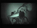
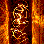
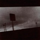
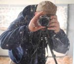
|  | | | Here are a coupe of photos I did recently this year and would like to read your opinions about them  I will post other pictures of mine later on when ill have the time to as I learn a lot from people's opinions and advices. I will post other pictures of mine later on when ill have the time to as I learn a lot from people's opinions and advices.
edit: I added the modified version of the second photo
[last edit 11/28/2005 4:11 AM by Alvin - edited 1 times]
©---(®) Alvin (®)---© |
|
mada

Noble Donor
Location: Orange County, California
Gender: Male
23437
| |  | |  | |  | Re: Comments anyone ?
<Reply # 1 on 11/28/2005 4:10 AM >
| | | | Out of context, they really aren't too impressive. They seem like snap shots, more or less.
The following sentence is false. The preceding sentence is true.
|
|
baleze
 
Location: Montreal
Gender: Male

I don't really hate children. I just can't finish a whole one.
| | Re: Comments anyone ?
<Reply # 2 on 11/28/2005 12:33 PM >
| | | | Actually, the first one looks a lot like a snapshot. Nothing interesting there.
The other picture is pretty sweet. I love the modified version a little more.
http://www.flickr....otos/30228457@N05/
http://baleze.deviantart.com/
what |
|
n_millard

Location: Rhode Island
Lighting it Up
| | | | Re: Comments anyone ?
<Reply # 3 on 11/30/2005 10:27 PM >
| | | | yeah, the first one is meh, looking more towards the last two, same picture, but the b&w of the last one and the "overexposed" edges look really sweet, nice
|
|
xseption

Location: Richardson, TX
Gender: Male

| | | Re: Comments anyone ?
<Reply # 4 on 12/8/2006 5:09 PM >
| | | | I like the composition of the second one!
~ xseption
two cents and then some ... |
|
brandnewteeth

Location: Atlanta, Georgia
Gender: Male
Carry the torch that's never lit.
| | Re: Comments anyone ?
<Reply # 5 on 12/8/2006 5:20 PM >
| | | | That first one.. It's been said.
Anyhow, the other two are neat in concept, but I think the composition fails to capture what you were trying to capture.
mutantMandias: You're everywhere. You're the wind. You're the air. You're the bnt. brandnewteeth is like the Cyrus of Marietta gangs. CAN YOU DIG IT?
dsankt: BNT rocks shiny penny loafers. I heard he explores in them cos it puts a spring in his step for the laddies.
Contagion: I still think BrandNewTeeth is a prick, no matter what. Bitch ate all of my thanksgiving leftovers! |
|
darth_operator
Location: armpit o' Texas
Gender: Female

I don't hate kids...just the tangy aftertaste.
| | | Re: Comments anyone ?
<Reply # 6 on 12/8/2006 5:45 PM >
|  | | | crotch shot! and out of context, I'm really not too sure what I'm looking at in #'s 2 & 3.
|
|
olivia
Location: Maryland
Gender: Female

| | | Re: Comments anyone ?
<Reply # 7 on 12/8/2006 6:33 PM >
| | | | I like the way you edited the third one... and I think it's a good shot too.
|
|
schmoo
Location: San Fran, CA
Gender: Female

fun sized
| | | Re: Comments anyone ?
<Reply # 8 on 12/8/2006 7:39 PM >
| | | | I like the third one the best. It's a very abstract, geometric shot that makes you look twice if you don't know that it's a UE photo and a doorway. I like the frame-in-frame concept, although the right edge of the second wall (crenellated) seems to bug me a bit. Possible re-shoot? Also, I am not terribly fond of the faded edge, but perhaps that's just my personal preference to have Photoshopping be subtle and discrete.
Likewise I seem to ge the nagging impression that something is missing. More tonal depth? I don't know. But overall I think that it's a great idea and good composition.
Schmootography.com
Other stuff |
|
:: inuk
Location: Burnaby BC.
Gender: Male

Freelance Thinking
| | Re: Comments anyone ?
<Reply # 9 on 12/13/2006 2:40 AM >
| | | | I actually prefer the second one, but do like the faded border.
::
|
|
182 lbs of sad
Location: in the gym training my ass off!
Gender: Male
| | Re: Comments anyone ?
<Reply # 10 on 3/12/2007 2:01 PM >
| | | | im not liking them at all sorry
Fight like a man
Bleed like a man
Die like a man |
|
screamingwatts
| | Re: Comments anyone ?
<Reply # 11 on 3/12/2007 9:54 PM >
| | | | they don't really do anything for me, but i do have some constructive criticism. I think 3 would have looked great if you got in closer to the actual hole so that the edges of that hole become the "frame" around the entire shot. from there, i'd close up the aperture so that the rest of those holes in the lineup are nice and crisp.
|
|
|
|
All content and images copyright © 2002-2024 UER.CA and respective creators. Graphical Design by Crossfire.
To contact webmaster, or click to email with problems or other questions about this site:
UER CONTACT
View Terms of Service |
View Privacy Policy |
Server colocation provided by Beanfield
This page was generated for you in 218 milliseconds. Since June 23, 2002, a total of 740900117 pages have been generated.
|
|


