|
|
|
UER Store
|
|
 order your copy of Access All Areas today!
|
|
|
|
Activity
|
|
952 online
Server Time:
2024-05-05 16:12:39
|
|
|
 dev
  
Passed away September 23rd, 2006.
 | |  | bring the hatred
< on 11/27/2005 10:08 PM >
|  | | | i'm pretty sure that i've posted all of these before.
whatever.
and for those that might comment: i'm using a sony dsc-p31. this means that i have no manual control over shutter or aperture, a 33mm (equiv) fixed lens, and max exposure is 2 seconds @ f/2.8 @ ISO 100.
also, these are just random selections from my photobucket, i have different versions of most of these that i actually took the time to post-process in a more sane fashion.
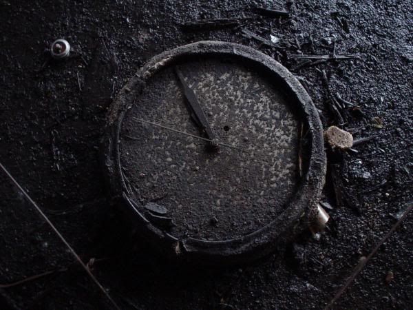
1.
2.
3.

4.

5.
6.
7.
8.

--dev
|
|
mada
 
Noble Donor
Location: Orange County, California
Gender: Male
23437
| |  | |  | |  | Re: bring the hatred
<Reply # 1 on 11/28/2005 1:18 AM >
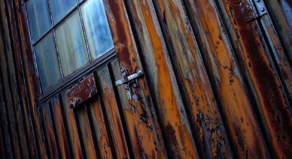
| | | | 1 and 4 are obviously cropped to hell which means you might just want to throw them out completely and start over.
8 has no real focus point.
2 is amazing, aside from the lense flare but it kind of adds to it in a way. Nice job.
3 three is almost there but, again, obvious cropping.
5, 6, and 7 are pretty good but also pretty standard and therefore in the mediocre realm.
The following sentence is false. The preceding sentence is true.
|
|
Dowcet
  
Location: Middletown, ct
| | | Re: bring the hatred
<Reply # 2 on 11/28/2005 1:18 AM >
| | | | #1 and #7 are REALLY wonderful... I love the color and the form!
In #2 I find the ghostlike glare in the middle-right really distracting. If you could burn it out without it looking too unnatural, this would be a big improvement.
#4 seems like it might be cropped too tight, especially on the bottom edge where the shape of the motor-thingy is cut off. If you have a full-frame image I'd to see it posted on here for comparison
|
|
Redknight

Location: Missouri
Gender: Male
| | Re: bring the hatred
<Reply # 3 on 11/28/2005 4:57 AM >
| | | | #3 Is print worthy, no doubts about it to me.
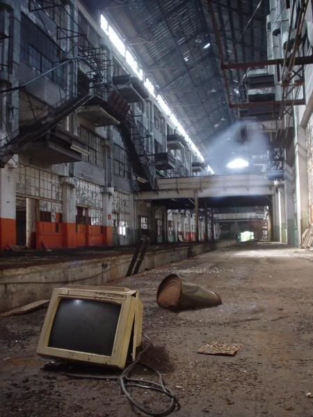
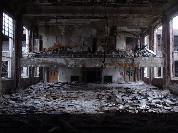
Alot of the others are kinda mediocre. I am liking #2 but the glare is distracting from the shot to me. Im also liking #6, it takes a step away from mediocre to me, but it could be alot better with better framing of the shot.
|
|
robdobi

| | | | Re: bring the hatred
<Reply # 4 on 11/28/2005 6:24 AM >
| | | | #1 looks really good, i'm always a sucker for nice rust but as mada said the cropping is kind of bothersome
#2 is pretty rad as well, the light coming through is sort of a pain but not much you can do about it without heavy photoshoppery. if you want me to get really anal the cord touching the bottom of the photo is the sort of composition thing that always drives me nuts.
dobi.nu / fullbleed.org - series 12 now available. / flickr / tumblr
/ prints for sale |
|
seicer

Location: New York
Gender: Male
| | | Re: bring the hatred
<Reply # 5 on 11/28/2005 6:46 AM >
| | | | #1: Excellent color hue separations and interesting angle.
#2: Nice focus on the old, broken monitor resting silently on the floor of this industrial hulk. Great comparison that the new technological advancements cannot seem to stand the test of time against an old, graying building.
#3: Perhaps a colour shot would be more appropriate?
#4: Not 100% sure on the focus at first hand.
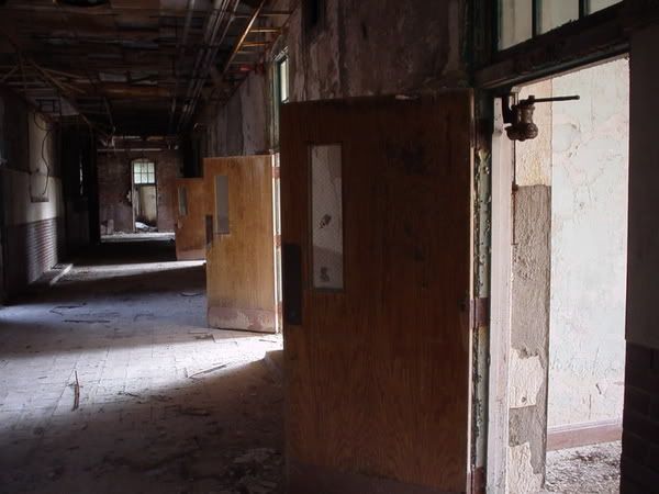
#5: Great shot of all the doors open. I would like to see this from other angles as well.
#6: That's just errie.
#7: Great colors and interesting perspective and take on it. Most would aim for a dead-on shot from the front.
Abandoned |
|
dev
Passed away September 23rd, 2006.
| | Re: bring the hatred
<Reply # 6 on 11/28/2005 3:55 PM >
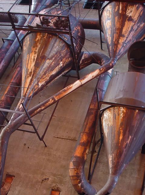
| | | | on all: cropping often is a downright necessity with my camera. having a fixed lens means that it's often impossible to get the composition that i want by properly framing the shot. that being said, i'll see to putting more thought into where i cut the lines.
#1 is the over-cropped version of that image; i'm currently working on round three of that one simply due to the fact that i really really like the colors. might hafta go back and reshoot that area, if i can find it again (that building complex is 1.5 million sqft)
#2: without serious photoshop abuse, that spectral lens flare is just not going away. i almost look at it as a secondary subject... excuse or not, once again, the crappy lens on my camera is at fault. (i exposed that image 4 times trying to shade or get rid of that flare. it just wasn't going away.)
#3: here's an uncropped color original. the crop on that one is kinda blah, and without some more work on desaturating it properly, it does look better in color.
#4: junk.
#5: i was going for a hallway shot with a funky angle and showing repetition in the doors... but it's hard to shoot any hallway shot that's NOT been done to death. oh well.
#6: i really, really wish i could re-shoot this. unfortunately, this image was taken the day that demolition started.
#7: at least this building is still there. can definitely re-shoot.
#8: definitely lacking subject. the preferred focus point would have been the hook on the crane. i shot a few frames of it on film with the lens wide open (i think, i haven't developed the film yet.) we'll see.
-------------------
thanks to all who didn't say "great photos!"
--dev
|
|
EatsTooMuchJam
Location: Minneapolis, MN
Gender: Male
Squirty "Stickybuns" von Cherrypants
| |  | |  | | | | | Re: bring the hatred
<Reply # 7 on 11/28/2005 4:05 PM >
| | | | Great photos!
++++
"The large print giveth and the small print taketh away."
-Tom Waits |
|
dev
Passed away September 23rd, 2006.
| | Re: bring the hatred
<Reply # 8 on 11/28/2005 5:56 PM >
| | | | Posted by EatsTooMuchJam
Great photos!
++++
|
You know, I just might change my username on here to "EatsNotEnoughJam" just so I can say "great photos +++++" all over and get my postcount up to 3800.
I swear, some of the people on here must think that there's a "10,000 useless posts" star, and they're trying damn hard to get it...
|
|
EatsTooMuchJam
Location: Minneapolis, MN
Gender: Male
Squirty "Stickybuns" von Cherrypants
| | | | | | Re: bring the hatred
<Reply # 9 on 11/28/2005 6:13 PM >
| | | | Posted by dev
You know, I just might change my username on here to "EatsNotEnoughJam" just so I can say "great photos +++++" all over and get my postcount up to 3800.
I swear, some of the people on here must think that there's a "10,000 useless posts" star, and they're trying damn hard to get it...
|
Great angry commentary!
+++++++++
"The large print giveth and the small print taketh away."
-Tom Waits |
|
dev
Passed away September 23rd, 2006.
| | Re: bring the hatred
<Reply # 10 on 11/28/2005 6:21 PM >
| | | | Posted by EatsTooMuchJam
Great angry commentary!
+++++++++
|
Great misjudgement of sarcastic-i-thought-your-sarcasm-was-funny commentary!
+++++++++++++++++++++++++++++++++++++++++++++++++++++
|
|
EatsTooMuchJam
Location: Minneapolis, MN
Gender: Male
Squirty "Stickybuns" von Cherrypants
| | | | | | Re: bring the hatred
<Reply # 11 on 11/28/2005 6:47 PM >
| | | | Posted by dev
Great misjudgement of sarcastic-i-thought-your-sarcasm-was-funny commentary!
+++++++++++++++++++++++++++++++++++++++++++++++++++++
|
Great misjudgment of my sarcastic response to your sarcastic commentary!
++++++++++++++++++++++++++++++++++++++++++++++++++++++++++++++++++++++++++++++++++++++ ++++++++++++++++++++++
"The large print giveth and the small print taketh away."
-Tom Waits |
|
Glass

Location: Chicago
as one does
| | | Re: bring the hatred
<Reply # 12 on 11/28/2005 7:21 PM >
| | | | lol
I think you do well with texture and bless your black and white heart for keeping some midtones!
|
|
Mr. Motts
Noble Donor
Location: Long Island and Brooklyn NY
Gender: Male

| | | Re: bring the hatred
<Reply # 13 on 11/29/2005 1:30 AM >
| | | | I really like #1, the cropping wouldn't bother me unless it was accompanied by photos with more "standard" aspect ratios, then it would look out of place.
I agree with Rob in that #2 would be killer if the cord didn't touch the bottom edge.
#4 feels muddy and lacks a focal point
#7 might be more interesting if framed differently, again little focal point. Perhaps a wider shot to emphasize that there wasn't a focal point and exaggerate the repetitive shapes on the building... but here it's kinda floating in the middle. I don't find the colors to be too pleasing, warming it up might look better.
The others look great
Save the planet... kill yourself.
http://www.opacity.us/ - Abandoned Photography |
|
Azrael
Location: South West UK
Gender: Male

| | Re: bring the hatred
<Reply # 14 on 11/29/2005 10:51 AM >
| | | | You could have caught the light better in #2 perhaps if you used filters but it is a fantastic shot. Really lets you see the scale of the place.
Urban Explorers always take the red pill... |
|
Lynx
Location: North York
Gender: Male

:do not cry out or hit the alarm
| | Re: bring the hatred
<Reply # 15 on 12/1/2005 8:57 PM >
| | | | I really like #2 except for the ghosty lens flare is distracting and I'd rather have seen the detail in that spot.
#1 is really nice colour and texture, very aggressive crop, which apparently gets some people annoyed but I don't mind it, though I think it would be a stronger image if it was just framed better in the first place.
I like 6 cause it totally makes me want to build a model of that place and use it for wargaming..it's awesome, it looks so war-torn. you don't understand how much it makes me want to get back into Wh40K cityfight. making terrain was my favourite part.
#3 is just cool but looks more like a cinematic composition than a still image...know what i mean?
|
|
Dowcet
Location: Middletown, ct
| | | Re: bring the hatred
<Reply # 17 on 12/2/2005 1:12 AM >
| | | | Posted by robdobi
hope you don't mind dev, but i needed a break from work and was curious how it would look if the photo actually was photoshopped to death. here is the remix.
|
If I had never seen the original I would have never suspected anything; its definitely not "photoshopped to death", if you ask me. I think this new image is really strong.
EDIT- typo
[last edit 12/2/2005 1:13 AM by Dowcet - edited 1 times]
|
|
buckybear
Gender: Male
| | Re: bring the hatred
<Reply # 18 on 12/2/2005 3:20 AM >
| | | | I like number 2. The smashed CRT really makes it stand out.
|
|
dev
Passed away September 23rd, 2006.
| | Re: bring the hatred
<Reply # 19 on 12/5/2005 9:27 PM >
| | | | 
so. #2 was everyone's favourite.
i went back, only to find that monitor had been kicked down into the rail spur, so i moved shit back as best as i could remember without having a print of the original... it was overcast, so the windows didn't flare nearly as bad, but the foreground (bottom third or so of the image) was underexposed, so i hadda do some levels work on that part of the image, so it's a bit noisy. whatever. it was worth the second try and the 3 minutes in photoshop to bring out the foreground.
it could prolly use some more post-process, but i don't feel like it right now.
|
|
|
|
All content and images copyright © 2002-2024 UER.CA and respective creators. Graphical Design by Crossfire.
To contact webmaster, or click to email with problems or other questions about this site:
UER CONTACT
View Terms of Service |
View Privacy Policy |
Server colocation provided by Beanfield
This page was generated for you in 125 milliseconds. Since June 23, 2002, a total of 740662943 pages have been generated.
|
|