 |
 |
|
UER Store
|
|
sweet UER decals:

|
 |
 |
|
Activity
|
|
851 online
Server Time:
2024-05-02 14:40:35
|
|
 |
 Louie
      
 | |  | |  | You know you want to.
< on 11/26/2005 3:47 AM >
|  | | | Come on.
Violate them. Penetrate them. Fuck them like an animal.
DESTROY MY PHOTOS!!
(only to build them back up with constructive criticism, of course!)


louie
|
|
Noah Vale
    
Location: Portland, Or
It's nobler to never get paid, than to bank on shit and dismay
 | |  | |  | |  | Re: You know you want to.
<Reply # 1 on 11/26/2005 3:55 AM >
|  | | | The second one doesn't do anything for me, but the other two are great! Only thing I can say is maybe a bit more detail in the gravel in the first shot.
"Dallas is a magnificent and wide open city, and I'm deeply envious of any urban explorers who have the good fortune to live there." -Ninj. |
|
msb
    
Location: Sykesville, MD
Gender: Male

 | |  | |  | |  | Re: You know you want to.
<Reply # 2 on 11/26/2005 3:59 AM >
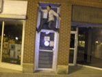
|  | | | I like the second one, but I wish the sticker could be parallel with the border. The slight angle bothers me.
The last one, I think there is too much background. The top half of the photo adds very little. I am not sure how you would fix it though, cropping it would make for a very wide and short photo.
Keep shooting man, you produce good stuff.
|
|
Redknight
   
Location: Missouri
Gender: Male
 | |  | Re: You know you want to.
<Reply # 3 on 11/26/2005 4:11 AM >
|  | | | Im liking the first shot(do it in B&W!! jk ). The gravel on the right is a wee bit overexplosed, may be helped with some filter in b&w or a different aperture. I cant decide but for the framing I think I would like alittle less foliage on the top, the angle of the shot is excellent though. ). The gravel on the right is a wee bit overexplosed, may be helped with some filter in b&w or a different aperture. I cant decide but for the framing I think I would like alittle less foliage on the top, the angle of the shot is excellent though.
2nd one doesnt really do much for me.
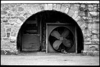
Im also liking the third. May want to open the focal range to include whatever that is on the left alittle better(a dental tool?). The out of focus part on the right is kinda distracting from the shot, so framing it without that or perhaps a angle thats alittle higher and to the right.
Definatly liking the first and third.
|
|
msb
    
Location: Sykesville, MD
Gender: Male

 | |  | |  | |  | Re: You know you want to.
<Reply # 4 on 11/26/2005 4:15 AM >
|  | | | Posted by Redknight
Im liking the first shot(do it in B&W!! jk ). ).
|
or IR. Those trees would come out nicely. 
|
|
Redknight
   
Location: Missouri
Gender: Male
 | |  | Re: You know you want to.
<Reply # 5 on 11/26/2005 4:18 AM >
|  | | | Ive never shot IR  . Would the trees be brighter or darker. I think it would be kinda cool to use a green filter b&w and see some big contrast in there and give the shot a different feel. Wouldnt the green also lower the brightness of those white rocks alittle also? . Would the trees be brighter or darker. I think it would be kinda cool to use a green filter b&w and see some big contrast in there and give the shot a different feel. Wouldnt the green also lower the brightness of those white rocks alittle also?
|
|
mada
  
Noble Donor
Location: Orange County, California
Gender: Male

23437
 | |  | |  | |  | |  | Re: You know you want to.
<Reply # 6 on 11/26/2005 4:19 AM >
|  | | | I like the first and last one. The middle one just doesn't work in that desaturated-digital-file kind of way. Perhaps some more contrast would help.
The following sentence is false. The preceding sentence is true.
|
|
msb
    
Location: Sykesville, MD
Gender: Male

 | |  | |  | |  | Re: You know you want to.
<Reply # 7 on 11/26/2005 4:21 AM >
|  | | | Posted by Redknight
Ive never shot IR  . Would the trees be brighter or darker. . Would the trees be brighter or darker.
|
The leaves on the trees would be white.  He can always play with different color "filters" in PS. He can always play with different color "filters" in PS.
|
|
Obscura
 
Gender: Male

Nikonwhore
 | |  | Re: You know you want to.
<Reply # 8 on 11/26/2005 7:29 AM >
|  | | | Posted by fatLouie
Come on.
Violate them. Penetrate them. Fuck them like an animal.
DESTROY MY PHOTOS!!
(only to build them back up with constructive criticism, of course!)

center the tracks in the bottom of the shot...one step to the left... like the way it draws the viewer in.. B&W IR would be very cool for this shot.

not that interesting to me...

rule of thirds is good for the box but that out of focus hot spot on the wall is distracting... how about if it were taken from a steeper angle to eliminate the background a bit more... nice shallow depth of field
louie
|
Obscura
"Grizzly...Who's Steve?" |
|
Louie
      
 | |  | |  | Re: You know you want to.
<Reply # 9 on 11/26/2005 7:48 AM >
|  | | | Obscura - stop replying with image quotes. It takes up too much space. Simply refer to the image numbers.
Number 2, back from the dead (and hopefully improved!)
You see, I'm very selective about my shots! (haha, get it? no? oh well...)

[last edit 11/26/2005 7:49 AM by Louie - edited 1 times]
|
|
volare
  
Gender: Male

 | |  | Re: You know you want to.
<Reply # 10 on 11/26/2005 4:40 PM >
|  | | | I really liked #2 as was.. the color on the DC sign is ok.. but the color on the Raiders sticker is really awful in my opinion. I really liked the minimalism of the original completely desaturated #2.
I think #3 is fantastic as is.. perfect depth of field..
The only one I'm not crazy about (lol.. which ironically seems to conflict with all of your other feedback) is #1. The composition itself is great.. but better lighting would bring tons of mood and atmosphere to the shot. To me it looks like the shot was taken late morning or afternoon on a slightly hazy day. I always avoid shooting at this time simply because I hate the natural light at that time of day. Warm early morning or early evening sunlight would bring so much character out of the brick.. IR might be cool too as someone else mentioned..
In any case.. I like the style.. great work.
(This is also my first post.. I'll have more intro and pics of sites maybe later.)
[last edit 11/26/2005 4:46 PM by volare - edited 1 times]
|
|
seicer
     
Location: New York
Gender: Male

 | |  | |  | Re: You know you want to.
<Reply # 11 on 11/26/2005 4:44 PM >
|  | | | The first one, with the train tunnel, is now one of my favorites and is my background on my PC at the moment. I'm a HUGE railfan and love shots like that, where the rails lead you into the picture.
Second one is better in color than in B/W.
I like the third one, great focused object.
Abandoned |
|
Obscura
 
Gender: Male

Nikonwhore
 | |  | Re: You know you want to.
<Reply # 12 on 11/26/2005 6:27 PM >
|  | | | Posted by fatLouie
Obscura - stop replying with image quotes. It takes up too much space. Simply refer to the image numbers.
|
sorry, I'm used to replying that way for my students. Thought it would be okay so people didn't have to scroll up and down... won't happen again.
Obscura
"Grizzly...Who's Steve?" |
|
Louie
      
 | |  | |  | Re: You know you want to.
<Reply # 13 on 11/26/2005 6:41 PM >
|  | | | Posted by seicer
The first one, with the train tunnel, is now one of my favorites and is my background on my PC at the moment. I'm a HUGE railfan and love shots like that, where the rails lead you into the picture.
|
Thanks. What resolution do you run your monitor at? I'll send you a high-res version.
|
|
InsertNameHere
  
Location: North County San Diego
Gender: Male

We were playing flashlight tag, officer!
 | |  | |  | Re: You know you want to.
<Reply # 14 on 11/26/2005 6:45 PM >
|  | | | Is that first one Moonville, by chance?
A cage went in search of a bird. |
|
Crossfire
    
Location: Kay-Dub
Gender: Male

Don't call it a comeback, I've been here for years.
 | |  | |  | |  | |  | Re: You know you want to.
<Reply # 15 on 11/26/2005 6:49 PM >
|  | | | Posted by fatLouie
Thanks. What resolution do you run your monitor at? I'll send you a high-res version.
|
I'd be down with that. 1280 x 1024, please!!
C.
Disgruntled. |
|
Louie
      
 | |  | |  | Re: You know you want to.
<Reply # 16 on 11/26/2005 7:19 PM >
|  | | | Posted by InsertNameHere
Is that first one Moonville, by chance?
|
Nope. Never heard of it.
http://img407.imag...10/backrail5sl.jpg
There you go, now you can enjoy all of the scanning imperfections in high-res goodness.
|
|
Kelwyn
 
Location: DC Metro area
Gender: Male

Jackass of all trades.
 | |  | |  | Re: You know you want to.
<Reply # 17 on 11/26/2005 7:33 PM >
|  | | | Good stuff. First one feels like it was shot on an overcast day; the colors a bit muted. I agree that if you center the tracks at the bottom, it would be improved, but otherwise, the composition is good. You may want to tip up or down just a bit, to keep the point where the tracks go into shadow out of the center. More trees would be interesting, but seeing more of the tracks would be too... I'm torn on which way to go.
The second is great, I love the desaturated version you posted first. Easily my favorite of the three (but I'm also a sucker for black and white).
The third doesn't feel like there is much you can do to improve it... good depth of field, great composition. It feels a bit grainy, but that seems to work for me.
Good stuff.
"I worry that Jesus drinks himself to sleep when he hears me talk like this."
- Anne Lamott, Bird by Bird |
|
nd31
  
 | |  | Re: You know you want to.
<Reply # 18 on 11/26/2005 7:33 PM >
|  | | | The first has really weird screeny granular pattern. It's got decent composition though. As for the second one, I definitely agree with the others who've said it's flat. It looks definitely digitally desaturated, and the probably neutral tones of the subject matter doesn't really help.
The last I really like. It looks very 80's science textbook-ish.
|
|
handskills
     
Location: Jer zay
Gender: Male

visual distress
 | |  | |  | Re: You know you want to.
<Reply # 19 on 11/26/2005 10:14 PM >
|  | | | As Far as number 2 goes...
the Redskins can continue to piss themselves.
the dental x-ray film is a nice find but the image
lacks a certain punch... emotion, ya know...
hmmmm... how do you spell genous se qua?
|
|
|
|
All content and images copyright © 2002-2024 UER.CA and respective creators. Graphical Design by Crossfire.
To contact webmaster, or click to email with problems or other questions about this site:
UER CONTACT
View Terms of Service |
View Privacy Policy |
Server colocation provided by Beanfield
This page was generated for you in 136 milliseconds. Since June 23, 2002, a total of 740195645 pages have been generated.
|
|


 ). The gravel on the right is a wee bit overexplosed, may be helped with some filter in b&w or a different aperture. I cant decide but for the framing I think I would like alittle less foliage on the top, the angle of the shot is excellent though.
  . Would the trees be brighter or darker. I think it would be kinda cool to use a green filter b&w and see some big contrast in there and give the shot a different feel. Wouldnt the green also lower the brightness of those white rocks alittle also?


