|
|
|
UER Store
|
|
 order your copy of Access All Areas today!
|
|
|
|
Activity
|
|
376 online
Server Time:
2024-04-16 13:02:12
|
|
|
 crazy-with-a-camera

Location: West Michigan
Gender: Female
 | |  | Re: Long time stalker on UER
<Reply # 1 on 7/3/2013 1:04 AM >
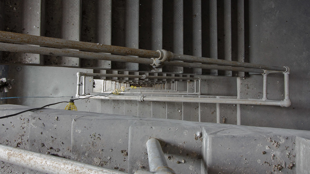
|  | | | #2 over #3 for me. The lights break up the infinite look of it. The rest I have no input on.
|
|
BOX
   

box1
| | Re: Long time stalker on UER
<Reply # 2 on 7/6/2013 2:59 AM >
| | | | This is 100% opinion and has no reflection on the skills of 'actual' photography:
Too clean. Too bright.
A lot of ue is about darkness and shadows unless the location is naturally bright
|
|
corvettejoe

Location: Central FL
Gender: Male
| |  | Re: Long time stalker on UER
<Reply # 3 on 7/17/2013 5:09 PM >
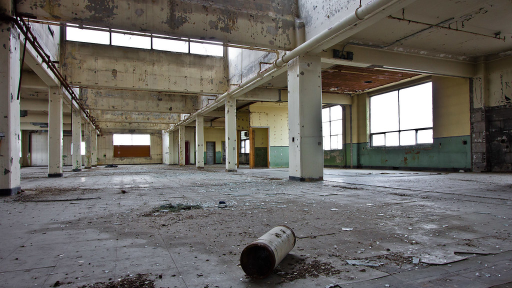
| | | | #2 is way better than #3. I didn't know what it was at first until I scrolled down to see the next one to see it was a stairwell. I liked it horizontal better as it has a very infinite look to it. The lighting was also better.. Dark grey above, light grey below.
#1..did you use a tripod? the right left is slightly out of focus at first glance. If a tripod, did you have the aperture cranked up high to get it to focus further back?
I like the water slides and colors. BUT... It appears to be slightly tilted clockwise? I would use the back wall connecting to 2 slides or the beam on the sign behind it to level it. I might have pulled the shadows out some and .. it seems to "washed out" over all... I dig the desaturated look, but its either not enough or needs to be brightened a bit somehow, or be "more bold" (sorry I don't know all my technical words yet LOL).
I would also spot heal that plane out of it, its too distracting and has nothing to do with the coolness of the slides and crazy-cool colors.
www.abandonedtravels.com
www.facebook.com/abandonedtravels |
|
|
|
All content and images copyright © 2002-2024 UER.CA and respective creators. Graphical Design by Crossfire.
To contact webmaster, or click to email with problems or other questions about this site:
UER CONTACT
View Terms of Service |
View Privacy Policy |
Server colocation provided by Beanfield
This page was generated for you in 89 milliseconds. Since June 23, 2002, a total of 738262900 pages have been generated.
|
|