 |
|
|
UER Store
|
|
sweet UER decals:

|
|
|
|
Activity
|
|
589 online
Server Time:
2024-04-24 04:35:05
|
|
|
 moapy

 | |  | Looking for feedback/advice
< on 12/10/2012 2:32 PM >
|  | | | Hi all, please tell me where you think I might have composed a little better here. I love this place, and I can get back in very easily so I want to plan out my next visit a bit better.
Please note that I do not use HDR and have zero intentions of ever using HDR. I know some people can work well with it, but mostly its fucking ugly and I don't want to spend hours in post processing when I could be out shooting.
1. I'm mostly happy with this. Lots of nice leading lines to guide you about the photo, the box is a bit distracting but I didn't notice it when I was shooting (it was very dark in there).

2. Sick graff, love the popped colours. Very happy with this, even with the unorthodox crop.

3. Not too happy with this, I really want to go back and reshoot this wall.

4. Another strange crop, but probably my favourite shot of this lot. Lots of lines to follow and I'm pretty stoked with the negative sky space.

5. Erm... really not sure how I feel about this one.

6. Exposure is a bit long for the blown lights, but it was so dark I didn't have much choice... again not too happy with this shot.

7.Pure self indulgence. I did try to compose this somewhat but I think it's way too busy...

8. I like this, but feel like I could do something else with this frame. Maybe shoot from a lower point.

|
|
moapy
| | Re: Looking for feedback/advice
<Reply # 1 on 12/12/2012 11:33 PM >
| | | | No takers?
|
|
La Cigale

Location: Paris, France
Gender: Male
| | Re: Looking for feedback/advice
<Reply # 2 on 12/14/2012 11:08 PM >
| | | | Two main issues I have with the set are that, I personally don't like straight up graffiti shots (like #2 and #3). I think that unless that was your piece, then you're not doing much in terms of photography expect making a copy of it. Now if you use it in context, where the graffiti is on the wall as part of a larger scene, this I have no problem with, like in shot number #6. If you're making a graffiti book, then that is something different.
The other main gripe I have, and this one again is purely person, I think the long exposure night shots could be a little darker. I don't think that keeping them so bright add's anything to the shot.
#1 Nothing terribly interesting in this shot. The extreme wide angle doesn't add anything to the shot, I would have straightened them out in PS
#2 Not into straight up Graffiti shots. Would have straightened out the wall (or taken the photo from a higher point to be flat on to the scene. Also, is this a true rendition of the colours? No problems with the crop. Different photos with different subjects require different formats. Just because our cameras shoot 3x2 doesn't mean we need to keep that crop for any reason at all.
#3 Perspective. Straight up graffiti shot.
#4. I think this is my favourite shot. Shows you the space, gives you a feel for where you are. But I would have made it a little darker. Also, if the shutter was open for less time, the sky could have been a little bit more interesting. I agree with your thoughts on the negative space the sky creates.
#5. The contrast looks strange to me in this shot. I woulds have brightened up the shadows a little bit, and maybe cropped in a little bit too.
#6. Extreme wide angle doesn't add to this shot. Would have made it a little darker. I like the shot as a while though. Peeking over the tops of the ruin, and from your elevated position it makes for a good perspective.
#7. The brightness in this shot looks a lot better in my opinion. You still have the bright lights of the night, but you know it's night and celebrate it rather than try to hide it. I would have straightened it a little though
#8. I don't think a lower perspective would add anything.
I don't know why I am the first to comment on this. There are some good photos in there and defiantly enough to talk about, good or bad, of which there are both points. So I hope someone else says something. They deserve it. Good job
*** There is a fucking up up up*** |
|
Steed
       
Location: Edmonton/Seoul
Gender: Male

Your Friendly Neighbourhood Race Traitor
| |  | Re: Looking for feedback/advice
<Reply # 3 on 12/28/2012 2:02 AM >
| | | | I like the way the shots are overexposed. They're not blown out, and while they don't capture "night," they do seem to say something interesting.
You really need to be more careful about lines though. A lot of the shots are very distorted due to weird camera angles, as well as whatever kind of lens you're using. 5 is almost spot on but a bit more tugging in photoshop would fix it. 1, 4, 6, 7, and 8 are noticeably distorted to the point where it takes away from the picture.
I get the feeling a lot of these would work better if you just went all the way and used a fisheye lens. It would certainly explain away all the distortion.
|
|
moapy
| | Re: Looking for feedback/advice
<Reply # 5 on 1/3/2013 6:19 AM >
| | | | Thanks for taking the time to reply!
The straight up graffiti shots are a personal love of the art. I don't do it, but I admire it greatly and love being able to look back at stunning pieces. Also - I don't ever screw with the colours on graffiti shots, aside from fixing white balance.
Interesting comment on the brightness, I actually shoot very dark normally, but this place really seemed to come to life with a bit of exposure. That and the fact that it was a full moon and in a major city meant it was pretty bright anyhow. Great comments though, I'll have a play around with the exposure.
Yes, I really need to work out some way to address the distortion of my 10mm lens (this goes for Steed's comments too). I'm pretty new to photography and love the wide angles, but yes the distortion is a bit of a killer.
Posted by La Cigale
Two main issues I have with the set are that, I personally don't like straight up graffiti shots (like #2 and #3). I think that unless that was your piece, then you're not doing much in terms of photography expect making a copy of it. Now if you use it in context, where the graffiti is on the wall as part of a larger scene, this I have no problem with, like in shot number #6. If you're making a graffiti book, then that is something different.
The other main gripe I have, and this one again is purely person, I think the long exposure night shots could be a little darker. I don't think that keeping them so bright add's anything to the shot.
#1 Nothing terribly interesting in this shot. The extreme wide angle doesn't add anything to the shot, I would have straightened them out in PS
#2 Not into straight up Graffiti shots. Would have straightened out the wall (or taken the photo from a higher point to be flat on to the scene. Also, is this a true rendition of the colours? No problems with the crop. Different photos with different subjects require different formats. Just because our cameras shoot 3x2 doesn't mean we need to keep that crop for any reason at all.
#3 Perspective. Straight up graffiti shot.
#4. I think this is my favourite shot. Shows you the space, gives you a feel for where you are. But I would have made it a little darker. Also, if the shutter was open for less time, the sky could have been a little bit more interesting. I agree with your thoughts on the negative space the sky creates.
#5. The contrast looks strange to me in this shot. I woulds have brightened up the shadows a little bit, and maybe cropped in a little bit too.
#6. Extreme wide angle doesn't add to this shot. Would have made it a little darker. I like the shot as a while though. Peeking over the tops of the ruin, and from your elevated position it makes for a good perspective.
#7. The brightness in this shot looks a lot better in my opinion. You still have the bright lights of the night, but you know it's night and celebrate it rather than try to hide it. I would have straightened it a little though
#8. I don't think a lower perspective would add anything.
I don't know why I am the first to comment on this. There are some good photos in there and defiantly enough to talk about, good or bad, of which there are both points. So I hope someone else says something. They deserve it. Good job
|
|
|
Abandoned not Forgotten
Location: Northern NJ
Gender: Male

| |  | | | Re: Looking for feedback/advice
<Reply # 6 on 1/7/2013 6:28 PM >
| | | | Very nice shots! What kind of camera / lens are you using? I'd also be curious to know the settings!
1. I like this a lot, in fact with all the different colors it almost looks like it has a slight HDR treatment. I think the composition is nice, and the box is hardly noticeable. I would try cropping and rotating the photo so that the "curb" (that the box is laying on) is parallel to the bottom of the photo, just to see how that would look.
2. Not a huge fan of in-your-face graffiti shots like this, but for what it is - it looks very nice.
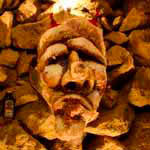
3. Not sure about the composition on this one - it looks fine to me. It's a very interesting piece of art. My only issue is I can't quite figure what's in the guys left hand at the top.
4. This one is nice. I only have 2 minor issues with it: First, I would try straightening out the column on the left to make it parallel with the left edge of the image and second, the building in the background seems a tad too bright.
5. Interesting shot, I would crop some off the left side to make it more centered.
6. I like this one, though I would play with rotating it to make the bottom of the wall parallel with the bottom edge of the photo.
7. Really nice self portrait. Did you stand there for a second and move away, because I can see right through you! I agree with La Cigale that it's nice how you can actually see the night in this shot.
8. I like how you can see nature reclaiming the building in this shot. Instead of doing a lower perspective I think I would tilt the camera down a bit, because it seems to me like there's a bit too much sky here.
Hope my input helps. Good luck and happy exploring!
Abandoned not Forgotten (Under Construction)
Flickr | YouTube | Facebook
Canon T4i | Tokina 11-16mm f/2.8 | Canon 50mm f/1.8 II | Manfrotto 190XPROB |
|
moapy
| | Re: Looking for feedback/advice
<Reply # 7 on 1/8/2013 12:49 PM >
| | | | Posted by Abandoned not Forgotten
Very nice shots! What kind of camera / lens are you using? I'd also be curious to know the settings!
1. I like this a lot, in fact with all the different colors it almost looks like it has a slight HDR treatment. I think the composition is nice, and the box is hardly noticeable. I would try cropping and rotating the photo so that the "curb" (that the box is laying on) is parallel to the bottom of the photo, just to see how that would look.
2. Not a huge fan of in-your-face graffiti shots like this, but for what it is - it looks very nice.
3. Not sure about the composition on this one - it looks fine to me. It's a very interesting piece of art. My only issue is I can't quite figure what's in the guys left hand at the top.
4. This one is nice. I only have 2 minor issues with it: First, I would try straightening out the column on the left to make it parallel with the left edge of the image and second, the building in the background seems a tad too bright.
5. Interesting shot, I would crop some off the left side to make it more centered.
6. I like this one, though I would play with rotating it to make the bottom of the wall parallel with the bottom edge of the photo.
7. Really nice self portrait. Did you stand there for a second and move away, because I can see right through you! I agree with La Cigale that it's nice how you can actually see the night in this shot.
8. I like how you can see nature reclaiming the building in this shot. Instead of doing a lower perspective I think I would tilt the camera down a bit, because it seems to me like there's a bit too much sky here.
Hope my input helps. Good luck and happy exploring!
|
Thanks for feedback man, every bit helps! I'm a photography noob so I'm just using the ol' Canon 1100d which was a present. I got a half decent lens though (which I'm probably using a bit too much) the 10-22mm f3.5 Canon lens. I love it.
As for settings, it's really hard to get a low ISO shot in this camera, which is pretty noisy at anything over 800 so most of these are long exposures (most 4-5 mins) at ISO 200 and f11.
|
|
La Cigale
Location: Paris, France
Gender: Male
| | Re: Looking for feedback/advice
<Reply # 8 on 1/9/2013 1:51 AM >
| | | | Posted by moapy
As for settings, it's really hard to get a low ISO shot in this camera, which is pretty noisy at anything over 800 so most of these are long exposures (most 4-5 mins) at ISO 200 and f11.
|
HERE HERE. This is the good way to do things. But be careful of f11... I think you will find f8 gives you a sharper image, and will cut down your shutter time by half which might be good for unwanted obstacles that long exposure inevitably implore (like noise)
*** There is a fucking up up up*** |
|
moapy
| | Re: Looking for feedback/advice
<Reply # 9 on 1/9/2013 2:58 AM >
| | | | Posted by La Cigale
HERE HERE. This is the good way to do things. But be careful of f11... I think you will find f8 gives you a sharper image, and will cut down your shutter time by half which might be good for unwanted obstacles that long exposure inevitably implore (like noise)
|
Interesting, can you please explain that further? Feel free to use all the camera wizardry terms you need to, I'm really keen to learn everything I can about photography.
I though that the smaller the aperture the larger the DOF and as such the greater the sharpness across the whole image?
[last edit 1/9/2013 3:09 AM by moapy - edited 1 times]
|
|
Tenebrae
Location: The Wild West
Life's short; eat dessert first.
| | Re: Looking for feedback/advice
<Reply # 10 on 1/9/2013 12:57 PM >
| | | | I might not have responded prior to the further appeal, simply because I'm not a fan of graffiti, but you have some interesting shots here.
Although I like the exposure effect on the sky as contrast to the busyness of the graffiti colors, I think 1, 4, 6, & 8 are over-exposed.
Line distortion only distracted me in the first shot, but now that Steed pointed it out, I am noticing it in the others as well.
|
|
|
|
All content and images copyright © 2002-2024 UER.CA and respective creators. Graphical Design by Crossfire.
To contact webmaster, or click to email with problems or other questions about this site:
UER CONTACT
View Terms of Service |
View Privacy Policy |
Server colocation provided by Beanfield
This page was generated for you in 171 milliseconds. Since June 23, 2002, a total of 738867143 pages have been generated.
|
|

