 |
|
|
UER Store
|
|
 order your copy of Access All Areas today!
|
|
|
 Abandoned not Forgotten
  
Location: Northern NJ
Gender: Male

 | |  | |  | |  | Trying to work on my composition - all input is appreciated!
< on 11/14/2012 12:54 AM >
|  | | | I've been working on my composition lately and trying to stick to basic photography principles (leading lines, rule of thirds, ...)
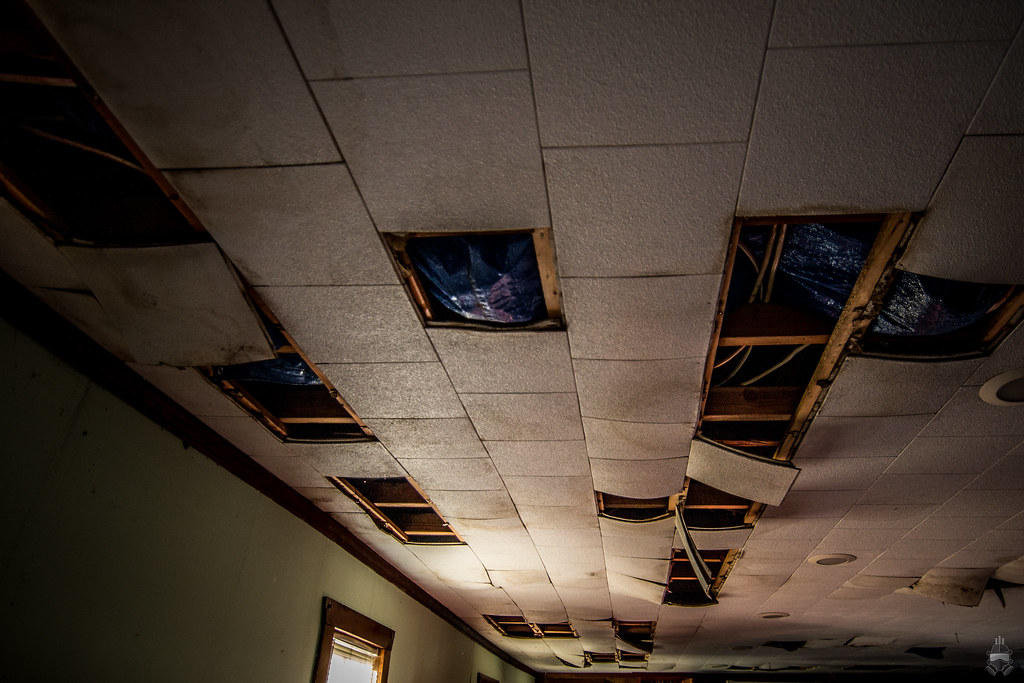
1. Not sure where I was going with this one, something with leading lines. The original included the back wall as well which was later cropped out - I think it looks better this way.
2. Here I wanted to capture the rocket and the fact that this is a minigolf. I attempted to apply the principle of leading lines (the green & it's orange-ish edge) and rule of thirds (placing the rocket in the top right. I think the angle of the shot gives it some "action", and although I like this shot I feel that it could have been better.

3. I really liked the chest, but could not think of a creative way to compose this one = considering the background is pretty boring (tall grass and fence). I tried to apply the rule of thirds in this case by placing the chest at the center of the intersection between the right and top lines. 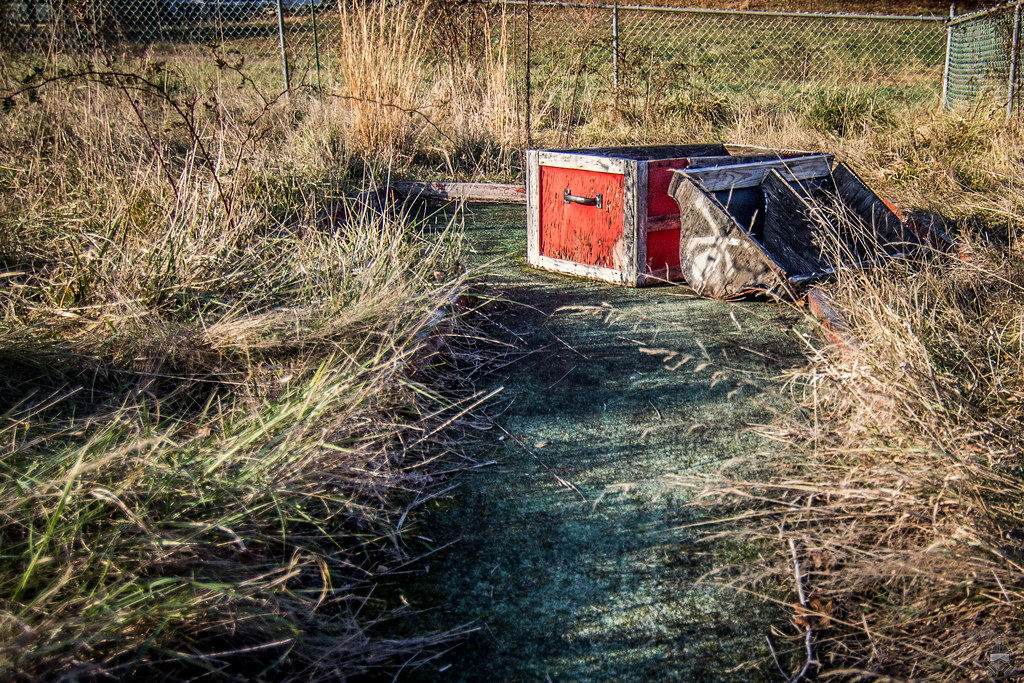
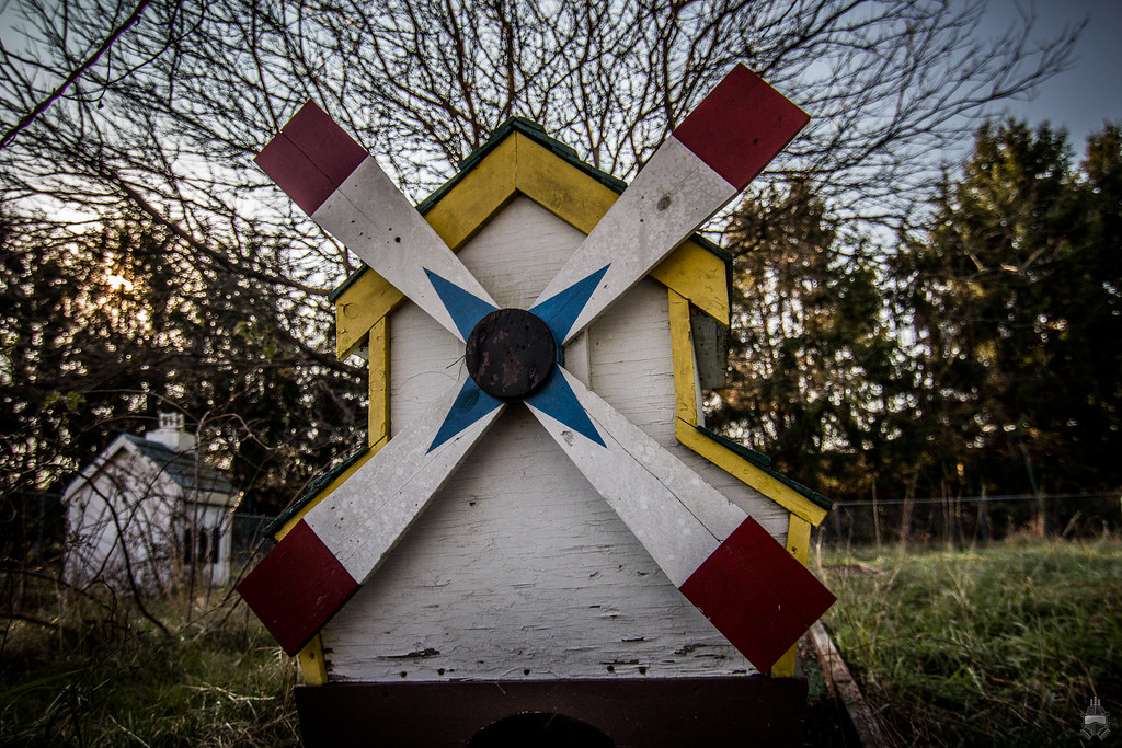
4. I like this shot a lot. I think it's because it's taken from below, giving the windmill a larger-than-life aura. Just like all my other shots, I still doubt it and feel I could have done better.
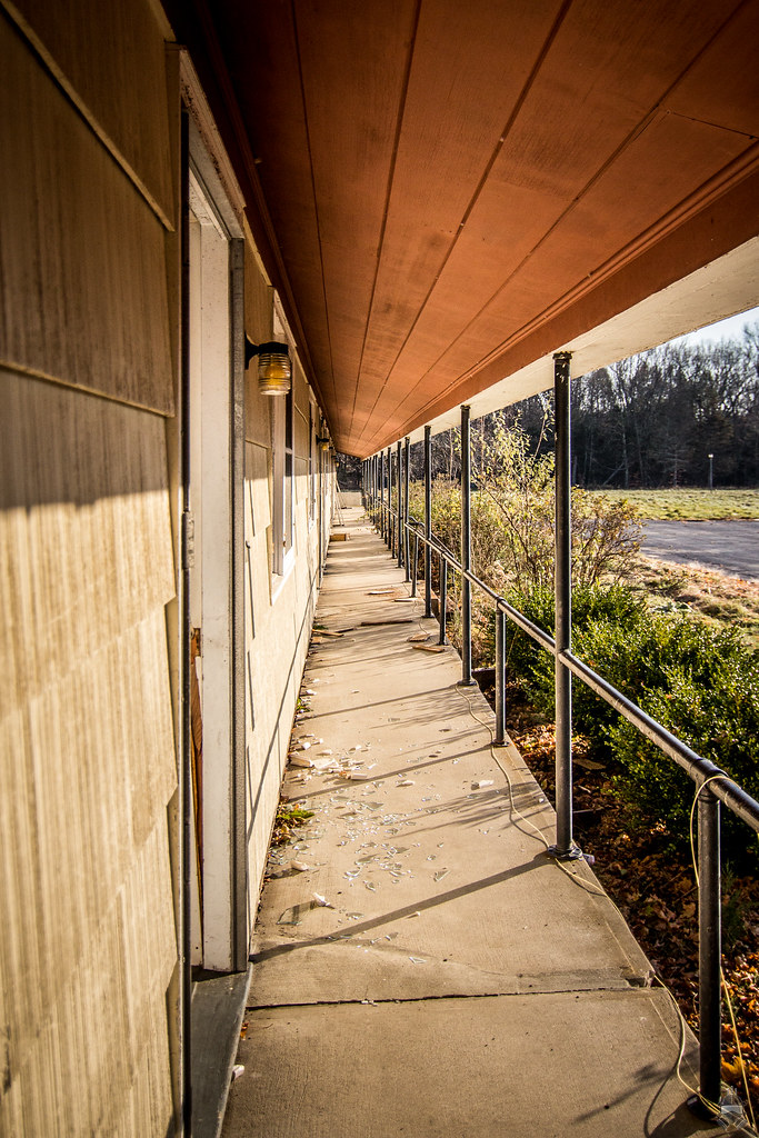
5. Just like the last shot, I like this one, yet I feel something is missing.
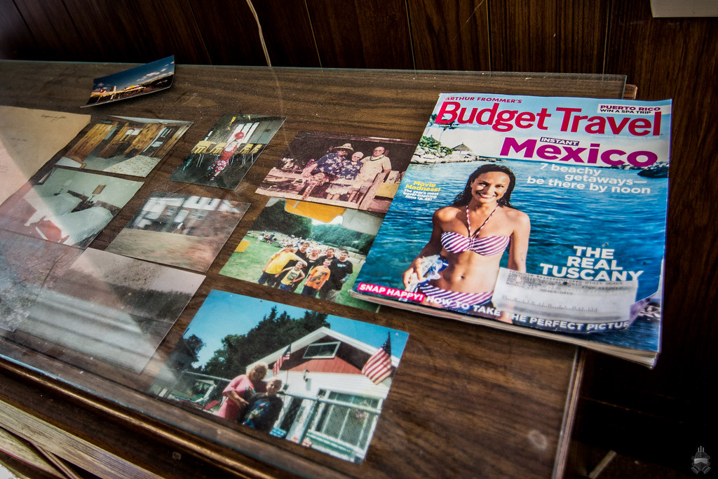
6. This was one of the more interesting things I encountered on the explore, but I feel like I totally blew this shot with shitty composition. Tried doing some rule of thirds magic with the magazine, but it still looks very bland to me.
7. Ignoring the lens flair, I think this is a pretty solid shot. Really not sure what I like about, and as always doubting that I took full advantage of composition opportunities. 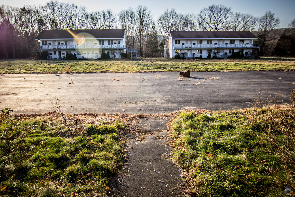
8. I'm really proud of this one, I didn't even realize how good it came out until I got home and opened it up on the computer. I think I did a decent job framing the shot with the window, but at the same time I feel like I included too much wall. 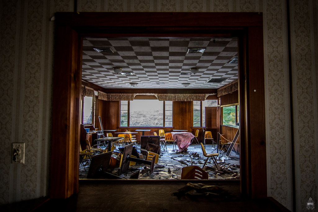
Oops, just remembered there was a 6 image limit on these posts. I'd hate to delete what I already wrote so I hope I'm not violating major rules here, it's just really hard to pick which ones to get critiqued. Anyhow, let me know what you guys think, and if the subject matter sparks your interest feel free to check out the whole set here on flickr. Thanks!
Abandoned not Forgotten (Under Construction)
Flickr | YouTube | Facebook
Canon T4i | Tokina 11-16mm f/2.8 | Canon 50mm f/1.8 II | Manfrotto 190XPROB |
|
Steed
      
Location: Edmonton/Seoul
Gender: Male

Your Friendly Neighbourhood Race Traitor
| | | Re: Trying to work on my composition - all input is appreciated!
<Reply # 1 on 11/14/2012 2:05 AM >
| | | | Is it a rule now that you can only post six? Seems smart, but I can't imagine it being enforced.
So, a few comments about your photos.
1. I see what you're going for, but viewed on my computer where I scroll down over the image it looks skewed until I see the bottom frame. You can easily use photoshop to make the lines more parallel. You need to pull the left corner upward so the ceiling tiles have a more parallelogram shape.
2. This shot ends up kind of distracting because of the competing subjects. I think a better choice might've been to focus on the sign. Also, it would've been better to find a way to isolate the rocket so it doesn't have those trees all in the background.
3. There's a lot you could do to play around with this shot, or leave it as is.
4. I like almost everything about this shot. You could probably tilt it a bit clockwise so it feels more grounded. I'm also wondering if the house on the left takes away.
5. Was this taken leaning against the wall? I think the best way to improve this shot would be to get yourself into the middle of the space, so you have four lines receding to a center.
6. As far as this kind of picture goes, you pulled it off. I don't think it's worth overanalysing the composition because that's really not the point here.
7. I think this could be improved slightly by tugging down the bottom right corner in transform skew.
8. Great shot, but needs less wall, and especially that socket. I know sometimes there's that urge to include more and more elements, but simplicity is more important. You also should use Photoshop to make the vertical lines parallel.
I get the impression you're relying way too much on the rule of thirds. It really is not the only composition technique out there. You really should be learning through trial and error.
|
|
theendof93

Location: Kings Park, NY
Gender: Female
| | | Re: Trying to work on my composition - all input is appreciated!
<Reply # 2 on 11/14/2012 10:58 AM >
| | | | #5 is well done.
i like #8 a lot, but i have to say i disagree with steed about less wall. if it were me a would photoshop out the socket (or whatever that is) and straighten it up, but i would leave the relatively large amount of wall.
just my opinion...
update: i looked at the rest of this set on flickr and i absolutely love the shot titled "the throne".
update: after looking at "the throne" again, i'm thinking it could you some straightening and a little bit of cropping. i played around with it in ps and think it makes this image stronger than it already is.
[last edit 11/14/2012 11:12 AM by theendof93 - edited 2 times]
TheEndOf93.com
93Photography.com |
|
Abandoned not Forgotten
Location: Northern NJ
Gender: Male
| | | | Re: Trying to work on my composition - all input is appreciated!
<Reply # 3 on 11/15/2012 2:29 AM >
| | | | Posted by Steed
1. I see what you're going for, but viewed on my computer where I scroll down over the image it looks skewed until I see the bottom frame. You can easily use photoshop to make the lines more parallel. You need to pull the left corner upward so the ceiling tiles have a more parallelogram shape.
|
I'm a little confused, are you referring to the lines between the ceiling tiles?
Posted by Steed
2. This shot ends up kind of distracting because of the competing subjects. I think a better choice might've been to focus on the sign. Also, it would've been better to find a way to isolate the rocket so it doesn't have those trees all in the background.
|
Yes! Competing objects - this is exactly how I feel. I had a hard time figuring out how to isolate the rocket, guess I'll try harder next time.
Posted by Steed
3. There's a lot you could do to play around with this shot, or leave it as is.
|
I'm pretty happy with this one, but I'd definitely like to see how others would "play around" with it.
Posted by Steed
4. I like almost everything about this shot. You could probably tilt it a bit clockwise so it feels more grounded. I'm also wondering if the house on the left takes away.
|
I actually kind of like the slight angle it's under, but at the same time I could see where you're coming from. I too am wondering if the house takes away from the shot.
Posted by Steed
5. Was this taken leaning against the wall? I think the best way to improve this shot would be to get yourself into the middle of the space, so you have four lines receding to a center.
|
No it wasn't, I was actually standing more or less in the middle. If you notice the awning/roof is angled. I do see what you mean by having the four lines receding to center.
Posted by Steed
6. As far as this kind of picture goes, you pulled it off. I don't think it's worth overanalysing the composition because that's really not the point here.
|
That's reassuring 
Posted by Steed
7. I think this could be improved slightly by tugging down the bottom right corner in transform skew.
|
I agree, that would help the symmetry a lot.
Posted by Steed
8. Great shot, but needs less wall, and especially that socket. I know sometimes there's that urge to include more and more elements, but simplicity is more important. You also should use Photoshop to make the vertical lines parallel.
|
I actually wasn't trying to include the socket, but on the bright side it should be pretty easy to shop out.
Posted by Steed
I get the impression you're relying way too much on the rule of thirds. It really is not the only composition technique out there. You really should be learning through trial and error.
|
Honestly, it's not so much I'm relying on that rule - I guess I just instinctively shoot via trial and error and a lot of shots end up fitting in the rule. Thank you for your input, I really appreciate it!
Abandoned not Forgotten (Under Construction)
Flickr | YouTube | Facebook
Canon T4i | Tokina 11-16mm f/2.8 | Canon 50mm f/1.8 II | Manfrotto 190XPROB |
|
Abandoned not Forgotten
Location: Northern NJ
Gender: Male
| | | | Re: Trying to work on my composition - all input is appreciated!
<Reply # 4 on 11/15/2012 2:34 AM >
| | | | Posted by theendof93
#5 is well done.
i like #8 a lot, but i have to say i disagree with steed about less wall. if it were me a would photoshop out the socket (or whatever that is) and straighten it up, but i would leave the relatively large amount of wall.
just my opinion...
update: i looked at the rest of this set on flickr and i absolutely love the shot titled "the throne".
update: after looking at "the throne" again, i'm thinking it could you some straightening and a little bit of cropping. i played around with it in ps and think it makes this image stronger than it already is.
|
Thank you! Looking at #8 more and more, I think I agree with you more than steed that the amount of wall there really adds some strength(?) to the photo.
"The Throne" is probably the best shot out of the set and my favorite as well! I played around with cropping a little bit off of the left for greater symmetry, but that column really throws it off. If it's not too much trouble, I'd like to see what you came up with for that one. Thanks again for your input!
Abandoned not Forgotten (Under Construction)
Flickr | YouTube | Facebook
Canon T4i | Tokina 11-16mm f/2.8 | Canon 50mm f/1.8 II | Manfrotto 190XPROB |
|
randomesquephoto

Don't be a Maxx
| | Re: Trying to work on my composition - all input is appreciated!
<Reply # 5 on 11/15/2012 2:51 AM >
| | | | I'd say. Adding vignettes to your photos does nothing. And. If you focused on your composition a bit more. You wouldn't have to rely on cropping much. Take your time to achieve what you want. So your post work focuses on the subtleties of you images.
RIP Blackhawk |
|
Steed
Location: Edmonton/Seoul
Gender: Male
Your Friendly Neighbourhood Race Traitor
| | | Re: Trying to work on my composition - all input is appreciated!
<Reply # 6 on 11/15/2012 4:27 AM >
| | | | Well I think 8 would work best with more wall on the sides, but the socket is a bit distracting. Personally I'm not the kind of guy to photoshop something that exists out of my images. If it were me I'd probably just straighten it without cropping and leave the socket in.
For 1 I was referring to the horizontal lines of the tiles near the upper frame. I think they should be made to be perfectly horizontal to improve the image.
|
|
Abandoned not Forgotten
Location: Northern NJ
Gender: Male
| | | | Re: Trying to work on my composition - all input is appreciated!
<Reply # 7 on 11/16/2012 2:11 PM >
| | | | Posted by randomesquephoto
I'd say. Adding vignettes to your photos does nothing. And. If you focused on your composition a bit more. You wouldn't have to rely on cropping much. Take your time to achieve what you want. So your post work focuses on the subtleties of you images.
|
Exactly, I'm trying to focus on my composition more, just looking for a bit of direction I suppose. The vignettes are courtesy of some faux-HDR lightroom settings, which IMHO bring out color subtleties in the image.
Abandoned not Forgotten (Under Construction)
Flickr | YouTube | Facebook
Canon T4i | Tokina 11-16mm f/2.8 | Canon 50mm f/1.8 II | Manfrotto 190XPROB |
|
Abandoned not Forgotten
Location: Northern NJ
Gender: Male
| | | | Re: Trying to work on my composition - all input is appreciated!
<Reply # 8 on 11/16/2012 2:13 PM >
| | | | Posted by Steed
Personally I'm not the kind of guy to photoshop something that exists out of my images. If it were me I'd probably just straighten it without cropping and leave the socket in. |
My thoughts exactly, I want to show what's truly there!
Posted by Steed
For 1 I was referring to the horizontal lines of the tiles near the upper frame. I think they should be made to be perfectly horizontal to improve the image.
|
I see what you're saying now, that makes sense. I'll have to play with it in PS a bit.
Thanks for the advice!
Abandoned not Forgotten (Under Construction)
Flickr | YouTube | Facebook
Canon T4i | Tokina 11-16mm f/2.8 | Canon 50mm f/1.8 II | Manfrotto 190XPROB |
|
vividdecay
Location: Baltimore
Gender: Male
| | Re: Trying to work on my composition - all input is appreciated!
<Reply # 9 on 11/26/2012 5:05 AM >
| | | | I like number 8 but I must say, it looks like you're doing some type of HDR or over sharpening or something. Which is sometimes okay, just don't overdo it.
|
|
Abandoned not Forgotten
Location: Northern NJ
Gender: Male
| | | | Re: Trying to work on my composition - all input is appreciated!
<Reply # 10 on 11/30/2012 7:07 PM >
| | | | Posted by VividVisions
I like number 8 but I must say, it looks like you're doing some type of HDR or over sharpening or something. Which is sometimes okay, just don't overdo it.
|
Thanks, I'm really liking that one myself! I'm using these: http://lightroomki...hdr-effect-part-2/ LightRoom HDR presets. I think they really bring out the dark tone of the subject matter.
Abandoned not Forgotten (Under Construction)
Flickr | YouTube | Facebook
Canon T4i | Tokina 11-16mm f/2.8 | Canon 50mm f/1.8 II | Manfrotto 190XPROB |
|
mhester
Location: Hails from parts unknown
Gender: Male

| | | Re: Trying to work on my composition - all input is appreciated!
<Reply # 11 on 12/1/2012 12:20 AM >
| | | | Ahhhhh shot this place a ton of times, and I used to vaca here as a kid. It as a kid. It is a shame what they let this state do to the place.
Long time Urban explorer, who wants to push my love for the abandoned world into the art community. |
|
KMUE1991
Location: Maryland
Gender: Female

ECUE
| | | Re: Trying to work on my composition - all input is appreciated!
<Reply # 12 on 1/11/2013 7:33 PM >
| | | | You definitely have the right idea, Just get more practice and you'll see major improvements! I would say for starters make sure to straighten your photos.
http://www.flickr.com/photos/krissssten/ |
|
Abandoned not Forgotten
Location: Northern NJ
Gender: Male
| | | | Re: Trying to work on my composition - all input is appreciated!
<Reply # 13 on 1/12/2013 11:43 PM >
| | | | Posted by KMUE1991
You definitely have the right idea, Just get more practice and you'll see major improvements! I would say for starters make sure to straighten your photos.
|
Thank you for your response! I'll definitely be paying more attention to straightening in the future.
Abandoned not Forgotten (Under Construction)
Flickr | YouTube | Facebook
Canon T4i | Tokina 11-16mm f/2.8 | Canon 50mm f/1.8 II | Manfrotto 190XPROB |
|
|
|
All content and images copyright © 2002-2024 UER.CA and respective creators. Graphical Design by Crossfire.
To contact webmaster, or click to email with problems or other questions about this site:
UER CONTACT
View Terms of Service |
View Privacy Policy |
Server colocation provided by Beanfield
This page was generated for you in 156 milliseconds. Since June 23, 2002, a total of 739038209 pages have been generated.
|
|
