
| Posted by MysteriousExpedition That would work pretty great too. Honestly there's no right or wrong for light painting I think. It all depends on how subtle you would want the colors to be added in |

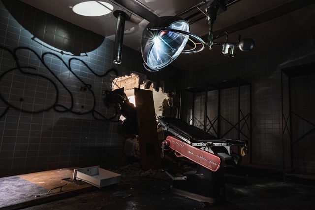
| Posted by blackhawk ^The biggest thing I see that's wonky is the gold trim on the chair getting poisoned with red. Using the red band contrast curve you can get rid of some of it. Using other PS techniques may be more effective. I don't use these so not going to be much help with those. Cool stuff, keep up the effort |
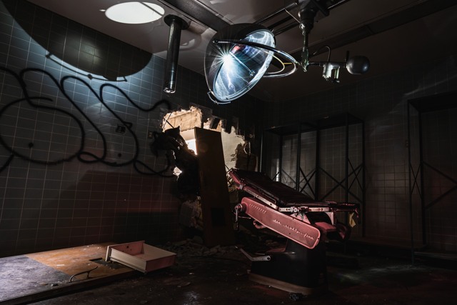
| Posted by Goste I agree, editing light painting shots like I said is new to me, but with the advice from everyone this one has come along ways, which I realize is to be more subtle about it. Thanks for the advice.
|
| Posted by Goste Feel like I have edited this thing like a million times, but it's all good glad to learn. I agree, I actually edited this twice once with just the frame of the chair fixed and the other with the gear box trim also adjusted. Let me know if there is one that takes preference? Thanks for everything again! Just the frame fixed
Frame and gear box trim fixed
|
| Posted by MysteriousExpedition This one is perfect IMO. You should definitely go with this one as the tones seem in line with everything else. The light painting shot you had before was really good too. Especially for complete contrasting colors. But this definitely takes the cake. Great job! |
| Posted by blackhawk WB and colors look near perfect. A little flat and neutral but not blown out like the original |
| This thread is in a public category, and can't be made private. |


