
| Posted by blackhawk Try playing with the contrast curves if you haven't. |
| Posted by blackhawk ^You really that inept? Get off my tail you butthurt whiney bitch.
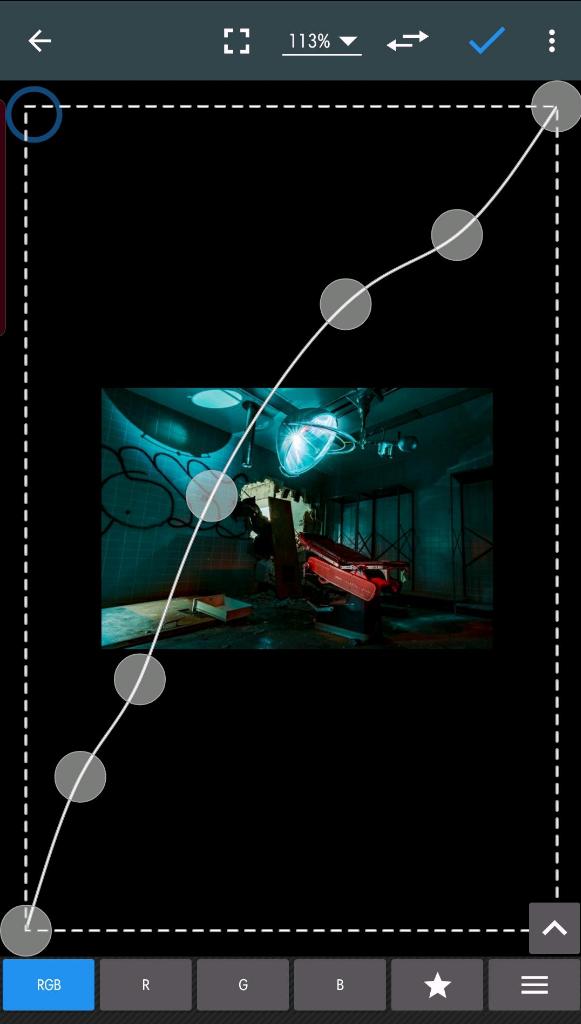
To OP: Works best on RAWs. Fastest way to dial in an image. Some apps allow for more adjustment points to be added and most can be slide around as needed on the contrast line. I turn off saturation and first adjust it in B/W, then bring up saturation to desired level. Contrast curves for each of the 3 color can be further adjusted if desired but usually not needed. |
| Posted by Goste That does look better thanks, what editor did you use for that? |
| Posted by blackhawk I spent like 5 seconds doing that; just trying to show how much, how selectively and easily you can manipulate the contrast. That's a free Samsung Galaxy Store app, Photo Editor MG for Android. There are many out there for whatever OS platform you're using. If you're using Canon cams try Digital Photography Pro from Canon. It's free. I prefer their older version from 10 years ago as it's easier to use. |
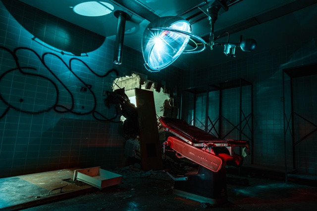
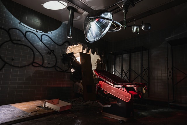
| Posted by Goste Here is me messing around with the tone curve, let me know if this looks better. Thanks
|
| Posted by blackhawk I can't view them side by side but it looks like the red channel is getting blown out in the last one and/or is too saturated. I'm not on a color calibrated monitor so. It's important to use the correct color management (ICC profile) thru put (cam>PC>monitor) then color calibrate your monitor before you edit. |
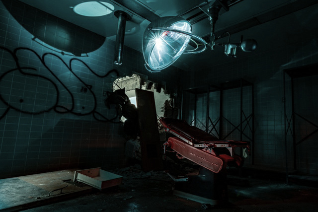
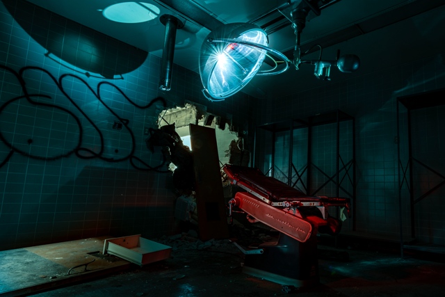
| Posted by Goste This is literally my first attempt ever at light painting during my exploration of an abandoned hospital. After the results, I'm going to be light painting more in exploration as it really helps to shoot those places in which conditions are challenging and can also give it a pretty cool look. Just wanted to get some opinions of what you guys think! FYI the file did loose some quality when it was compressed down, anyways thanks!
|
Posted by blackhawk
Dial back the color saturation. To me this looks more realistic, however the color calibration may be way off on my Note 10 plus to spite my best efforts. The red still seems blown out; maybe go back to the original image and play with the WB or just do less with the red than you did. I find it easiest to take all the color out and adjust the B/W contrast curve then bring up the color saturation. |
| Posted by Natchraz Nice! I really need to buy more lights since I’ve been dependent on natural light and my flash lately. |
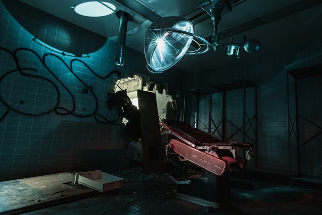
| Posted by Goste Thanks for everything and I agree looks better with less saturation, took me some time to mess with this one. Really appreciate all the advice.
|

| Posted by blackhawk You're welcome. Looking good from here |
| Posted by ryanpics I personally think the blue should be a little less strong and the red more, since the red is the only thing to give some color contrast. But that's just how I'd do it. In the end it's all up to what you think looks best. Once you get familiar with some editing tools you'll be able to get it to look how you want pretty easily. |
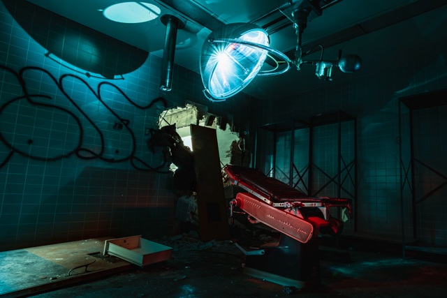
| Posted by Goste Well let me know if this looks better. Took a lot of the blue out and added the red back some. Let me know if this maybe looks like too much red. Thanks!
|
| Posted by ryanpics I personally think the blue should be a little less strong and the red more, since the red is the only thing to give some color contrast. But that's just how I'd do it. In the end it's all up to what you think looks best. Once you get familiar with some editing tools you'll be able to get it to look how you want pretty easily. |
| This thread is in a public category, and can't be made private. |


