I haven't posted a picture to be critiqued in awhile. I hope you guys see some growth and like what you see. Having said that, this is the first time i've tried this particular photography technique.
post by randomesquephoto | | Re: Whatcha think? <Reply # 1 on 5/9/2019 5:06 AM >
They're all framed a little strange and uncomfortable, without being able to pinpoint exactly. The first shot makes the most sense, but all Luis missing a sense of balanced composition...
The chair gets swallowed up some from the graffiti.
The angle tilt on 2 is a little awkward.
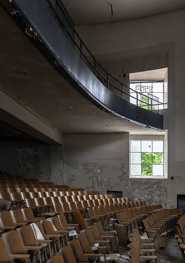
And in three (and two) there's a lot of meaningless space.
Three could be like, if you shifted yourself to the left some, and came down some it might make more sense.
I browsed a bit though your photostream. You've been to some great places, and it looks like you're ring to experiment and improve. Keep it up.
post by tiftastic | | Re: Whatcha think? <Reply # 2 on 5/9/2019 3:42 PM >
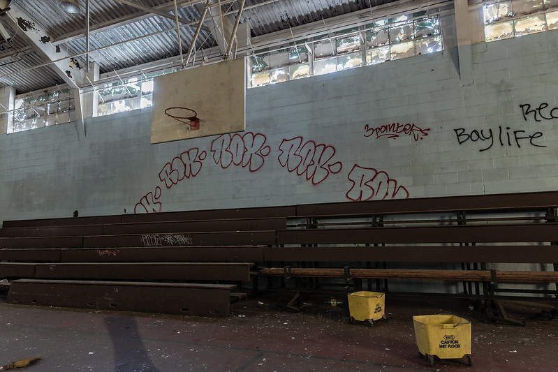
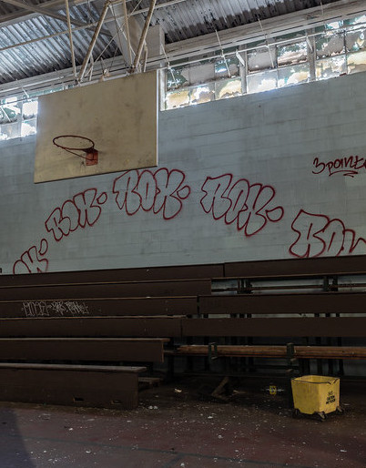
# 1 is my favorite. These are all well exposed and have a good balance of lighting; however, I agree that the composition makes them seem a little "off" - my eye doesn't know where to go. Simply re-framing could make a huge difference. For example, in #2, using the backboard and mop bucket as anchor points allows your eye to naturally start and one corner and travel to the other, taking in the whole image. In #3, cropping allows the curve of the balcony to draw you eye to the window (the actual focal point in this image.) You may want to read up on the rule of thirds - I think you would find it helpful. All in all - you have the hard part down (lighting/exposure) - great work!
post by AnUnlikelyExplorer | | Re: Whatcha think? <Reply # 3 on 5/10/2019 11:08 PM >
Thanks for the comments.
I can see where you all are coming from on the compositional framing. Im happy that no said they looked like HDR photos because that was what i was experimenting with. I want them to stay looking realistic.
Image 2. is what was giving me the biggest struggle here. Im not very good in gyms. I like the basket ball goal, i liked the arching ROX graffiti. I wanted to share what i was seeing but could find a way.
I like your reedits. I did a similar edit on 3. When i uploaded it to Instagram. Ill rethink them and see what you all think.
post by ryanpics | | Re: Whatcha think? <Reply # 4 on 5/11/2019 3:29 AM >
I think the HDRs look good, but 2 is just an odd case for it. Not a lot of natural contrast so it's just a little dull. I love the contrast in 1 though. In terms of composition, if you just got a little but lower for all of them I think they could be a bit better. For the 1st one it doesn't need it as much but it could get you on the level of the chair. The 2nd one could bring a little more attention and separation to the buckets. And the 3rd one would add some depth to be able to see the chairs get smaller as they get towards the wall. Still great shots though.
post by FLAMINN | | Re: Whatcha think? <Reply # 5 on 6/10/2019 11:38 PM >
I would have to disagree with some of the previous points. I think they are fun to look at. Im very tired of the cookie cutter architectural photos. they all start to look the same and give all the different locations the same presence. these pictures felt like i was seeing something new.
post by 08j23 | | Re: Whatcha think? <Reply # 6 on 6/23/2019 8:09 AM >
try looking up some ways to frame shots like the rule of thirds or the golden triangle. it takes some time to get used to shooting with these in mind but the payoff is great. Eventually you'll see everyday as ways to frame photos. The basketball court is great, personally I would have pulled out a bit wider to show how big the gym is. the mop buckets are just a smidge too close to the bottom of the frame. It makes them seem more of an interruption than drama for the foreground.